Kassidy Klingler
My Work
Package Design
Adv. Type and Layout
Adv. Design
Annual Report
Overview
We were asked to create the final part of our project; an annual report. There weren't many tricky things with this one, mostly because
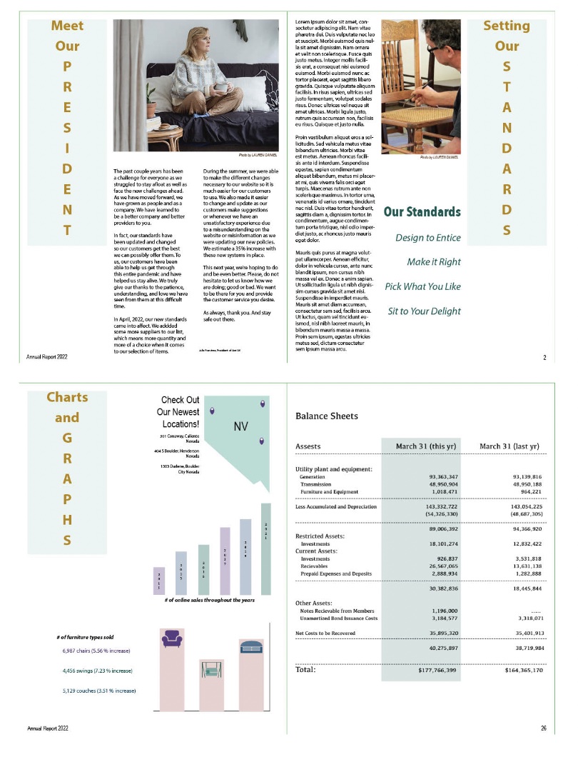
an annual report is tricky enough as it is. We did have to have at least three charts and graphs, a jump line, a presidents page, and a corrected balance sheet.
This last part of the project is essentially the bog test. What did we learn about branding? How did we grow over the semester? How were we able to make everything
feel like one, cohesive piece produced by one company? All of these are questions that were constantly being asked as we designed our entire project. It's also a
tricky design, purely because it's better to keep a simplified layout. We all struggled with that. Overall, a good challenge.

Research
Personally, I'm not the kind of person that likes annual reports. I don't really know how to read the numbers (either that or I'm just not interested in the stock market),
so I wasn't too familiar with annual reports. I have seen them, just didn't pay attention all that much. So, I tried to do research on annual reports. One of the main things
I was focused on was seeing how other people connected all the different charts to the related topic as well as the different pages they had. It was interesting to see how other
people handled annual reports. I tried to look at some for furniture companies to see how they handled it specifically. I was very inspired by what I found. I also found that the
majority of people kept it fairly simple.
Brainstorming
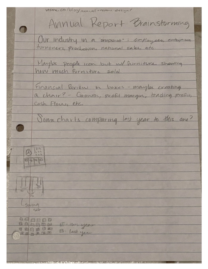
I didn't do as much brainstorming, but the main thing I was looking at were the different things I could do my charts on. I wasn't worried about my presidents spread as much.
I decided to try and figure out the charts since I was absolutely stumped. I didn't know what to do, so I figured I would brainstorm while looking at my research. It did help,
which I'm grateful for.

Sketches and Doodles
As always, I was trying different layouts out. I was looking at my research, seeing which ones I liked, then adapted to make it match the style of my company.
I really liked the different type of box styles I was seeing, so I tried to incorporate that as best I could into my layout. I also tried to mess with how I would try to
do the different graphs and how to make the different spreads all look similar.

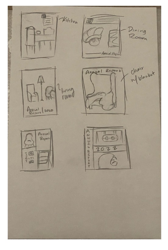
Thumbnails
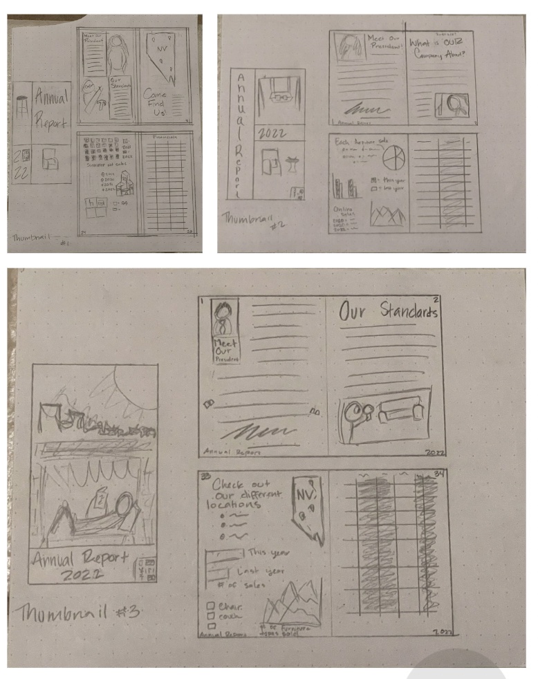
I took some of the best things I sketched and brought it into more detail on my thumbnails. I liked a lot of the different layouts that included boxes or squares,
including with with a Mondrian layout. I was told to be careful with that one if I decided to go forward with it. I tried different placements of the presidents and other
things I could try on the other side of the page. I also messed with several different graphs, making them all have some sort of a box.

Intermediates
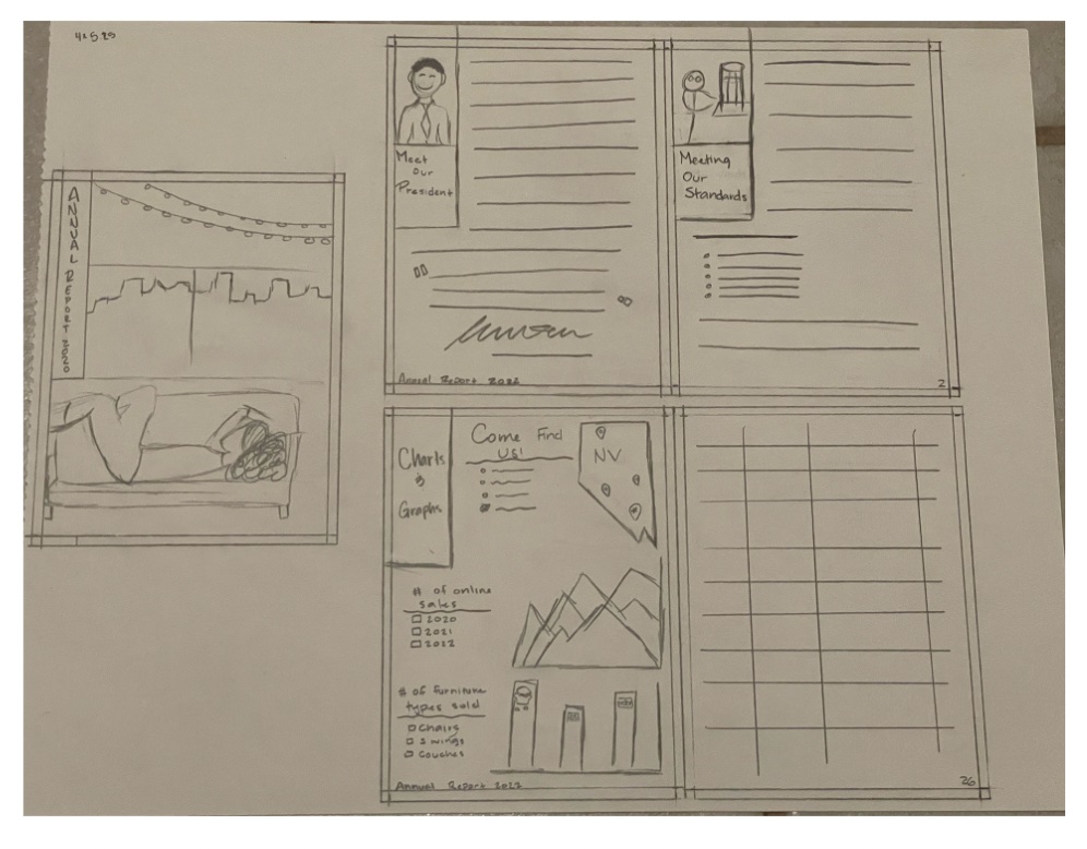
Due to time restraints, I could only do one intermediate. I took the one I liked the most from my thumbnails and tried to make it better. I drew out the pictures and
headers in a picture/polaroid kind of style. I also messed around with the idea of a pull quote as well as bullet points on my graphs page. I also looked had the idea to
bring my symbols into this report by putting them on a bar graph, comparing the sales between the different types of furniture.

Final Hand
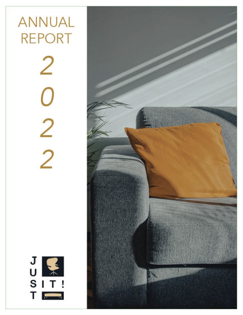
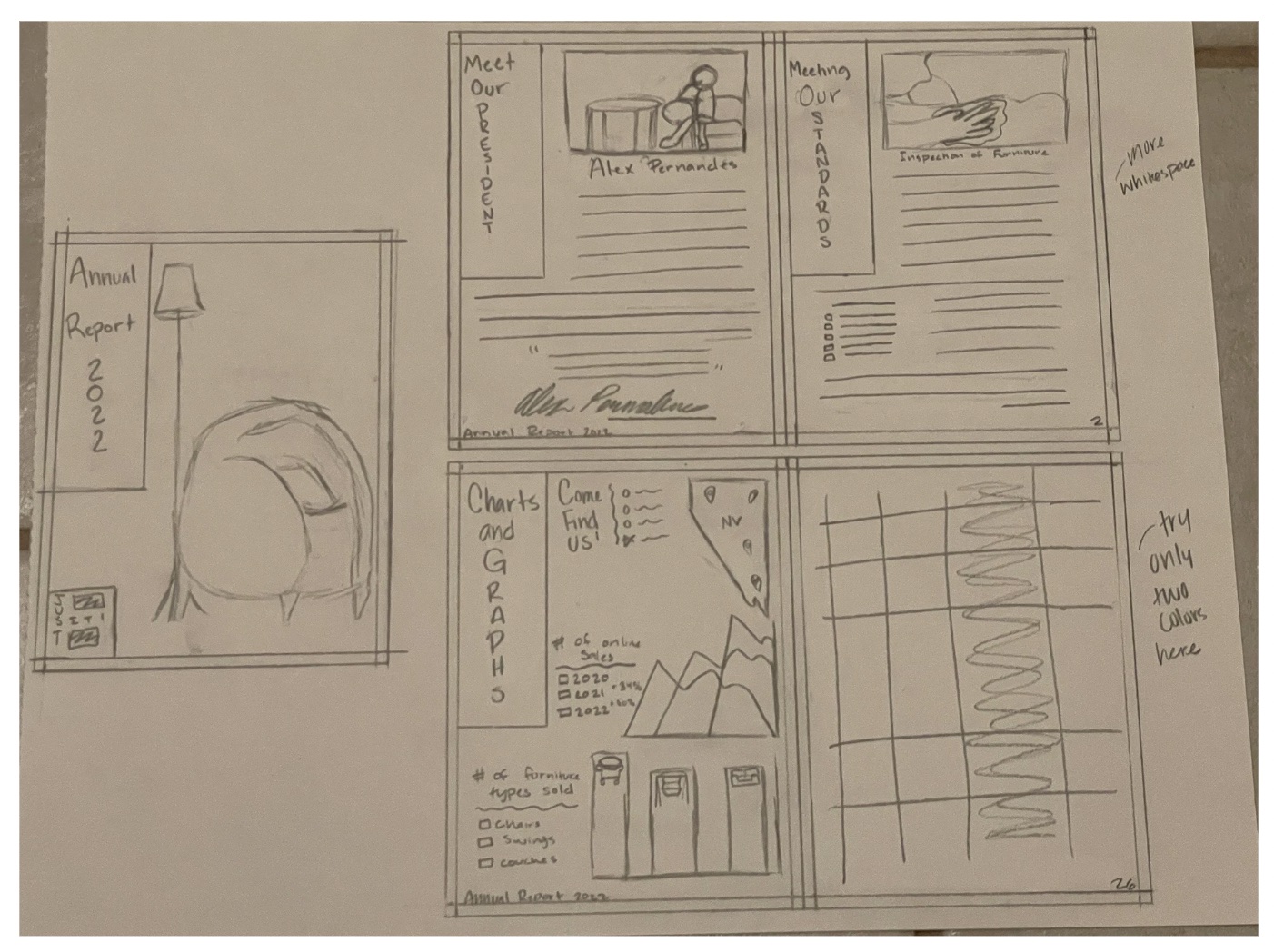
I changed the cover photo, mostly because it just didn't look right for what I wanted to do. I also changed the presidents photo to be the president enjoying some furniture.
I thought that added a more personable touch. I also changed the standards photo to be someone working on furniture. I figured that was another thing I didn't really talk about,
but it could be something I talk about here. I added a consistent band with the same type treatments; two words on top and a third word being vertical. I was really starting to
like this idea better.

B&W Progressions
I wanted to do black and white computer progressions, but I figured with the time I had left, it would be better to have something complete than having something have done to present.
Plus, with all the mounting I still had to do, it made since to skip this step and go straight towards the colors.
Color Version - Final
I wish I had messed around more with color, but again, the time thing. I severely underestimated the amount of time I would need for this project. Anyway, I wished I had stuck to just
two typefaces and limited my color choices. I think I added too much in there. However, I am very proud of myself. For not being interested in annual reports and struggling to get it done,
I am happy to be able to finish it. I am also happy to have another experience under my belt. I will definitely be messing with it more, but I am overall proud of what I was able to come up
with considering the time and effort I put into it.
