Kassidy Klingler
My Work
Package Design
Adv. Type and Layout
Adv. Design
Some Other Works I'm Proud Of
Wildlife Poster
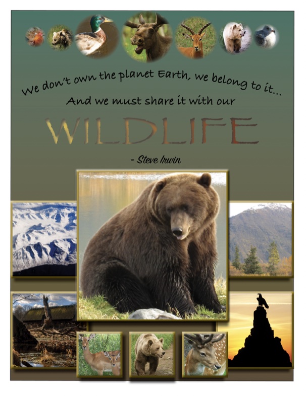
For my Indesign class, we were given several photos to work with as well as varying circles sizes and told
to make a wildlife poster out of it. As long as we had those certain elements, everything else was free game. I decided
to go for a Mondrian layout, looking for a little bit of a collage feel. I also like how I added the quote and made the 'Wildlife'
pop out with the depth I added to it.
Hexagon Pattern
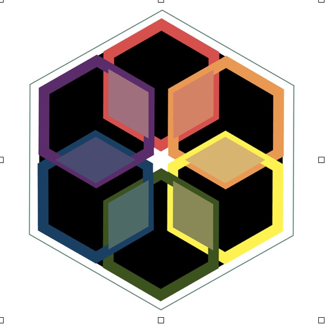
Thia pattern, as well as the two below this one, is a pattern I made that was intended for a sticker.
Again, this is for Indesign class. The point of the assignment was to get us familiar with dielines, but having
some stickers made it more fun and challenged us creatively. For this pattern, I was honestly just messing around.
I wasn't sure what to do, so I just made a hexagon and wwent from there. Sometimes I'll do stuff like that; not have anything
particular in mind when I doodle or craft. Then, I can sometimes create something really fun, like this one!
Cool Patterns
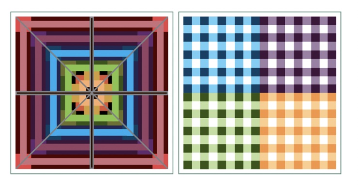
With this pattern, it's a little bit of random with a little bit of trying to replicate a real pattern.
The first one was another random one where I was messing around woth squares. I don't find it as successful as
the one above. The other pattern is supposed to be replicating gingham or a plaid kind of a pattern. I do like this one,
but I wish I had chosen different colors for it so it was a little better.
Gumball Machine
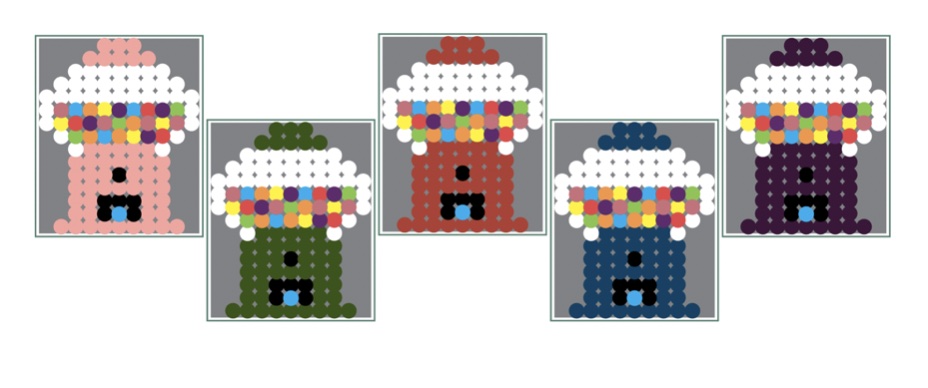
I got this idea from Pintrest. I was looking at my perler bead board, I used to play with these a lot when I was
younger and thought it might be fun to try as a sticker. The way I did this was just by copying and pasting the circles
and making them look right and centered. Then, I copied and pasted one of them, just changing the color as I moved from gumball machine to gumball machine.
I was still pretty new to all the programs and everything at the time, so I think there was probably an easier way to do it.
I really like how this one turned out, but I wish I made a more custom die for it when I did the assignment.
\
Family Crest Part 1
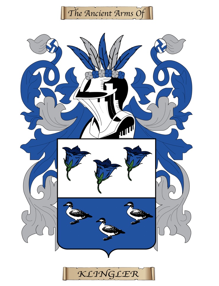
This one, and the one below it, are from the same assignment. This was from my Printing Fundamentals class. We did a poster and a sticker.
This one is the poster that is meant to fit on an 11x17. We also messed around with ClipArt (that isn't copyrighted) and how we can sucessfully
add that to our projects. This took me a lot of work and figuring out, but it turned out pretty good in the end. This project was a lot of fun!
I'm mostly pround of the little frillies: those were made by tracing and not by ClipArt, like I was originally intending.

Family Crest Part 2
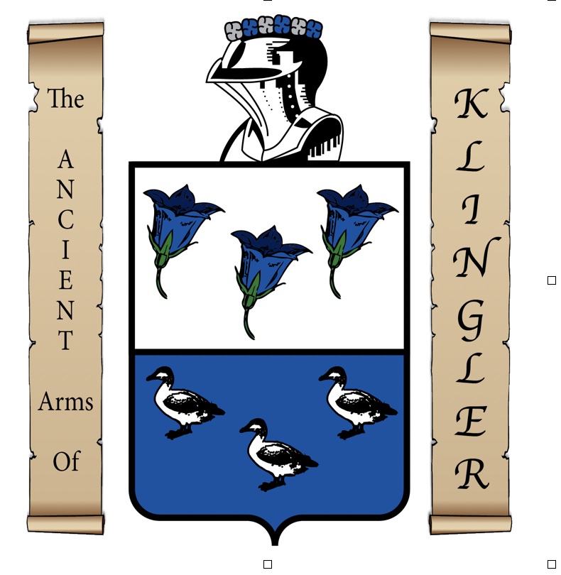
This part of the project was the sticker. I don't remember the dimensions it was supposed to be off the top of my head, but I know it was considerably
smaller than the poster. I wasn't sure how to fit all the information into such a small space, so I decided to take a vertical approach to my type. I know
now that you have to be careful with vertical type, but I think this one works and can be read fairly well. I think it also helps frame it and make you focus
more on the crest than you do one the scrolls with type on them. One thing I didn't mention above is that this is actually really close to my actual family crest.
I tried to get it as close as I could while also meeting the requirements of the assignment. I'm really pround of this one as well and had a lot of fun overall!


 \
\
