Kassidy Klingler
My Work
Package Design
Adv. Type and Layout
Adv. Design
Form
Overview
For this assignment, our skills are really put to the test. We are asked to do
some of the hardest things in design, which is creating a form as well as creating a
unique logotype. This really incorporates a lot of the things we've learned in type and
layout as well as the different things you can do in InDesign, such as character/paragraph
styles as well as how to make a table.

Research
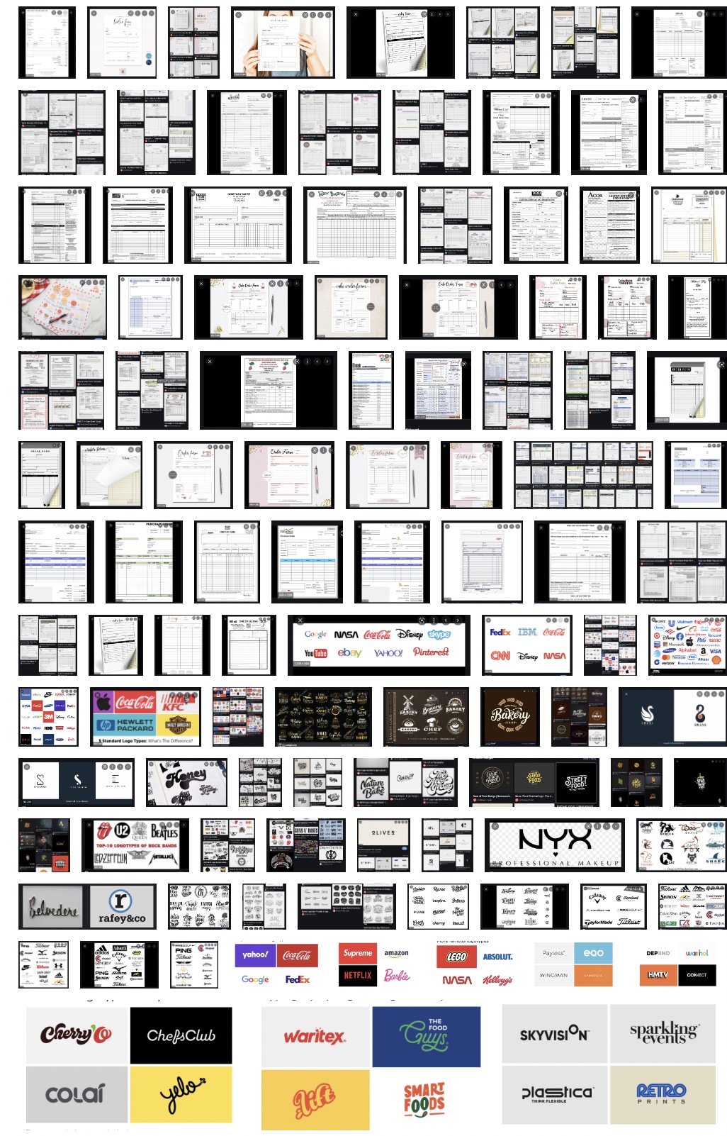
For this assignment, I wanted to research some different types of forms as well as see how
other people tackled the challenge of creating a form. Some of the different forms seemed
successful and others didn't. I took them both as inspiration. I tried to get different kinds,
from shipping to homemade goods to general information keeping. I found some really fun forms and
some very traditional forms in my research and I want to try both for my thumbnails. I also decided
to research logotypes since we need create one for this project. I researched images as well as different
websites to see how people creatively made the logotype work with their company. I was honestly astounded
at the different things people can create as I was researching.
https://logobly.com/blog/best-logotypes/
https://www.pinterest.se/fromupnorth/logotypes/
https://bpando.org/2017/12/06/logotype-design/

Brainstorming
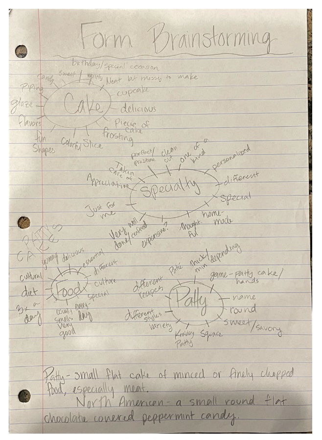
For the form, I was having a hard time trying to figure out what to brainstorm for this project. I debated
trying out different layouts from what I saw in my research, but I figured that would be more sketches and doodles.
Then, I remembered that I needed to do a logotype. So, I decided to do some different brain maps for the logotype to
try and see what kind of feel I wanted from it. I came up with a few different terms that I think helped me as I went on.

Sketches and Doodles
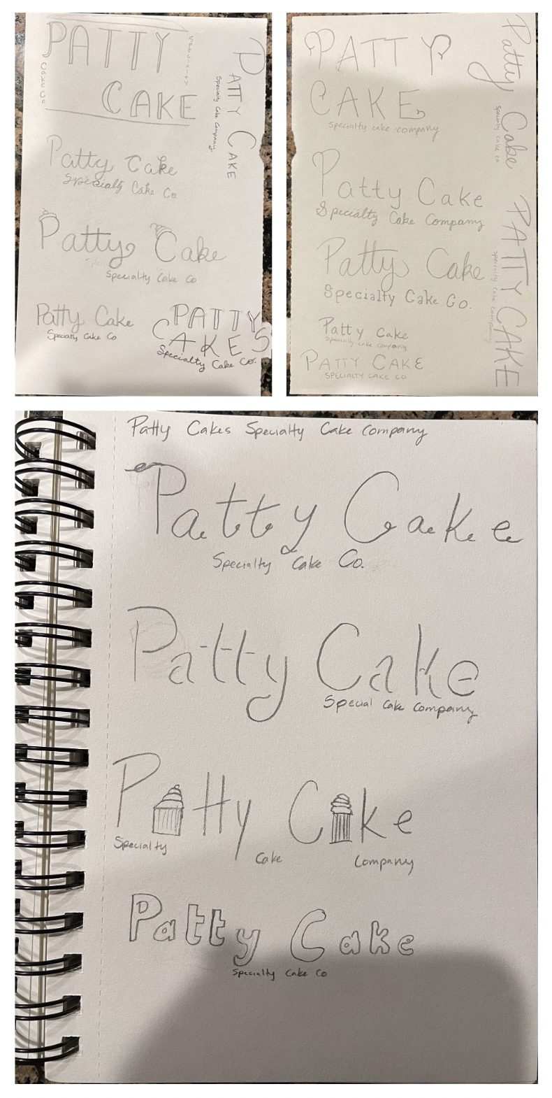
For the sketches and doodles, I did something for the logotype and the form. For the logotype, I tried looking at different
food typefaces, trying to get inspired by a couple, which I was. I tried to do different layouts and different things with the
type and I'm happy with the results. For the form, I tried to be inspired by the research I had done and tried the different
layouts I had seen. A couple of them worked better for what we were doing, so I tried the three I liked best for the thumbnails.

Thumbnails
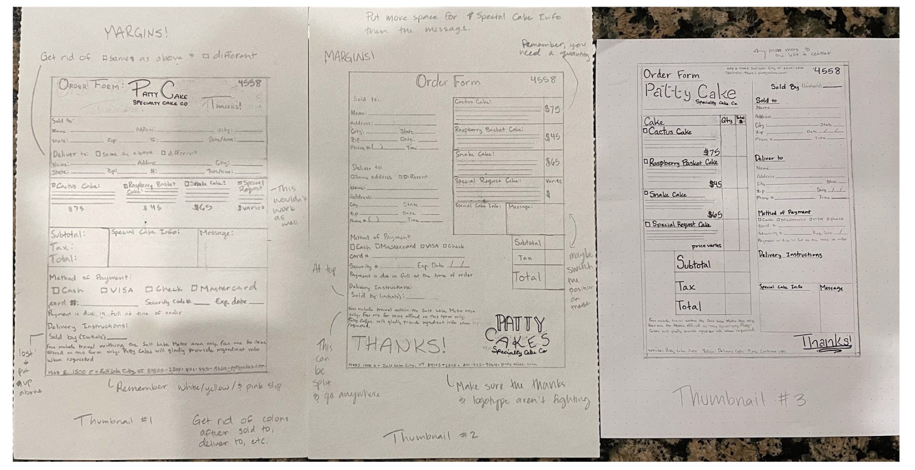
I tried some different things for the thumbnails. I tried two with tables and one without a table. My professor as well as my classmates
recommended that the table was a better route to take and I agree. I tried one that had information straight down, some that were left to
right and another that was right to left. I also tried a few different logotypes that I liked among my sketches. I also tried to do a few
placements of the logotype and the thank you. I tried one at top one at bottom, both on top, and both on bottom. One of the comments that
was made when showing this in class is that I forgot a couple of things such as the different colored papers, margins, making sure the spaces
are all the same, and so on.

Intermediates
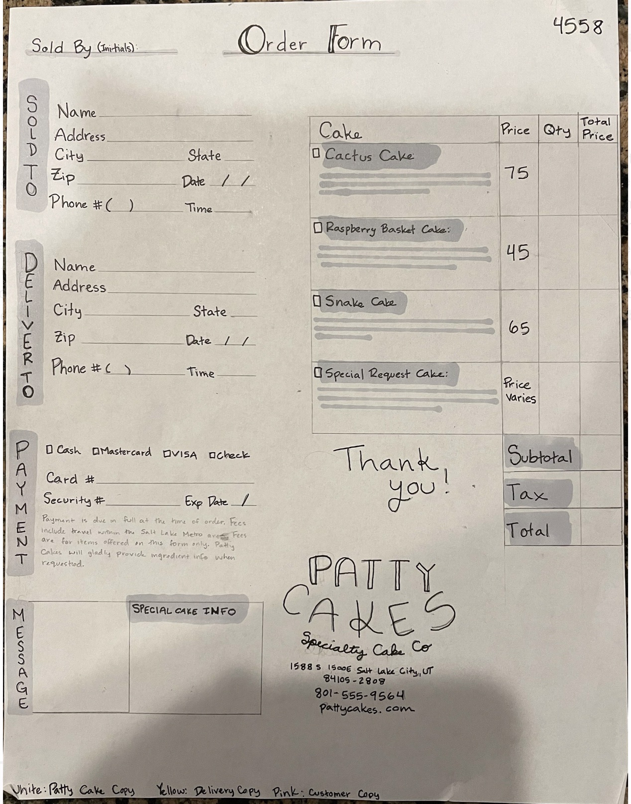
With the intermediates, I took the two best ideas from the thumbnails or at least different ideas from the thumbnails above. I tried one straight
down (with a table this time). Unfortunately, all of my intermediates look super spaced out because I forgot to add spaces and margins. I also felt
I was a little sloppy with the marker work, but I'm trying to be better about using the marker. I guess it all just takes practice. Anyway, I was
trying to make them both different from each other and I still had a few details wrong, which is fine. I'd rather it be wrong on the intermediate
than on the final project to hand in. I think from here I also decided which logotype I wanted to go through with because I believed it looked the best.
I also liked how the table was bigger on one of them; it seemed to make more sense. Overall. I liked the ideas and tried to merge the two, trying to keep
the best qualities of both.


Hand Final
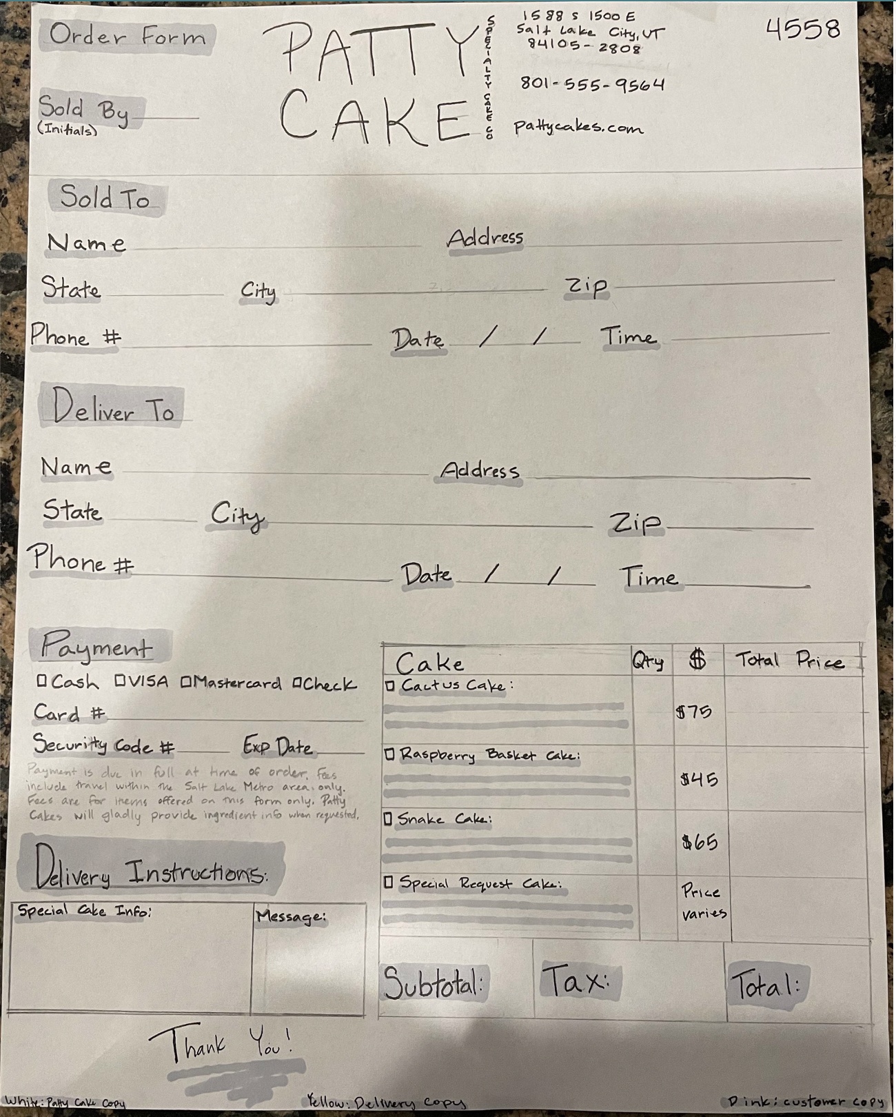
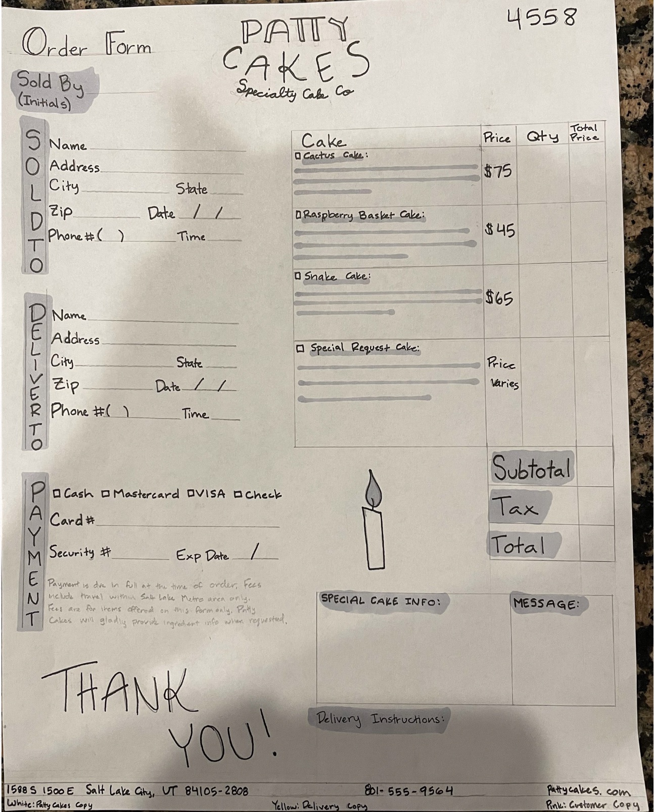
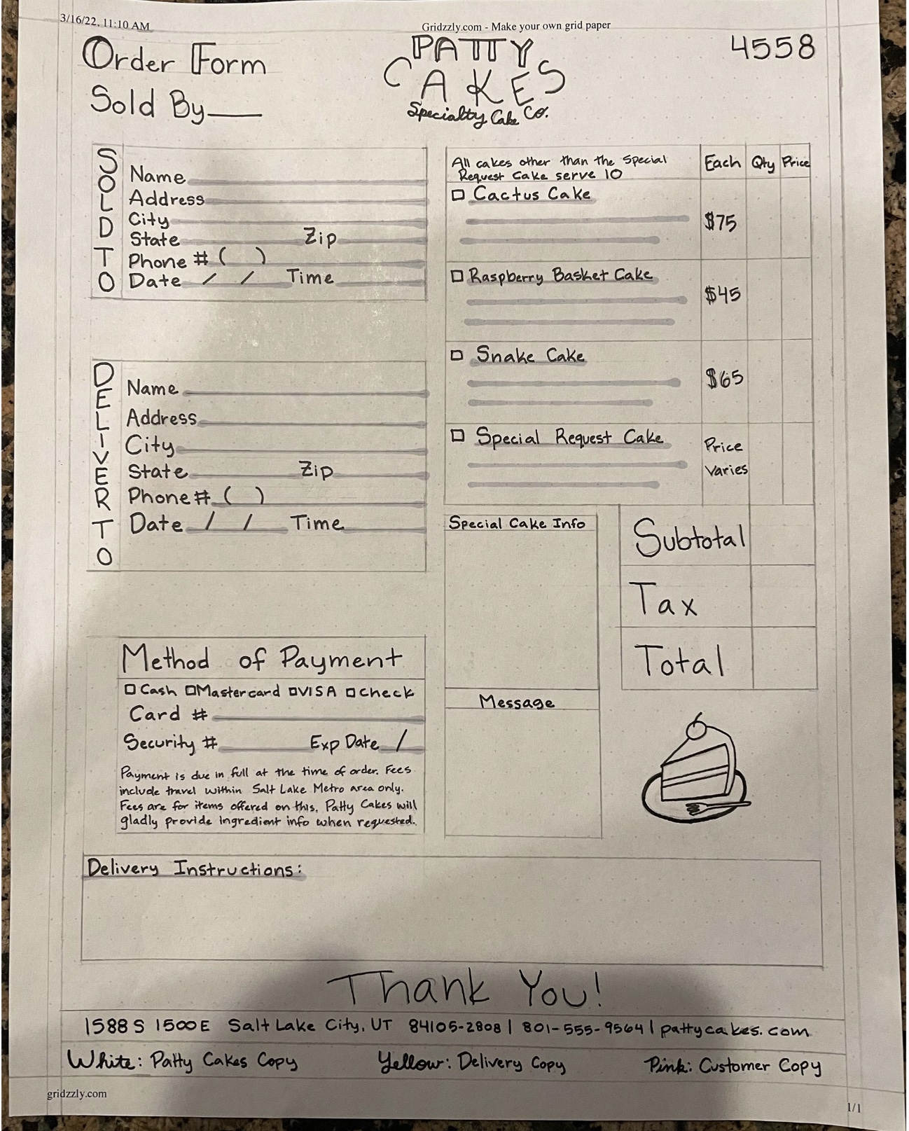
For this one, I actually made two hand finals. The first one, much like my intermediates, doesn't have any margins, so it's super spaced out. I did take the
comments from my peers and added that to my second final, including margins! I finally added margins! :) I didn't mess with markers as much on the second final,
mostly for the sake of time. But, I did outline everything in black so it would look more professional and stand out a bit more. I also tried to switch some things
around and even tried a different illustration. I'm much happier with the second final than I am the first.


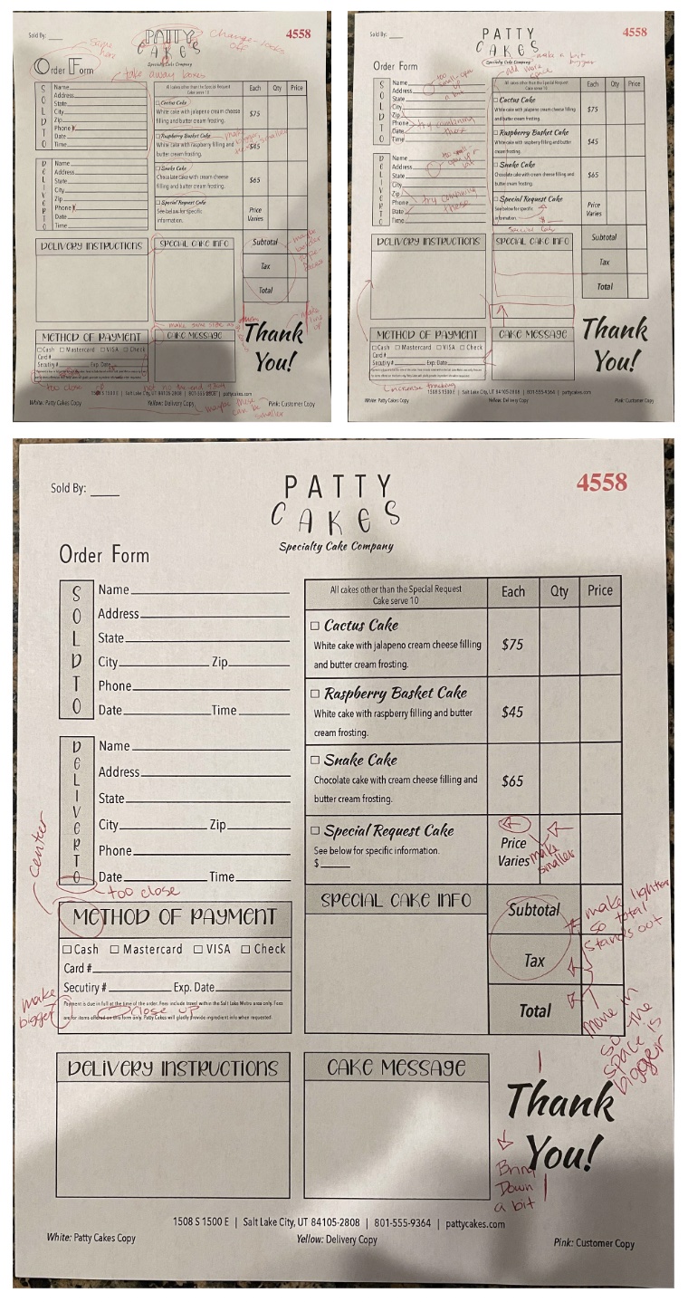
B&W Progressions
With the progressions, I did a few major changes, as to be expected. I did find a couple of typefaces I liked for the logotype, but for some reason, 1 or 3 loaded into
InDesign. So, I tried to work with what I had. I ended up using a condensed typeface throughout the whole thing. I ended up deciding that those three typefaces I used in
the logo (the eventual use of the condensed typeface) in the form to make it a little more fun and less boring. I asked my mom some advice on the way it looked and she
suggested I move some things together so it made more sense and so it connected more. I tried to find tracking and kerning issues because I know that those are things
I've missed in the past with critiques. Overall, I'm very happy with the way it turned out.

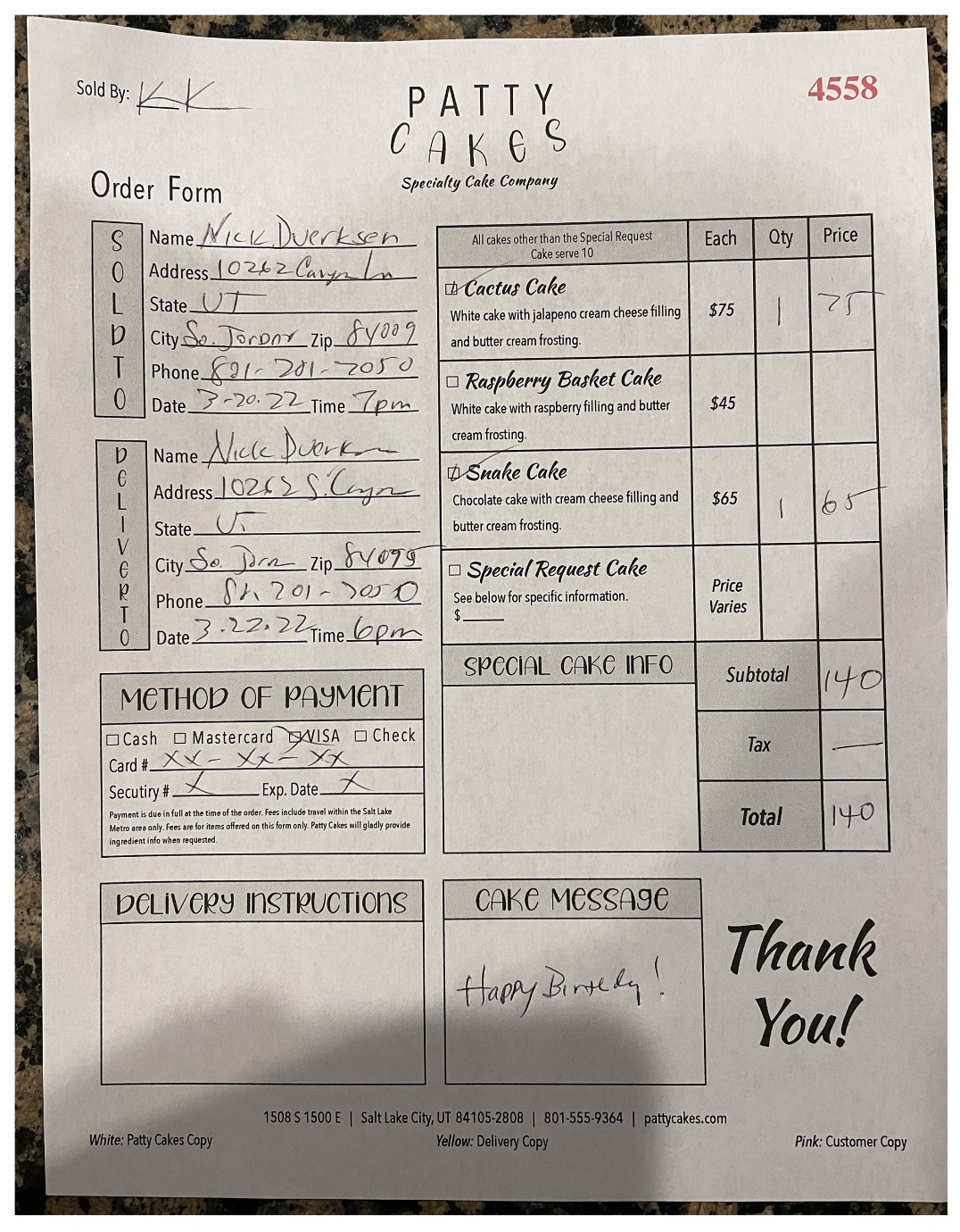
Filled Out Form
I asked my step-dad if he would fill out the form for me since he had been the only one not to see it. He filled it out and asked me a couple of questions, but I tried to
be vague since the whole part of the assignment was to see how simple and understandable it would be in the real world. After he finished, I thanked him and asked him how
it was and if the form was easy to understand. He said that it looked great and that he was able to understand very easily.

Final Clean Version
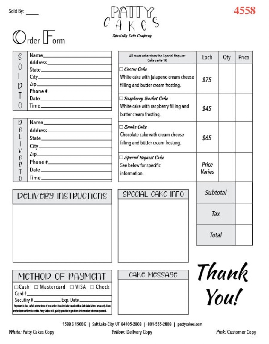
Overall, I think this was a very fun and difficult assignment. My professor was not kidding when she mentioned that forms can be one of the hardest things to design, next to
logos. It took a couple of times and tries, but I eventually got all the information on it that I needed. It was also fun to play around more with tables and vertical type.
I haven't done that in a while in InDesign, so it was nice to have a bit of a refresher. Overall, I think I had a lot of fun with this project and I feel very good about the
result I have.
