Kassidy Klingler
My Work
Package Design
Adv. Type and Layout
Adv. Design
Bag
Overview
For this assignment, we were given the opportunity to design a bag that would hold plant bulbs. This is an opportunity to be able to use photography, illustration, or a bit of both to try and
entice the customer to buy these bulbs, for whatever creative reason we come up with. I'm not a stranger to bulbs, but I am far from being an expert, so I am excited for the challenge in something
I don't know much about.

Research
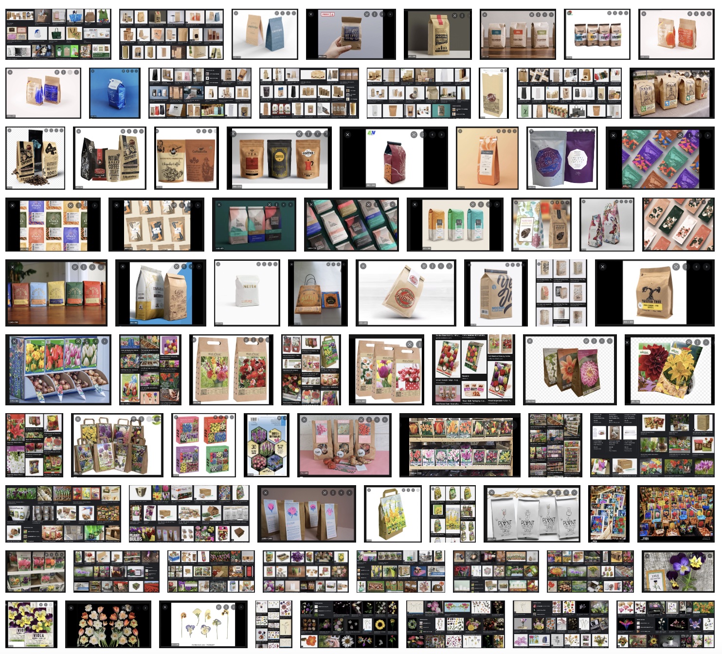
I wanted to get some inspiration on how other people have printed or designed bags, so I looked for a little bit, seeing what might turn up. I did find some fun designs, but decided to narrow my
search to coffee bags, which is the size of bag we'd be working with. I feel like coffee has some fantastic packaging, so I drew some inspiration from there. I then looked up different ways I could
go about putting a flower on my bag: scanning, drawing, and photographing. The scanning actually looked kind of fun, so I thought I might try it later if I had time. I finally looked at packages for
actual flowers. A lot of them come in big boxes, but I did learn that some of them do come in paper or cardboard boxes. I also noticed that a lot of them used photography, so I was starting to think
this may be a good time to use photography.


Brainstorming
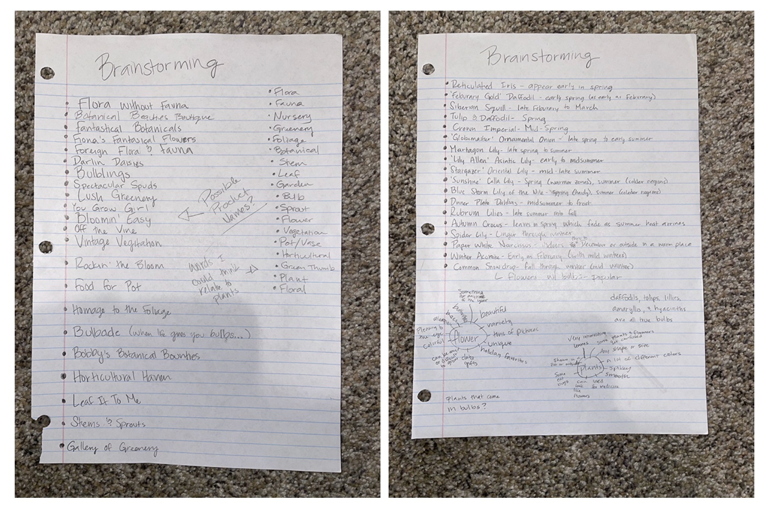
I tried to brainstorm different names. The names can make it or break it sometimes, so I wanted to brainstorm and see what I could come up with. I came up with some fun ones, but some of them don't come
from bulbs. As you can imagine, that may cause some issues. I also did a little brainstorming on which flower bulbs come best in what season. I realize now that that may count as research, but I'll just
leave it with the brainstorming for now. I also tried some more brain maps. I know there's no wrong to do it, so I'm just going for it and writing down anything that comes to mind.

Sketches and Doodles
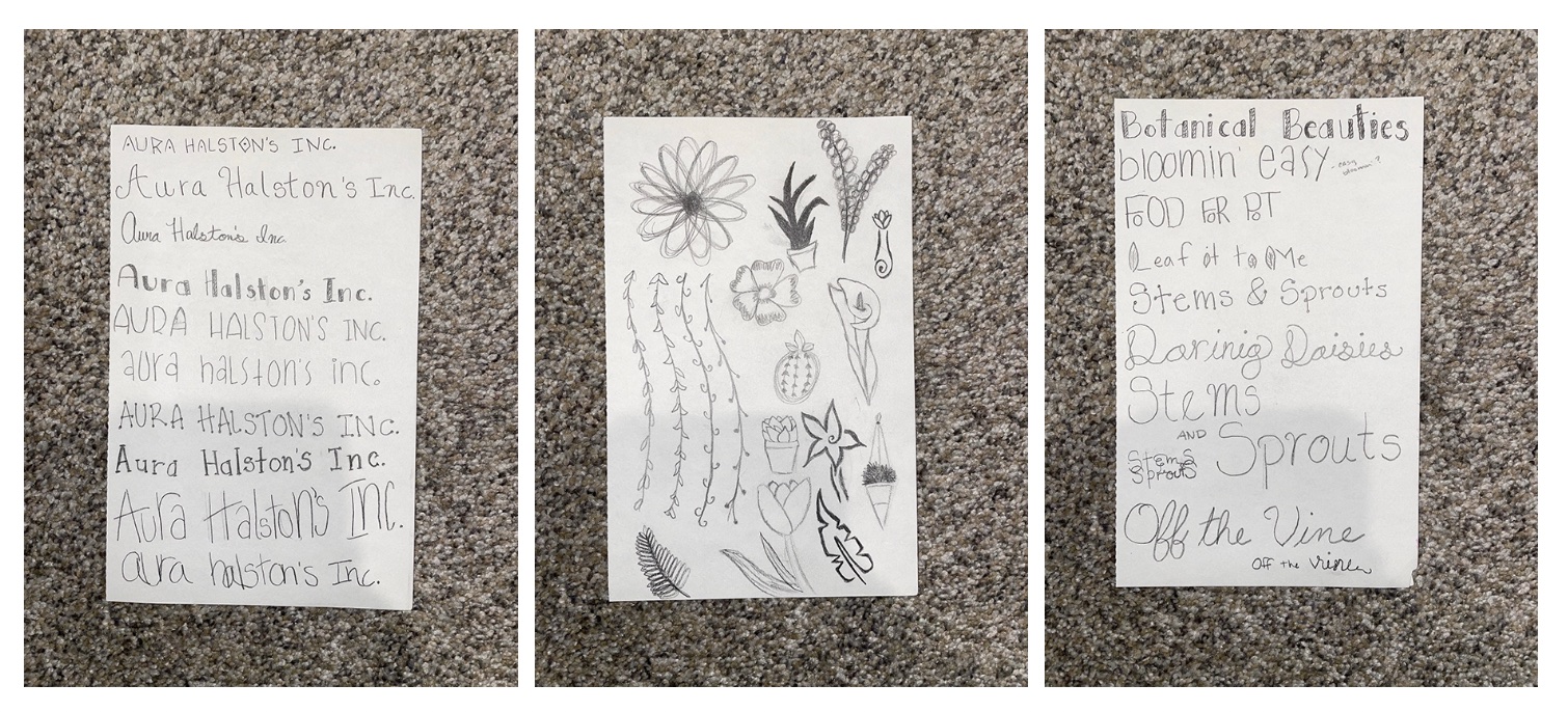
I messed around with the Aura Halston's Inc. a little bit. I realized that, before I started, I was about to do the same kind of things I normally do. So, I looked up some cute or flowery typefaces and
tried my best to copy those. I think I was happier with these results then I have been in past, mostly because I pushed myself to try something new. I also tried some of those same types of typefaces on
the brainstormed names I likes to see what they looked like there. Basically, I was playing around. I then tried different plants and flowers. I didn't pay attention to whether or not the flower/plant I was
drawing come from a bulb. I was more trying out different styles and shapes of plants/flowers. Again, I liked what I came up with.

Thumbnails and Dummies
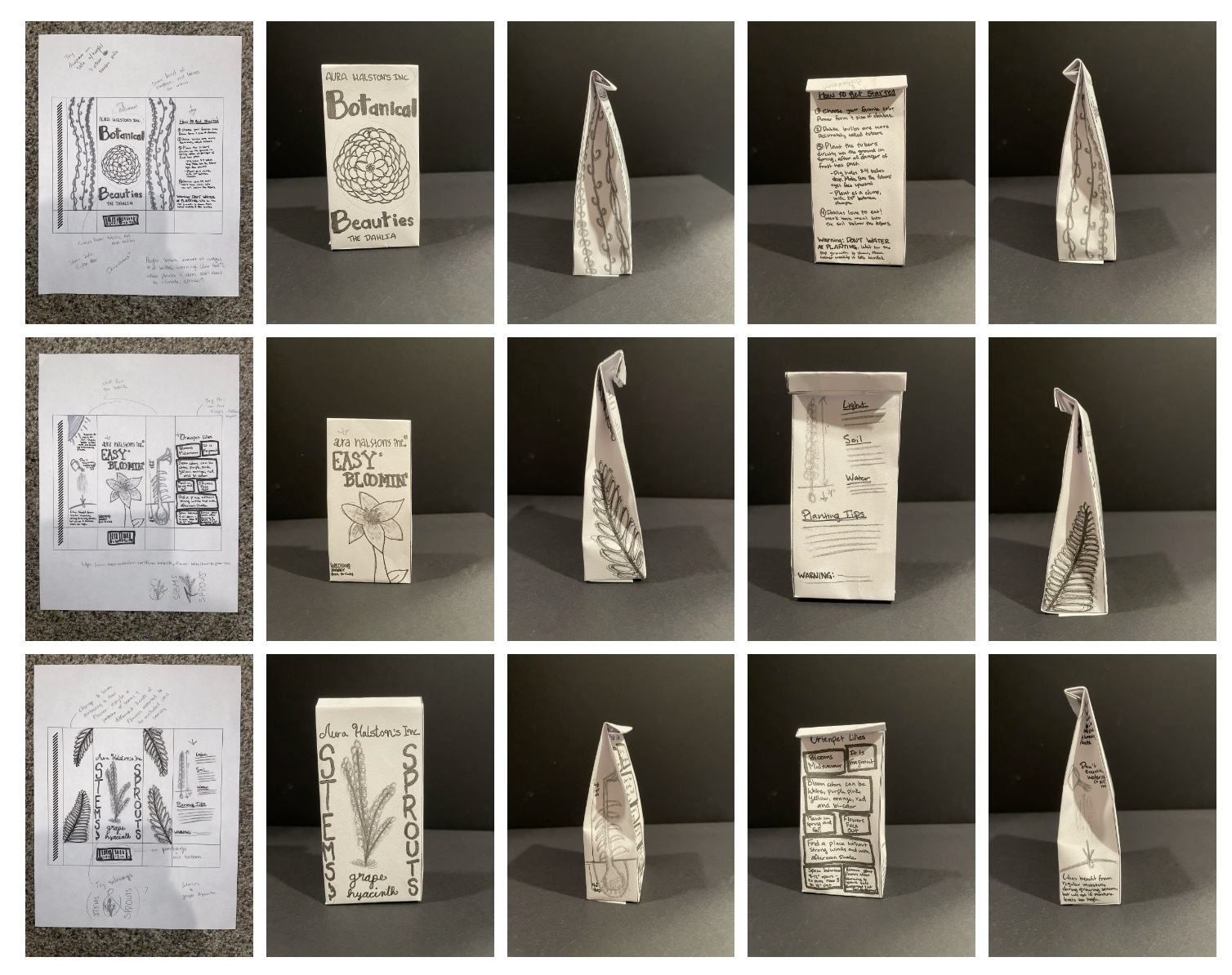
I just want to apologize up front with these thumbnails. I really only realized that they were the same layout ideas throughout all three of my ideas, including the sides. The sides are so tough to try and work
with that I think I got a little stuck. Moving on, I tried to make them more different from each other. For my first idea, I decided to try something with dahlias. I thought that the name 'Botanical Beauties'
would fit for this one, so I tried messing around with some of the styles I was messing with in my sketches and doodles. I then put some fun leaves on the side, thinking it would be fun to have something hanging.
I knew I wanted to something different with this moving on and I had a few ideas on how to do it.
For the 'Easy Bloomin'', I decided to do a little, since in my research, I found that Lilies are very easy plants to plant and aren't overly complicated. I had a few ideas for this one, including having some
infographics to help display what a person should do to plant this flower. I hate that I put the information in the boxes. I hate seeing it every time I put it on a board, but that's just part of the process.
Now I know one thing I didn't want.
The 'Stems and Sprouts' idea is probably where I had the most fun, at least with the title/logo part of the thumbnails stages. I know it's a bit hard to read, but I do like messing around with this vertical type
(when it works :D) I did like the types of leaves I did on the side, but they don't belong to the grape hyacinth. So, maybe another project. I did want to mess around more with this idea, so I did end up taking
this to my intermediate stage. I had an idea with the flower and the ampersand.
For the dummies, I learned that a lot of the information on the back was lost because I put it too close to the top. Thank goodness for dummies! I also learned that information on the side may not be such a great
idea if it's a lot of text. So, the infographic I had on the side of one of them would need to be moved since the information was a little too important to be on the side where no one could read it.

Intermediates and Dummies
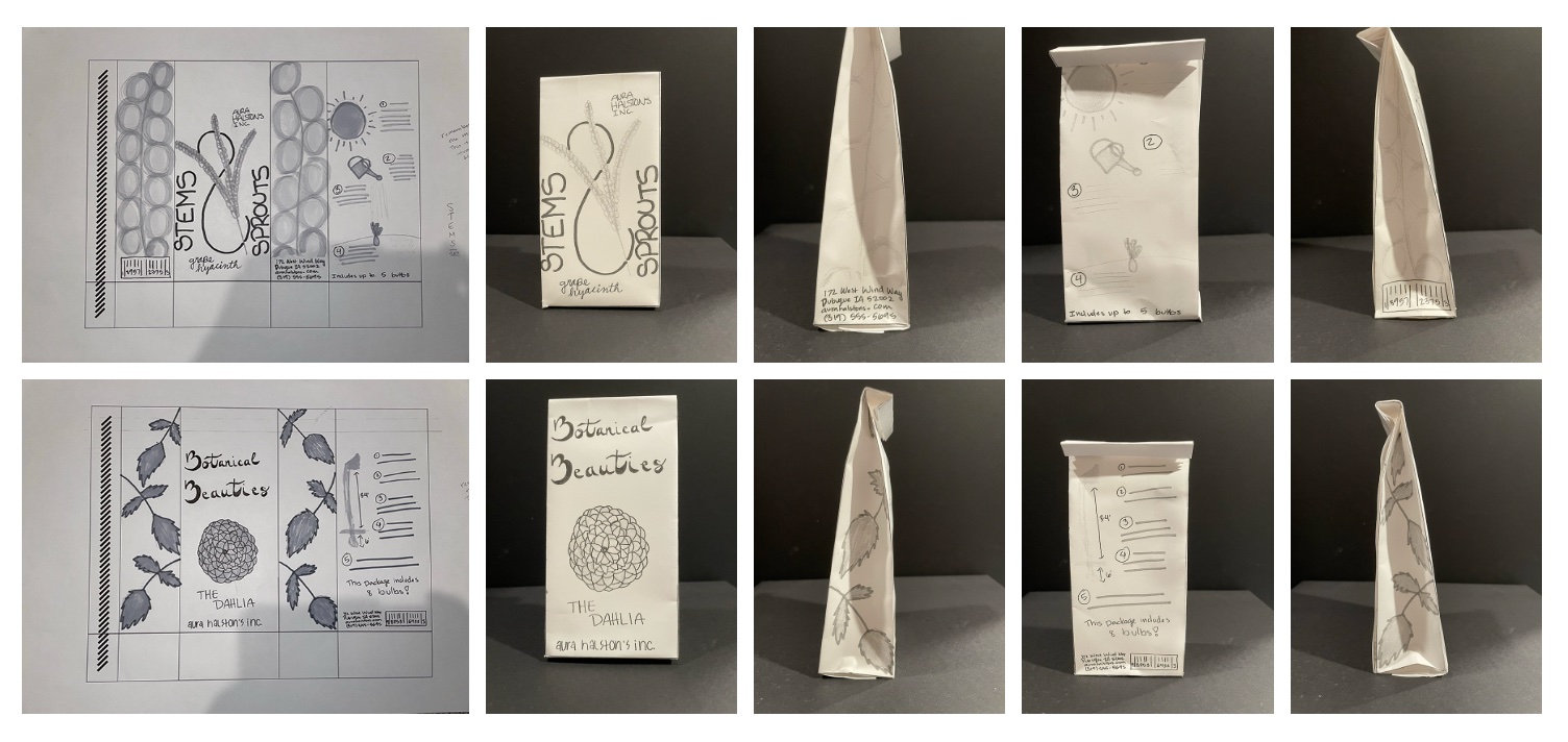
I did like my intermediates better than my thumbnails, which is a good sign, I think. For the 'Botanical Beauties', I got rid of the leaves dangling from the top and put dahlia leaves instead. I actually like
this much better. In fact, I even had an idea to scan the leaves and put a scanned picture element in my piece. I also changed the logo to being a nice script. I think this is very nice and I've liked it better
than any other script I've tried to show on my other projects. I also tried a picture on the back with information in how deep to plant it and how high it will grow. I did forget the warning, but I know that
these flowers are poisonous to cats and dogs. When I was getting ready to show the class my intermediates, I realized that the company name 'Aura Halston's Inc.' and the title 'The Dahlia' were competing with
each other. I need to make them stand out. I also needed to specify which Dahlia I was talking about as well as which possible colors they can come in.
For the 'Stems and Sprouts', I did a few different things. I put the flower inside the ampersand so the flower would complete it with the words 'stem' and 'sprout' lining the sides. I also lined the sides with a
blown up version of the flower. I also put an infographic on the back with the company information and barcode on the sides. I actually really like this idea, but the words 'stem' and 'sprout' are still a little
too hard to read. I'm not sure how to fix it if I were to go on, so it's an interesting issue to have. I also don't know if the blown up versions of the flower translate on the sides, but I still think it was an
interesting idea.
The dummies are better this time around, but still need some work. I still didn't get them low enough and determined that the front can be a little higher and the back can be a little lower. They can't line up
with one another unless I did some sort of a band or folded it in the front instead. I also realized that the text on the sides on the bottom were a little easier to read, so it was an option. Still, super
grateful for the dummies.

Final Hand Dummy
I decided to go with my 'Botanical Beauties' idea. I really liked the direction I was going with the 'Stems and Sprouts' idea, but the flowers were out of season and I didn't really have much time to go perfect
picture hunting. My backyard still had some dahlias, so I decided to take pictures and try some of my own photography in this project! I did like the direction I was going with the infographic on my 'Stems and Sprouts'
and 'Botanical Beauties', so I just combined the both of them for a more fun result. I also added the specific dahlia I wanted (I didn't realize at the time that they weren't the ones in my garden, but I fixed it for
the B&W, so it still works). I also changed the title so the 'B's looked like 'B's and not really fancy 3's. I accidentally made the leaves going the same direction, but it ended up being a blessing in disguise.
I noticed that I didn't like them going in the same direction and liked it better being a reflection. Overall, I'm starting to like this idea a little more and starting to think that it's coming together.
For some reason, when I was trying to scan my 13x19 hand final and make a dummy of the actual size, my printer wouldn't let me. Apparently, it will only scan up to 11x17. So, I scaled it and made it into an 11x17
instead. The dummy is the same size as the intermediates, but I got it made, which is more important to me. I can make the color studies life size and play around with it more.

B&W Computer Progressions
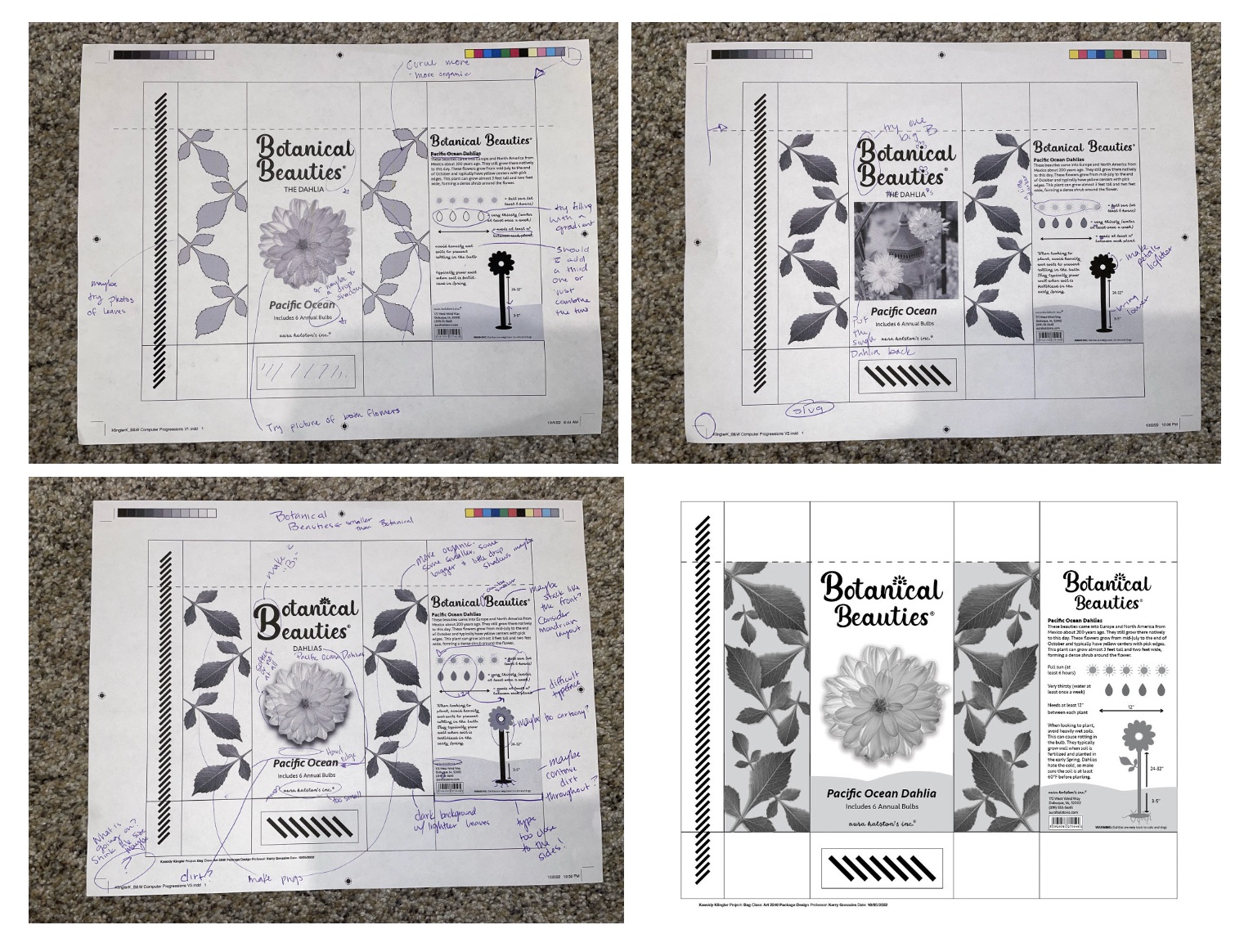
I ended up doing a lot of work with this in the end. I did a few changes before I went to class. I tried getting people at home to critique, but most of them couldn't find anything else to change. I was going to
ask the group chat, but I just ran out of time. The weekend got a little busier for me than I previously thought, so it became problematic. But, when I did get to class... holy cow! I got suggestions galore!
I was happy to be able to have the feedback I was craving. When I made the changes suggested by my fellow classmates, I was astonished by the difference it made! I fell in love with it! I even got a little extra
help from one of my classmates.

Color Studies
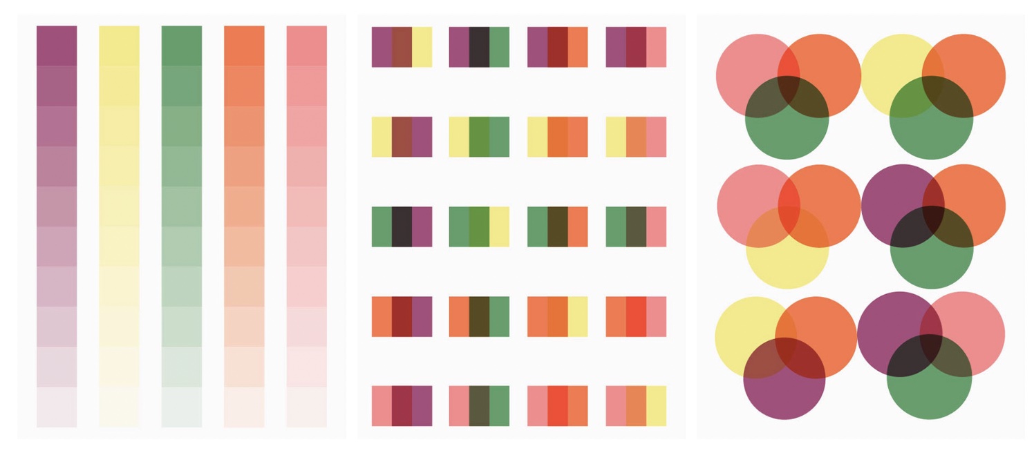
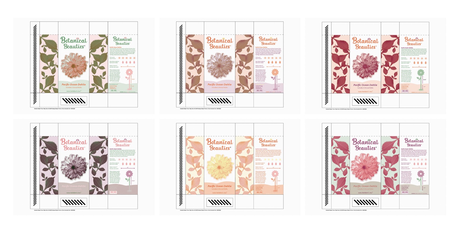
I was trying to think of colors of the dahlias I was looking at in my backyard as well as the internet and decided to pick purple, orange, green, pink, and yellow. I wanted to work with some colors I'm not as
comfortable with. I tried a greenish-blue this time, as well as pink and yellow. Pink and yellow aren't my favorite colors in the world to work with and I'm trying both in this assignment! I tried to stay away
from blue or colors I normally pick. I guess I kind of chose a little bit of a pastel palette this time around. I figured maybe I needed a softer look since we're working with flowers.

Color Combinations
I tried to do more color studies this time around. I think this is the first time i've tried to do six, so I'm proud I was able to get it all done. I liked a few of the concepts on a few of them and I was
actually starting to like the colors I chose. As I said above, some of the colors I'm using aren't ones I normally pick. When looking at it, I decided to combine two of the studies into one and ended up liking
it so much more for the final. It was awesome to see which color combos I liked when I was able to make more than 3. I wanted to make dummies for these to see how they would look, but time got the best of my and
I just ran out of time.

Final Product
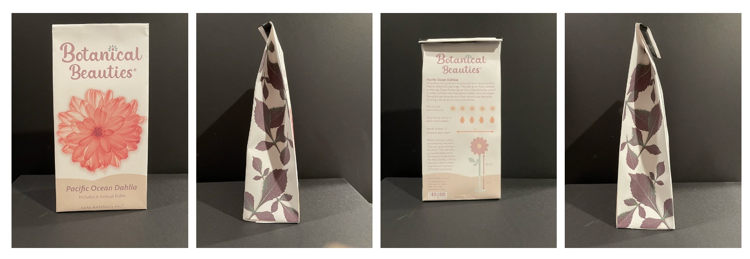
I am overall really happy with my results. I think this is the most happy I've been with my color study results yet! I liked how I was able to challenge myself and I was able to come through! Maybe the flower is
a little too big on the front, but most flower packages display a huge flower on the front. I also like how I was able to implement overprinting into this project! Come to think of it, I think this is the first
project I've really liked the overprinting for! I think it came out really nice in the end and I'm proud of what I was able to accomplish.

