Kassidy Klingler
My Work
Package Design
Adv. Type and Layout
Adv. Design
Newspaper Ad
Overview
In this assignment, we were challenged to create a newspaper ad for a traveling agency.
We needed to have certain required items within our ad, such as five or more things we are
advertising, prices, headline, and a couple tag lines for the different things we are advertising.
We could use anything from photos to cartoons to icons, as long as it was all black and white.

Research
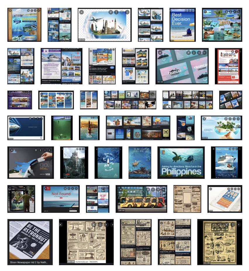
With the research, I wanted to look at different ads. I was having a hard time deciding what I wanted
to do for my ads, so I looked for inspiration in my research. I found a lot of different and creative
ways to make an ad, so I was able to get some inspiration on some creative ways to make an ad. At this
point, I knew I wanted to do three completely different ideas; pictures, icons, and cartoon. So, I also
tried looking at some ads that included those three things. I mainly found pictures and cartoons, but
they were inspiring none the less.

Brainstorming
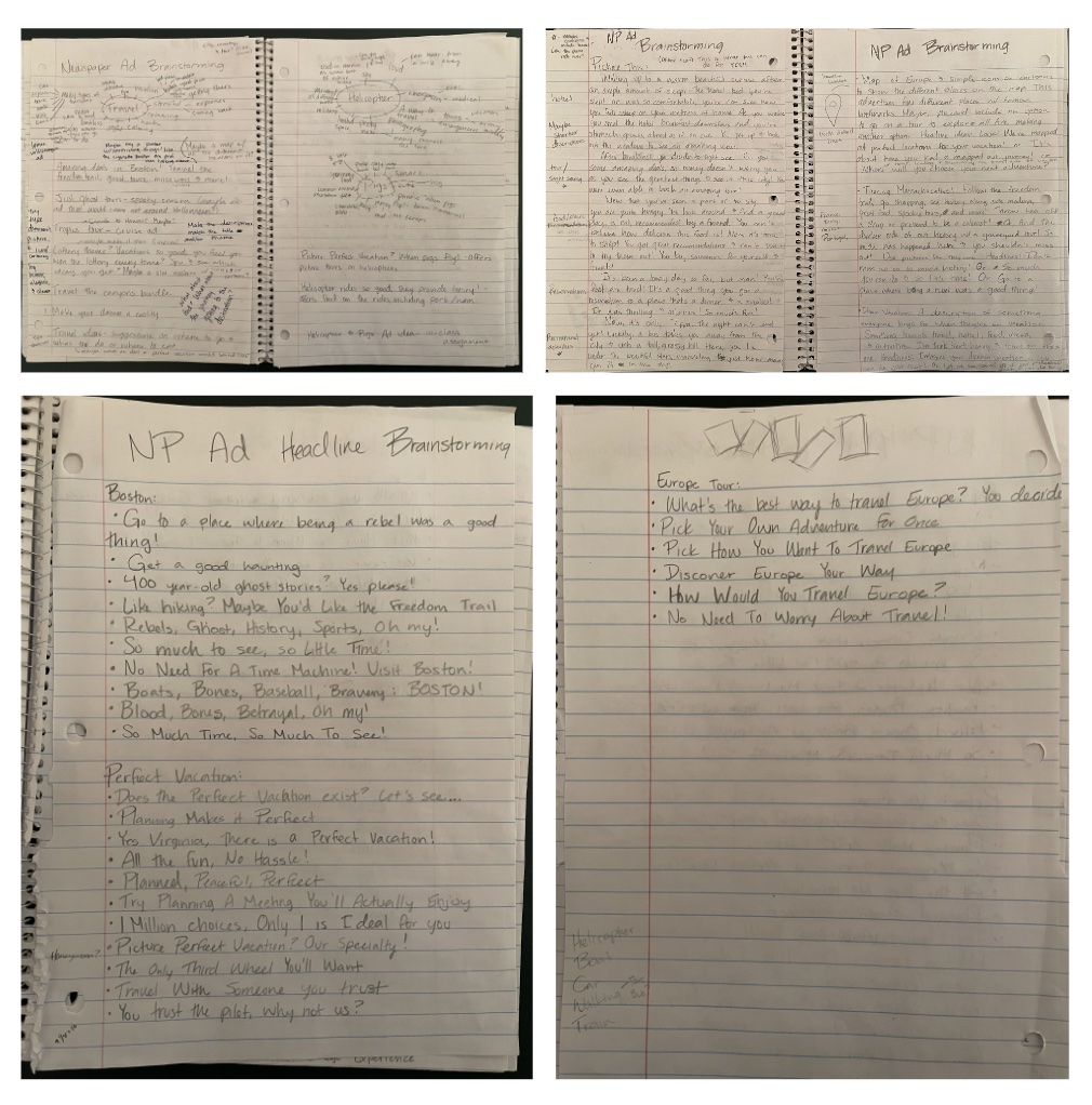
As I was brainstorming, I tried to think of different themes or things that could go along with the different
ideas I had (I noted them above). For the pictures, I thought of doing something in Boston because I went there
on a school trip for history. I loved the place and the different things I did and I took a LOT of photos.
I thought I might be able to have fun with the different themes. For the cartoon, I thought I could do something
relating to what a perfect vacation may be like. Essentially, I was trying to focus more on the services the company
could provide instead of an actual vacation they could take. With the third, I was thinking I could do something with
icons and more of a general tour, so I went with a European tour. I know it's a little cliche, but it's a classic for
a reason.
I think the majority of my brainstorming was spent on coming up with headlines. I was having a bunch of trouble with
trying to find the perfect headline that I could relate to the different ideas I had.

Sketches and Doodles
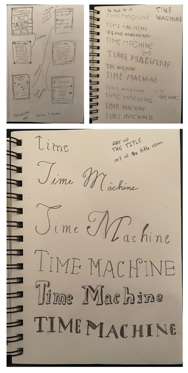
For some of the sketches and doodles, I tried different layouts for the different ideas. I tried to do two of each that were
different enough that I could see what I liked, didn't like, or needed to change so it would work for this assignment. I kind
of wish I did more sketches, but I was starting to run low on time, so I just did a couple of quick sketches and moved on. If
I had more time, I would've sketched more of the cartoons and icons I wanted to do for the thumbnails, intermediates, and hand final.
However, the time got to me and I tried to do the best with the time I got.
I did sketch out some possibilities for a different headline. For one of the headlines I did some sketches and doodles to try some different
treatments of type. I was messing with some futuristic type and some old-fashioned type. I didn't end up going with this idea, but I'm keeping
the sketches in case I may need them in the future. I have a feeling even unused ideas can become useful in the future.

Thumbnails
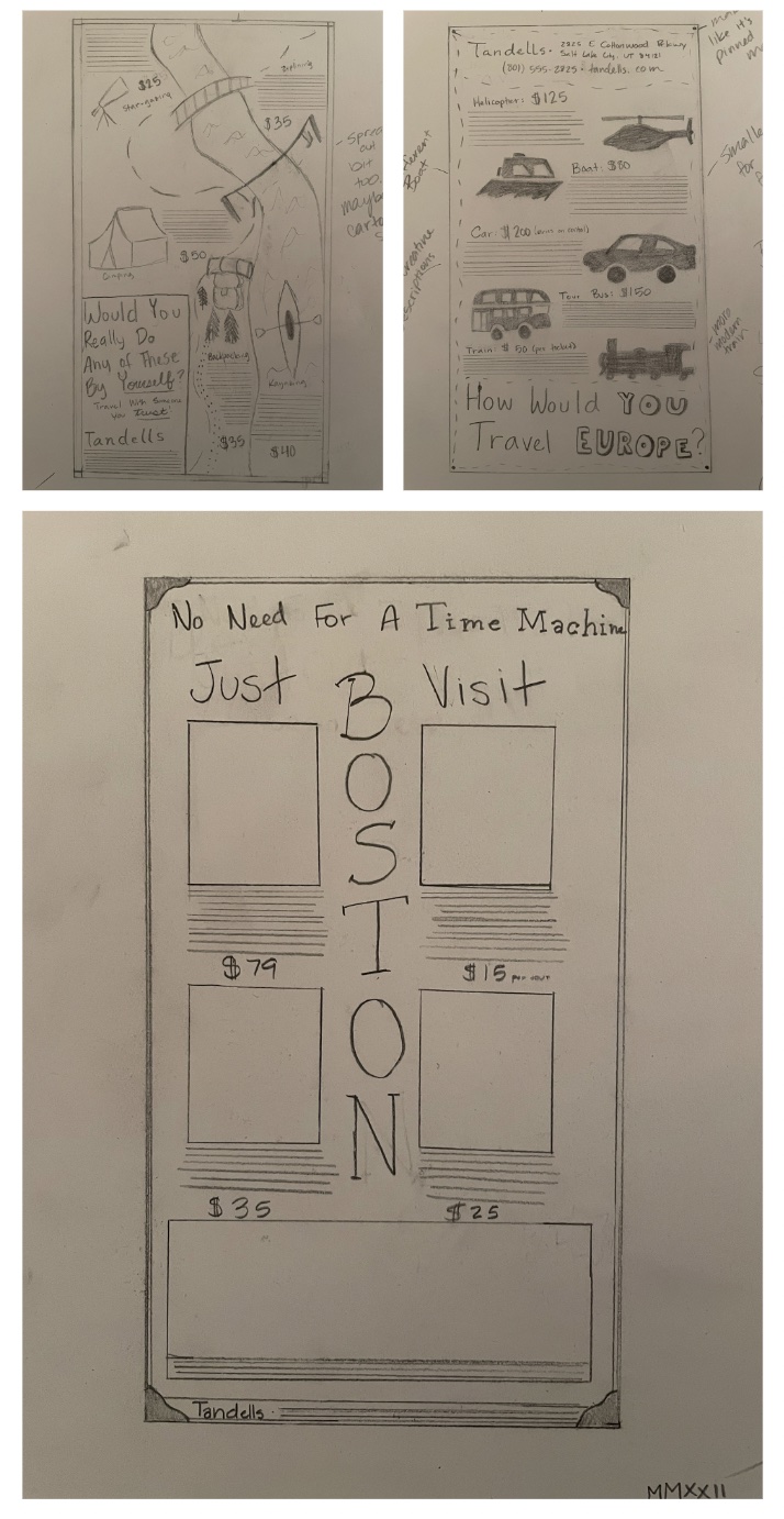
For these thumbnails, I still had my three different ideas, even though they were a little different from my original ideas. For the first thumbnail,
I went along with my Boston idea. I tried to do something different with Boston by making it vertical type, but I don't think it worked very well.
I did like the headline I chose and that was the headline I was playing around with a little bit. I really wanted to play around with the words
"Time Machine" to make it a bit more fun. For the sake of time, I decided not to put photo indications (mostly because I couldn't decide what photos
to put in). Mostly because of time, I decided not to go with this idea.
The next idea I had was the cartoon idea. I was having trouble with the 'perfect vacation' idea, so I decided to go with an idea of Tandells (the travel agency)
being one of the trusted friends you'd want to take with you on your trip. I do like the cartoon style on this one, but it is a little tight, especially around the edges.
The headline also has a bit more of a negative connotation to it, so I needed to make it a little more positive.
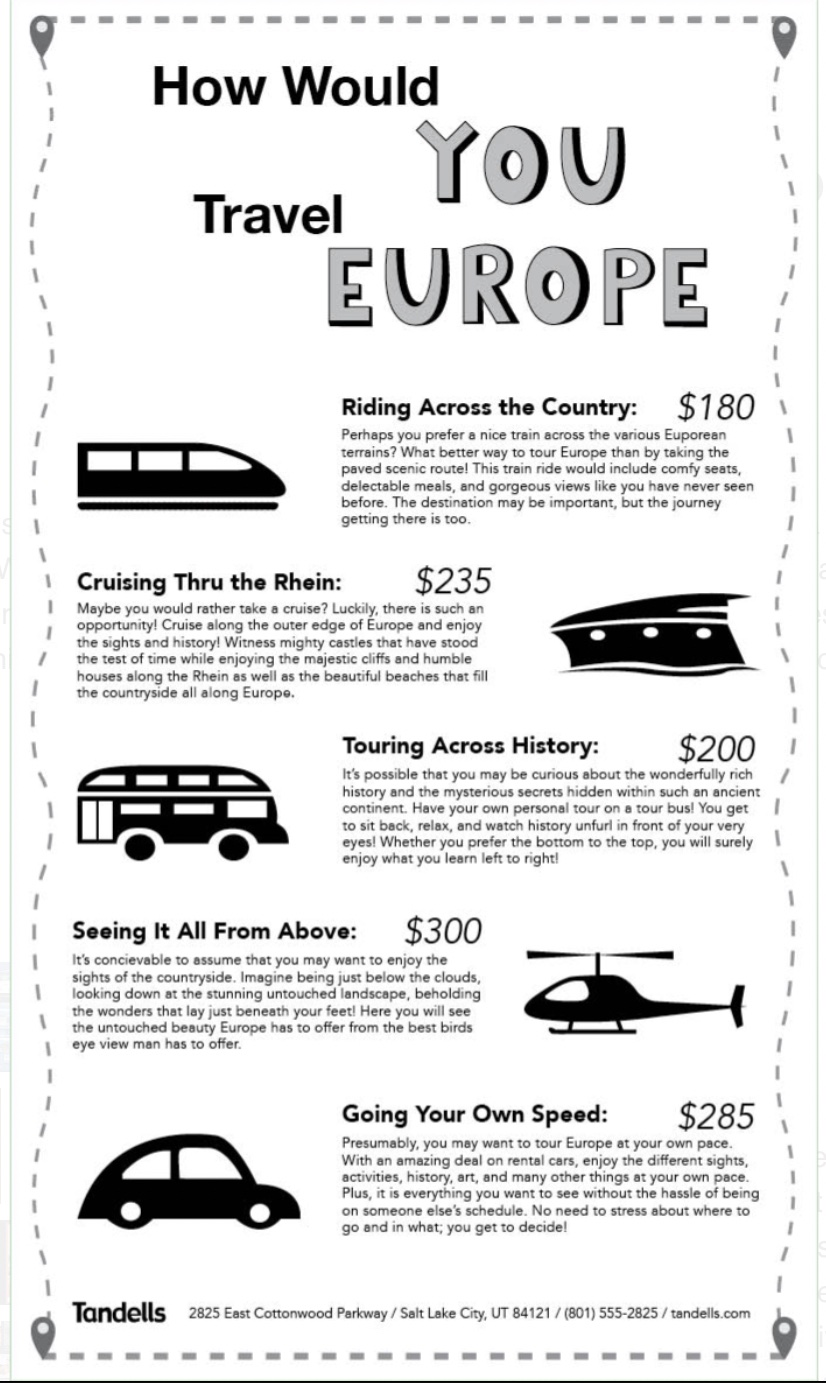
The last idea was the silhouette/icon idea. I meant to put them in circles, but I honestly think that they look better without them. I also tried to alternate them
so it drew your attention more. I wanted to make it look like a map being pinned to a board, so I included little pins in the corner and dashed lines around the edge.
I also tried to do something different by putting the title on the bottom, but I think it would look better if I did something different. I also really hated the boat,
train, and car I used, so I wanted to change those on the intermediates. I wanted to simplify it and easier to identify the symbols.

Intermediates
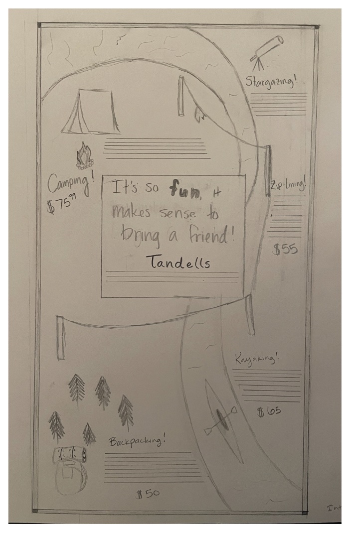
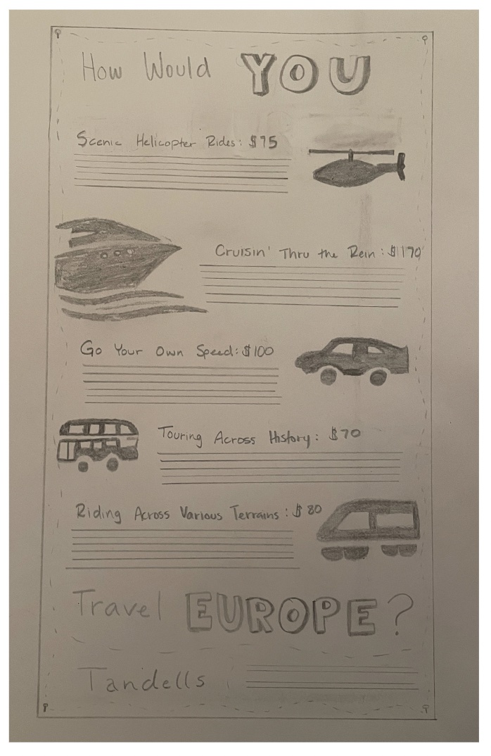
I took the cartoon and icon idea to the intermediate stage. I felt they were the strongest ideas.
For the cartoon, I decided to put the headline in the middle of the ad to try and see if that would work for this idea. I also decided to make the river go all around the
ad and tried to give more space to the different items and the type that would go with it. I also tried to leave a little more whitespace around the ad so it wasn't so crowded.
For the headline, I think I made it much more positive and I was much happier with the result. I tried to do something fun with the word "fun", but I'm not sure if it works here.
For the icon, I was still too close to the margins. I tried to have more fun with the sub heads for the different items and I think they work better. I also changed the boat
and the train, which I think looks a lot better. I tried to split the title between the top and the bottom, but I don't think it works quite as well. I tried to make the pins
in the corner look more like pins on a map, but I'm not sure if that's what it ended up looking like.


Hand Final
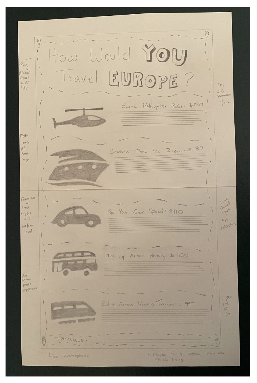
I decided to take the icon to the final. I felt it was the best and works better with what I'm trying to accomplish. I did try a couple of different ideas on here, some of them good
and others didn't work. I made them all line up to try something different, but I liked it alternating better. I also put the title at the top, but I had the suggestion to try and have
more fun with it. I was also told that the lines separating the different items were too distracting. I changed the pins in the corner to be the little location pins you see on Google Maps
or something like it (I'm not sure what they're called). I also had the suggestion to make the different icons alternate so I had a land, sea/air, land, sea/air, and land as well as make
the icons all the same size or pretty close to it.

B&W Computer Progressions
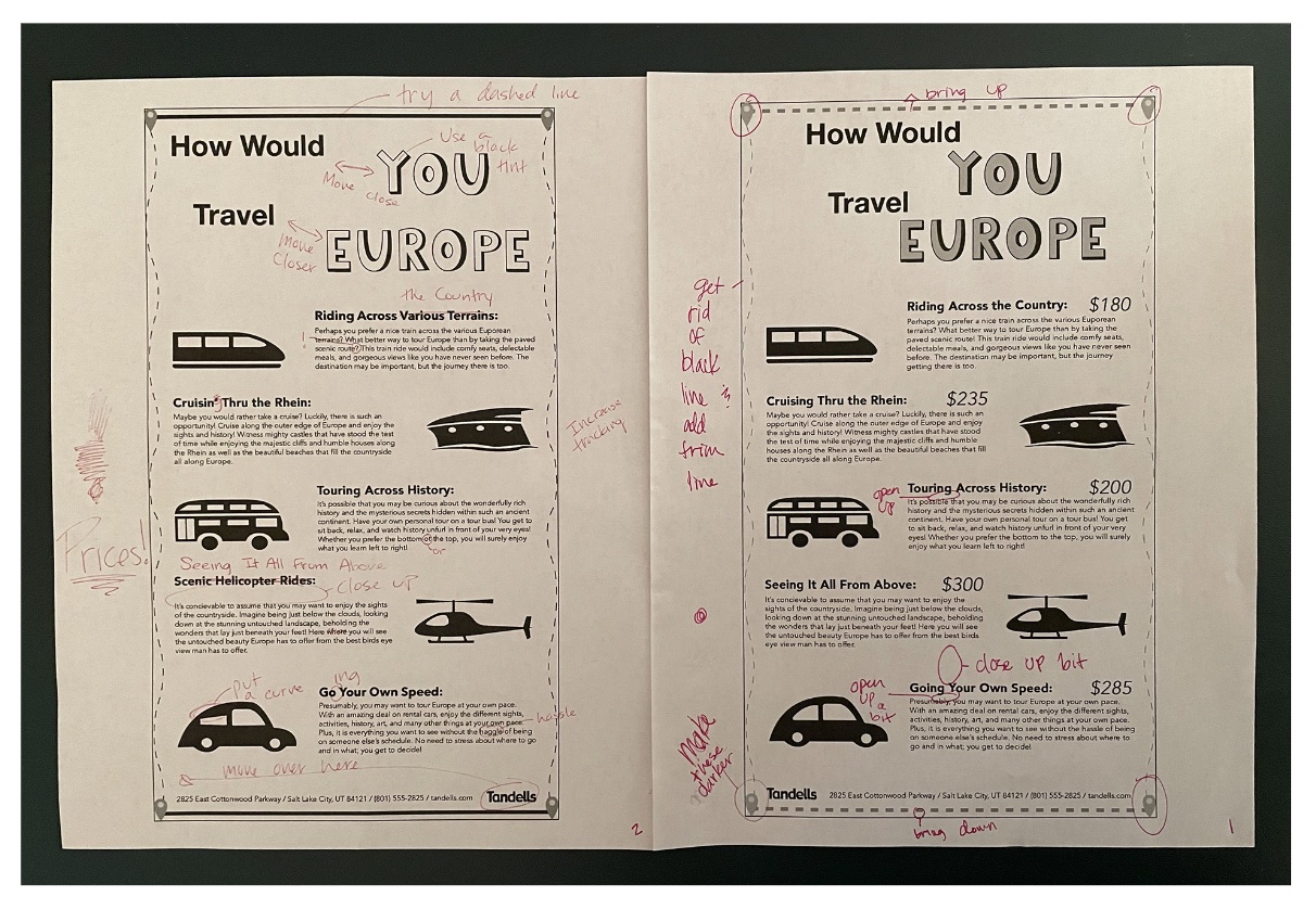
With the computer progressions, I made a few changes. I made a couple of changes to the sub heads to make sure they all related to each other better. I also made the title closer together
so it would 'read together' more. I increased the tracking on the sentences so the letters weren't touching. I changed the car window because it was bothering me and I moved a couple things around.
I also added a dashed line on the top and bottom so it looked more connected to the sides better. I think it also made it look more like a road map.
I then moved the dashed lines so the lines created the edges and moved some of the icons closer together because of some odd spacing. I made the little symbols in the corners darker so you could see them better.
I also got rid of the black line and added the ⅛ trim line. The black line was more of a guide, but I matched it up so the lines would create the border and I didn't need the black line anymore.
I also added prices since I forgot to do that in the earlier version.
For the sake of time, I didn't do more, but I think it turned out alright.

Final Clean Version and Reflection
I am really liking how this turned out. I was really worried about the silhouettes when I first made them, but after making a couple of tweaks, I think they look pretty good! If there was any icon I would change,
it would be the bus. It just looks funky to me for some reason. I really like the different dashed lines for the border and the different descriptions I came up with. I thought those were very fun and easy to do.
If there was anything on this ad I would 100% change, it would be the "You" and "Europe" in the headline. It looks so weird and funky to me and I don't know if they really match with the rest of the style in the ad.
I also made some of the shadows really weird, so maybe just changing the shadows would improve it a ton.
Overall, this project had it's ups and downs, but I think I had a lot of fun doing this. I think it was fun trying to think of a traveling ad and the different things you could advertise for a single company.
It was a bit challenging to think of a headline, but I think it was definitely good practice for the future. I think it was also interesting to try and play around with the different prices and layouts, seeing what would
work and what wouldn't. When I was doing this project, I was thinking back constantly to the Newspaper Ad Series we did in the beginning class and I think it really helped with this assignment. I really like the end result
and I had a lot of fun learning the different things I could do with a project if I'm willing to experiment.
