Kassidy Klingler
My Work
Package Design
Adv. Type and Layout
Adv. Design
What Is My Process?
One of the things I've been learning about in school is the design process. One of my prfessors in particular made sure that we follwed these steps so out work as designers would be much tighter
once we got out into the real world. This process includes, but is not limited to:
- Research
- Brainstorming
- Sketches and Doodles
- Thumbnails
- Intermediates
- Hand Final
- Black and White Computer Progressions
- Color Studies
- Color Combinations
- Final
I do use these as much as I can, but, as I have been learning and getting faster at coming up with ideas and becoming better at forming ideas in my mind, I can do them quicker and more efficently than I
could when I first started. I've also been able to learn how to come up with three completely separate ideas and work from those to narrow it down to the final one. It might be easier if I show you an
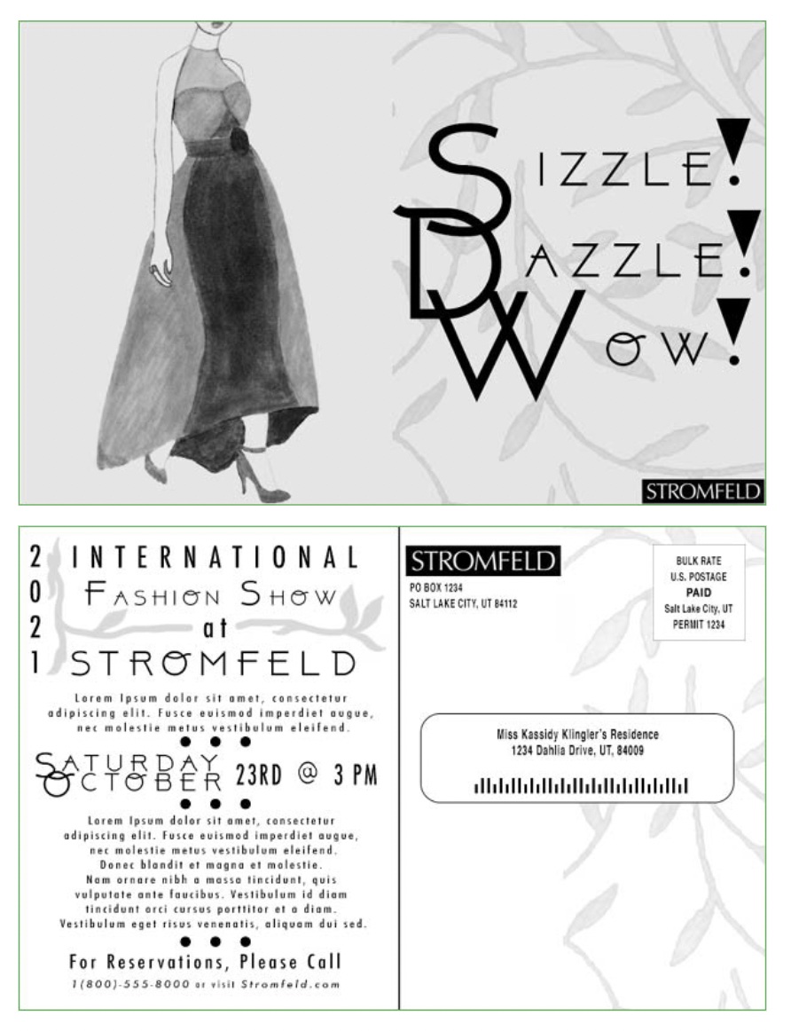
example of my process that continue to go on and on about it. Below is an example of a postcard we did for one of my classes.
Post Card Example
Overview
For this project, our skills are put to the test. We are using everything we have learned so far (InDesign, tracing, composing, indications, etc.) to try and create a fashion postcard. We are challenged
to create something that will entice woman to join this international event while also keeping the professionalism and 'expensive' look.

Research:
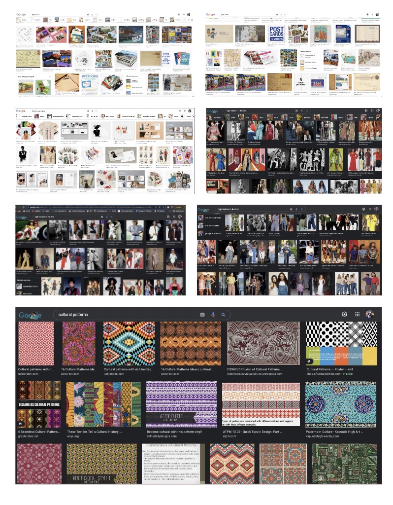
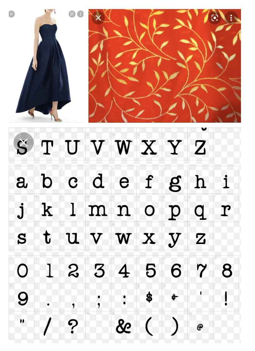
For this project, I tried to research some different things. In hindsight, I probably could've looked at some actual fashion websites, but Google Images was my inspiration at the time. I searched several
things including fashion in the 70s, 80s, and 90s, different styles of postcards, the model I wanted to use, different international patterns, and even a typewriter typeface I was considering going with
on my postcard.
The reason I looked up a typewriter typeface and 70s-90s fashion is because I was trying to understand my target audience, especially if they're above 45. I thought that since they grew up from that era
of fashion, that might inspire my for some ideas on how I could alter my model's clothing. Plus, I know that people growing up from that time period are more comfortable with serifs, or at the very least,
grew up with a typewriter typeface. Overall, this really helped to get my creative juices flowing.

Brainstorming:
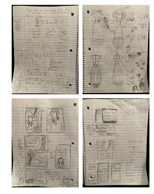
With the brainstorming, I tried out some different styles for the phrase "Sizzle, Dazzle, Wow". I was really looking and trying some different styles I thought might either appeal to the audience or to the style.
I messed with overlapping, cursive and loopy, serifs (the typewriter typeface I was talking about above), angles, big, small, and some art deco typefaces. I was really trying to have fun with it. I let the ideas
flow from my mind to my paper and really only stopped when I couldn't think of any more. I also tied to mess around with different styles of clothes. I really tried to make 4 complete sets so I could be better
prepared for the thumbnails I would be doing later on.

Sketches and Doodles
For the sketches, I tried different layout ideas for the front of the post cards. Again, just having fun with it. The stars next to the sketches are the ones I decided to use as my thumbnails. I also put notes next
to it featuring what to do differently for the actual thumbnail. I was also messing around further with the thumbnail designs and trying to see them a little bit bigger and a little more detailed before doing the
real thing. They are a little rough, but I was doing quick sketches so I could get to the thumbnails faster.

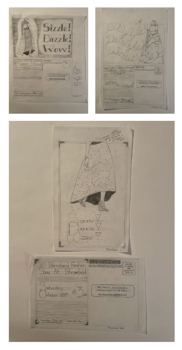
Thumbnails
These ideas were a lot of fun. I think a lot of people struggled trying to get them all different, but I didn't have much trouble at all. I tried to make sure that what I was using for one I wasn't using for the other.
I also tried to use different crops of the model. For example, I used only the bottom of the dress for one and used the whole model for another. Overall, I really had fun with the thumbnails. I figured these were kind of
like "rough drafts", so I tried to just get my inspirations and ideas on the paper. Then, I got critiques from people on which ideas and which concepts worked better together.

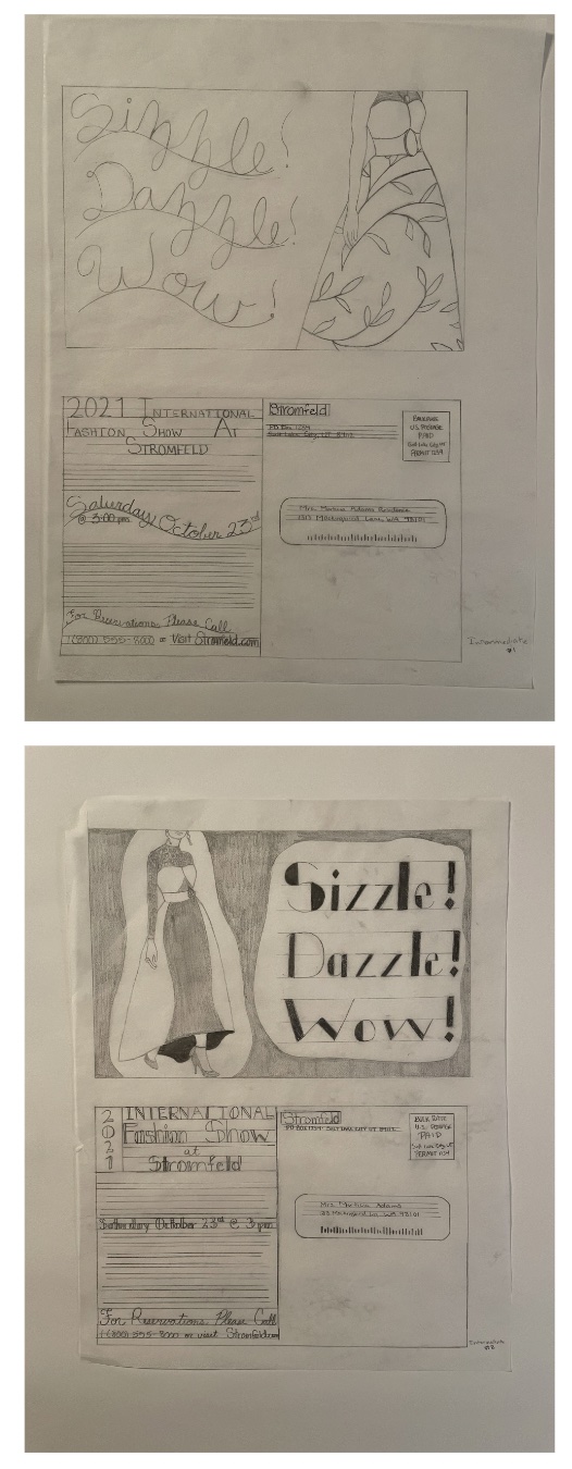
Intermediates
These intermediates were actually a little harder for me. I couldn't decide which ones I wanted to be my intermediates and which one I wasn't going to use. I liked all three of my thumbnails for different reasons, so I tried
asking other people. For them, these were the two that worked the most. So, they're the ones I went with. I did take a couple of my classmates as well as teacher's suggestions into account. I made the curvy cursive text smaller
on the first and added more Art Deco to the back of the post card on the other. This is where I decided which intermediate I wanted for the Hand Final.

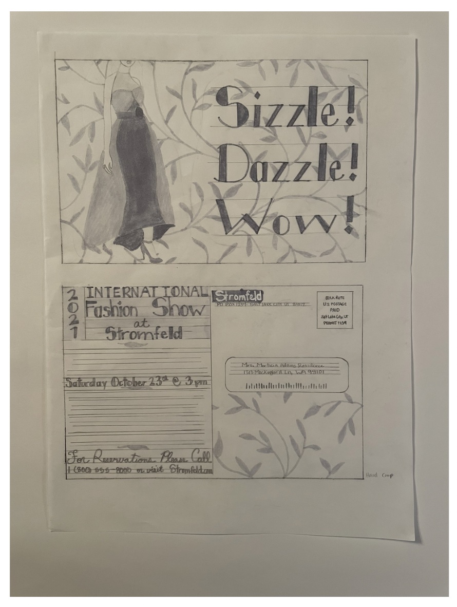
Hand Final
I chose the second intermediate for my hand final and, thanks to many of the comments and suggestions of my fellow classmates, I added the leaf design to my hand final. Honestly, I think it turned out really well. By this point,
I was starting to research different free Art Deco typefaces to see which one I wanted to use. I decided on the ABOVE typeface. It's not super close to what I made up, but it still looked nice and I wanted to try it out. I also
realized that some of the type on the back is hard to read with the Art Deco. I also realized I didn't like the grey leaves breaking up the different paragraphs on the back of the postcard. I also realized it was unprofessional
to have a silly name on the label, so I wanted to change it to my name.
Basically, I still have a lot of work to do before I can call it 'finished'.

B&W Computer Progressions
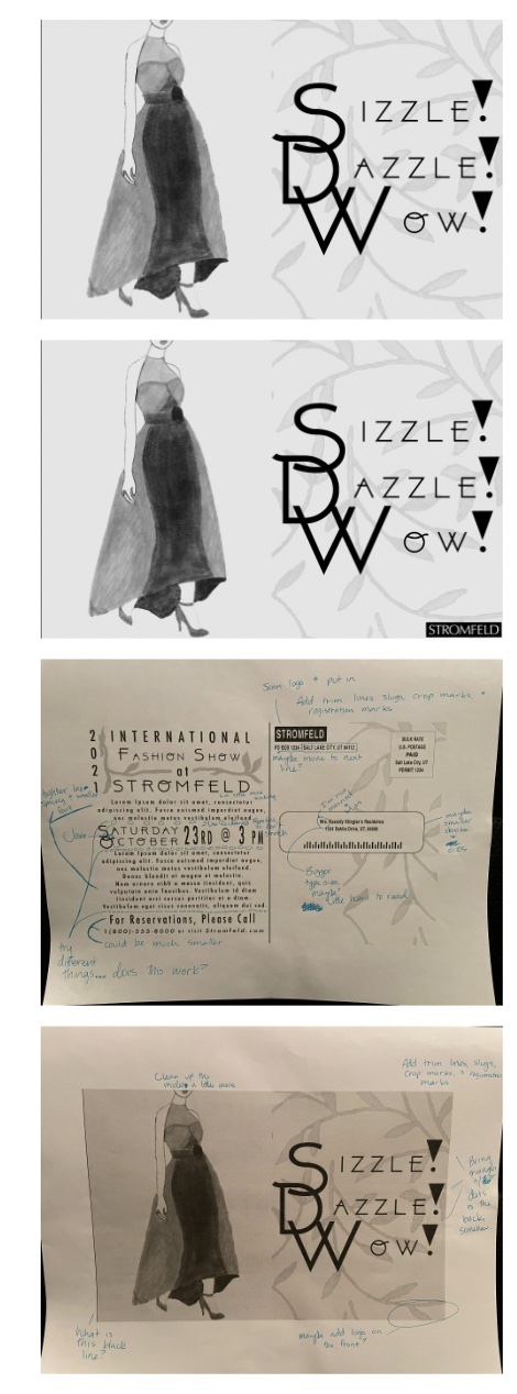
It was very interesting to take what I had done on paper and digitize it. I haven't really done that with any of my work, so this was a fun new experience. So, I added the leaves to only one side of the postcard because I felt
that the leaves took away from the model. I also started using the ABOVE typeface, which I really ended up loving. I also decided to add some elements from all of my thumbnails: overlapping letters and leaves. I was really happy
to be able to incorporate all of my thumbnails in some way, shape, or form because, as I said above, I really liked a lot of different things from my three different thumbnails. I also fixed the logo (I didn't scan it earlier,
so I went back and scanned it). I also changed the leading and tracking on the back of the postcard with the body text and it looks much better with more whitespace. Another thing I tried was adding the logo to the front. I
personally think it works where it is, so I left it.
I really like the hand drawn leaves I added to make the big text on the back less awkward and have another thing incorporated from the front to make it all connect better. I'm really liking the look at this point.

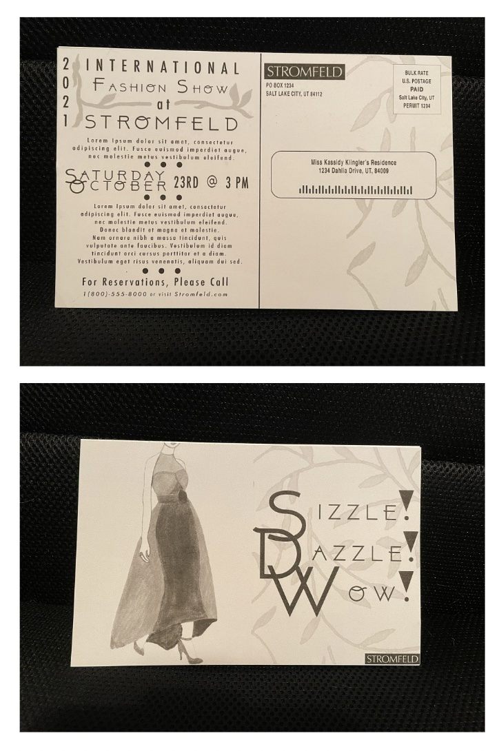
Computer Dummy
It was really interesting and fun to make a dummy. The only dummies I've made before have been folded pieces of paper for printing class. It was also really interesting to see what it might look like in real life. Also, from the
mark-ups to making the dummy, I added little dots in between each section on the back. This was a suggestion from my teacher and I actually really like how it looks. Anyway, this was one of my favorite steps.

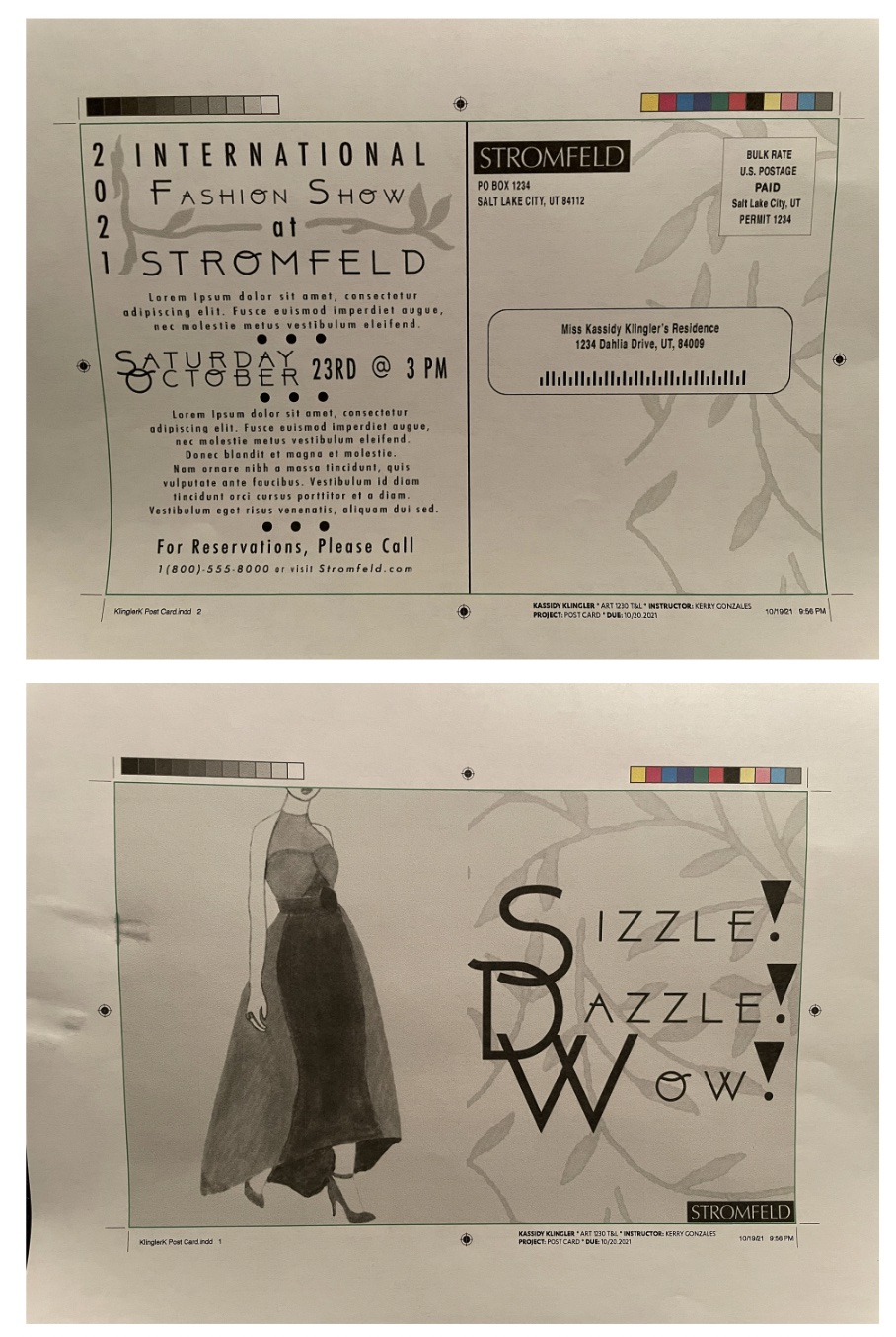
Final Composite
Since I forgot to add the trim lines, crop marks, registration marks, and slug information, I made sure to add it to the final composite. It's kind of interesting how much easier the steps in the design process become the further in the
process I am. I don't know how it will be in the future, but this is what I'm noticing now.
Sorry the paper is all crinkled. I was trying to take the picture and the paper wasn't cooperating. Also, I'm not sure how water droplets got on my paper, but I know it makes my work look a little more sloppy. Sorry about that as well.
Other than the weird accidents on the papers, I think it really looks nice.

Final
Overall, I think I'm happy with my work. At the moment, I think I'm a little tired of looking at it and it doesn't look as impressive as I thought it would look at this stage. But, as I said, I think I've just been staring at it for too long.
I know where I started and I'm very happy with my end product.
To be honest, I think this project was actually really fun. I was worried at first because I am not a fashion person. I wear what's comfortable, not expensive. Anyway, I think once I got the inspiration and the ideas flowing, I started feeling
more and more comfortable with working on this postcard. I think it was fun to go from what I did with my hand work and moving to the digital work. As I said above, I haven't really digitized my art before, so this was really fun to try and copy
and figure out. It was also fun to be inspired through everyone else's art and ideas and to try and use what we've been learning in class.
