Kassidy Klingler
My Work
Package Design
Adv. Type and Layout
Adv. Design
Cylinder
Overview
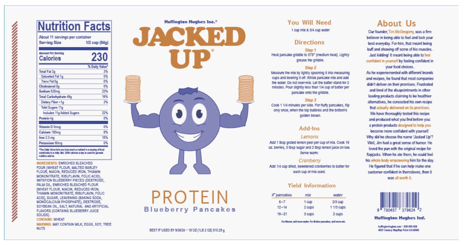
For this project, we were tasked with creating a baking mix label that would go around a cylinder. We needed several different things for this project; nutrition label,
instructions, ingredients, best buy date, and a few others that add to the challenge. It's a good challenge and a great way to start out the class! There are lots of
different ways to make a cylinder as well as a baking mix, so this was a fun project creatively!

Research
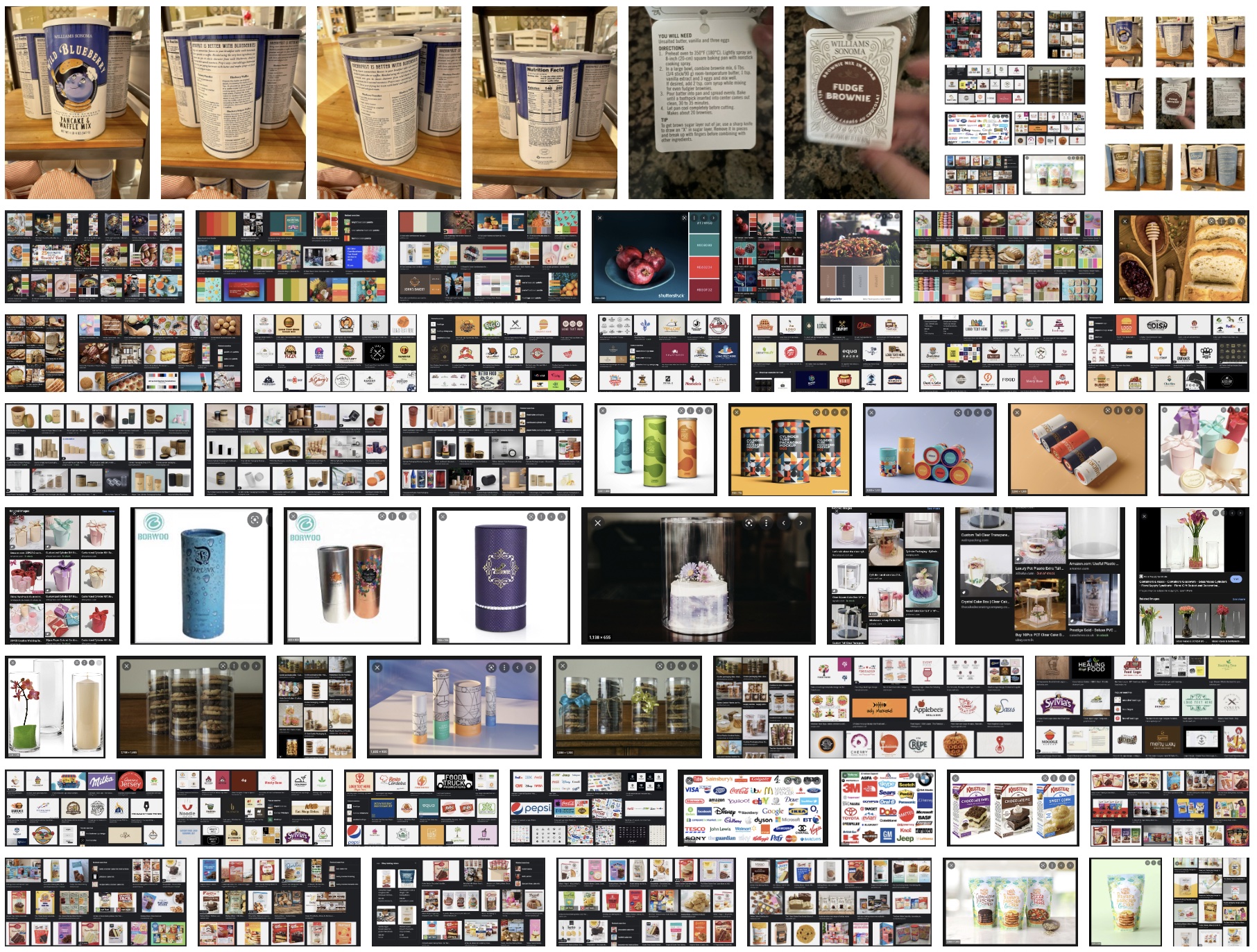
I was trying to research a few things. I know I've done a logotype before in a different class, but it's good to be reminded with examples. I also looked at cylinders
in general. "How did they handle this challenge?" " How did they get everything on there and make it look really nice?" I also found a lot of different products I've grown
up with my whole life, but never saw them as cylinders until I started this assignment. It started to get the gears turning. I also decided to look at different baking
mixes. I wanted to see how the handled this challenge as well. "How did the do the instructions?" "Are those tips when baking?" "They used photos and cartoons. That's
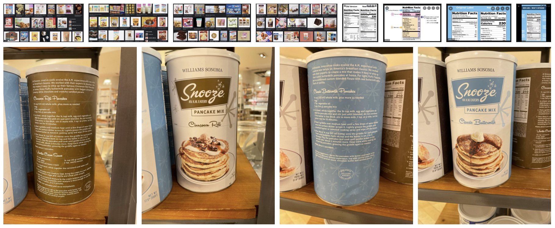
very interesting." I also tried to look at different color combinations, especially with food, to make sure it looked appetizing. I decided to take a trip to Williams and
Sonoma after class. I was flabbergasted with everything I saw! A lot of the things in there had a high-end look, but a lot of it was super cute and cartoony as well.
It was a good balance of things and inspiring to look at.


Brainstorming
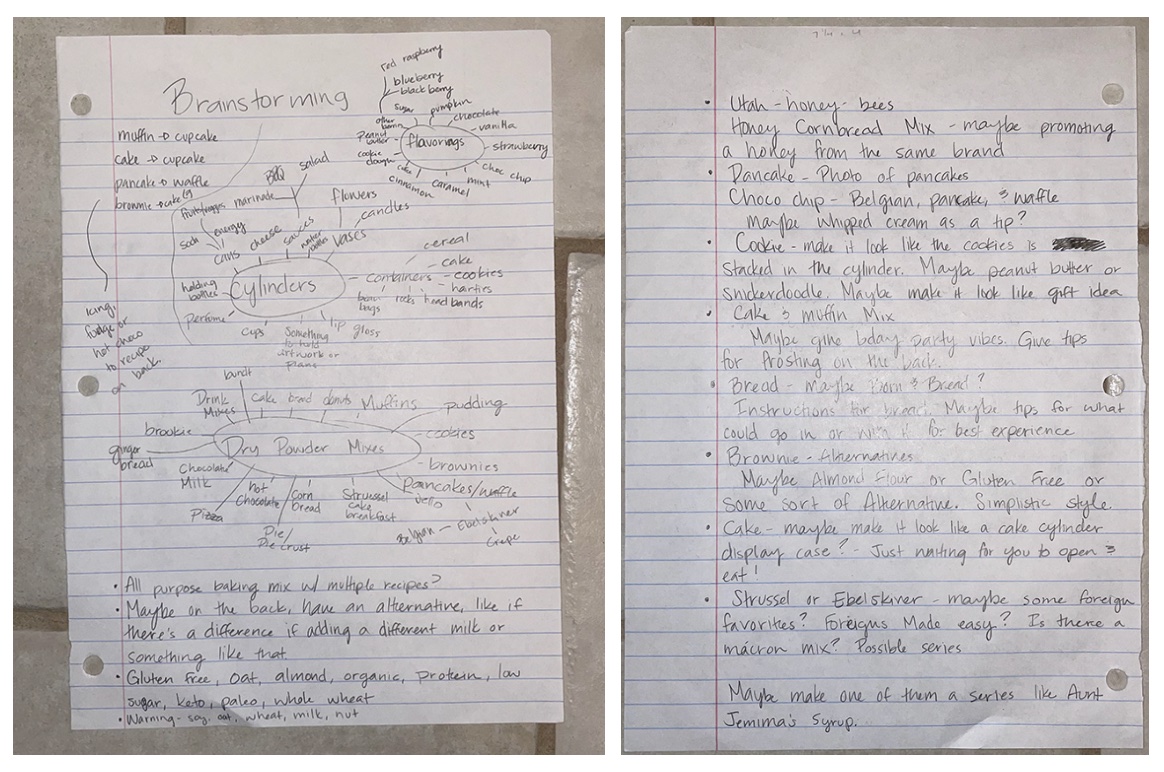
I know last semester I said I wasn't a huge fan of brain maps. Well, I decided to give them a try again. I know there's no right and wrong way, so I just tried my best
to make it look some what organized. It was helpful later on as it was divided up more clearly than just lines and lists on a page. I just kept adding to it as I came
across more ideas. I work at a grocery store, so I was able to get some inspiration there as I was working.

Sketches and Doodles
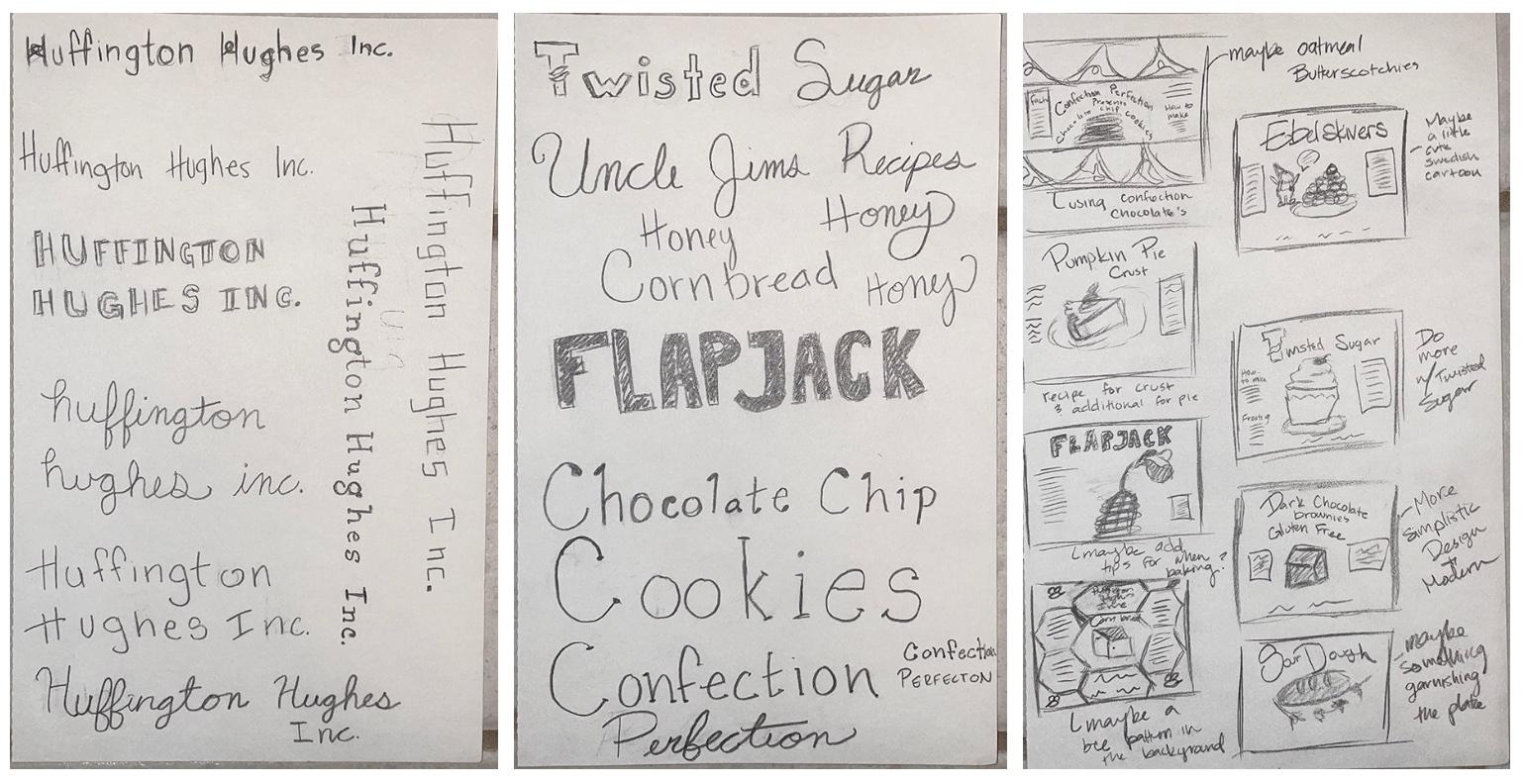
I knew I would need to make different logotypes, so I tried to mess around with those. I played around with different styles of type as well as different names that might
be able to work with the different names later on. I also worked with the Huffington Hughes Inc.... possibly a little too much, haha. I actually had a lot of fun playing
around with different logotypes as well as typefaces. I also sketched out some possible ideas for a couple of the mixes I brainstormed; trying to keep all of them different
from one and another.

Thumbnails and Dummies
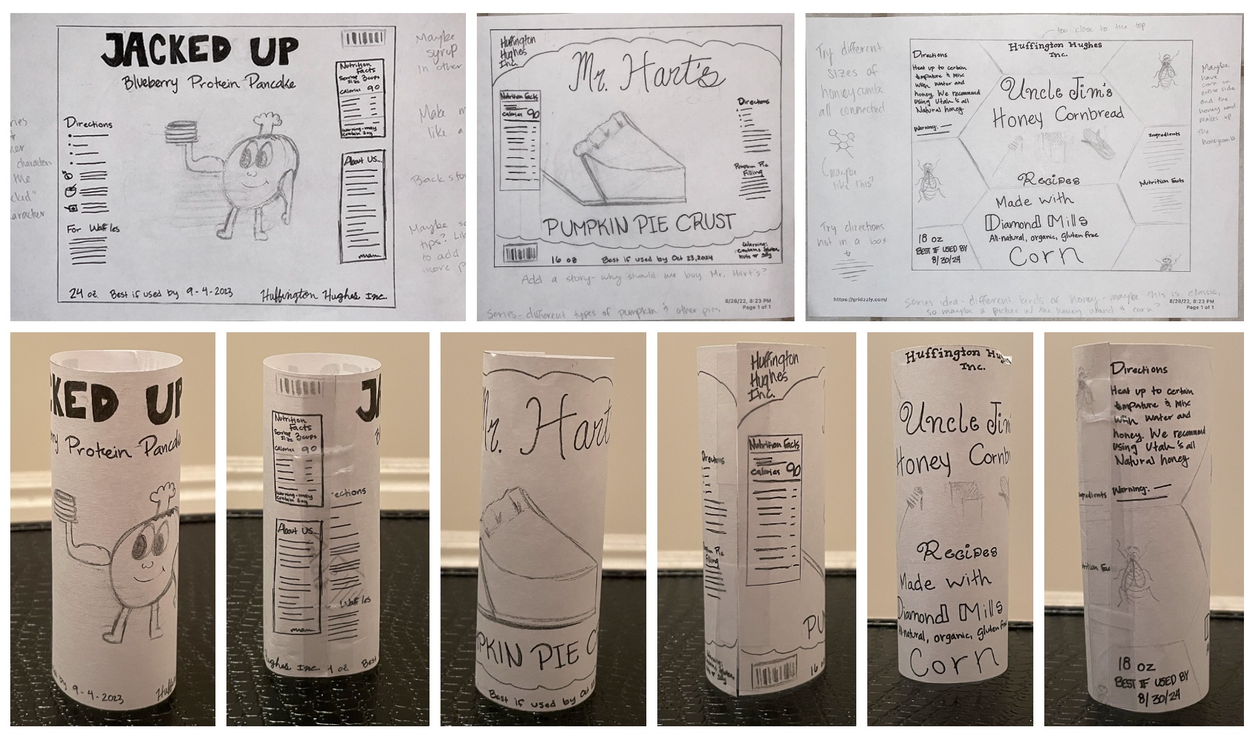
I had a couple of different ideas for my thumbnails. I tried to do a honey cornbread mix with the idea that I would promote a local honey to use when baking the cornbread.
It was a good idea and I ended up really liking it and had some really fun ideas moving on to the intermediates. I also had a pumpkin pie crust mix. I thought I could use
a backstory on this one with a famous recipe. I liked this idea at first, but I didn't because of two things. One, it wasn't really complete and was my most incomplete idea.
Two, I felt like pie crust wasn't really a baking mix most people would want since they can buy a pre-made one and they're pretty easy to make already. The third idea I had
was a blueberry protein pancake mix. For this one, the idea was to mess with something like gluten free, protein, etc. Basically like a dietary specialty product. I really
loved the direction I was taking with this one, so I decided to take it one step further.
With the dummies, I learned they are a lot trickier than they look. I also kept forgetting to make them and bring them to class. It does help me figure out some issues though,
like my layout issues really early on.

Intermediates and Dummies
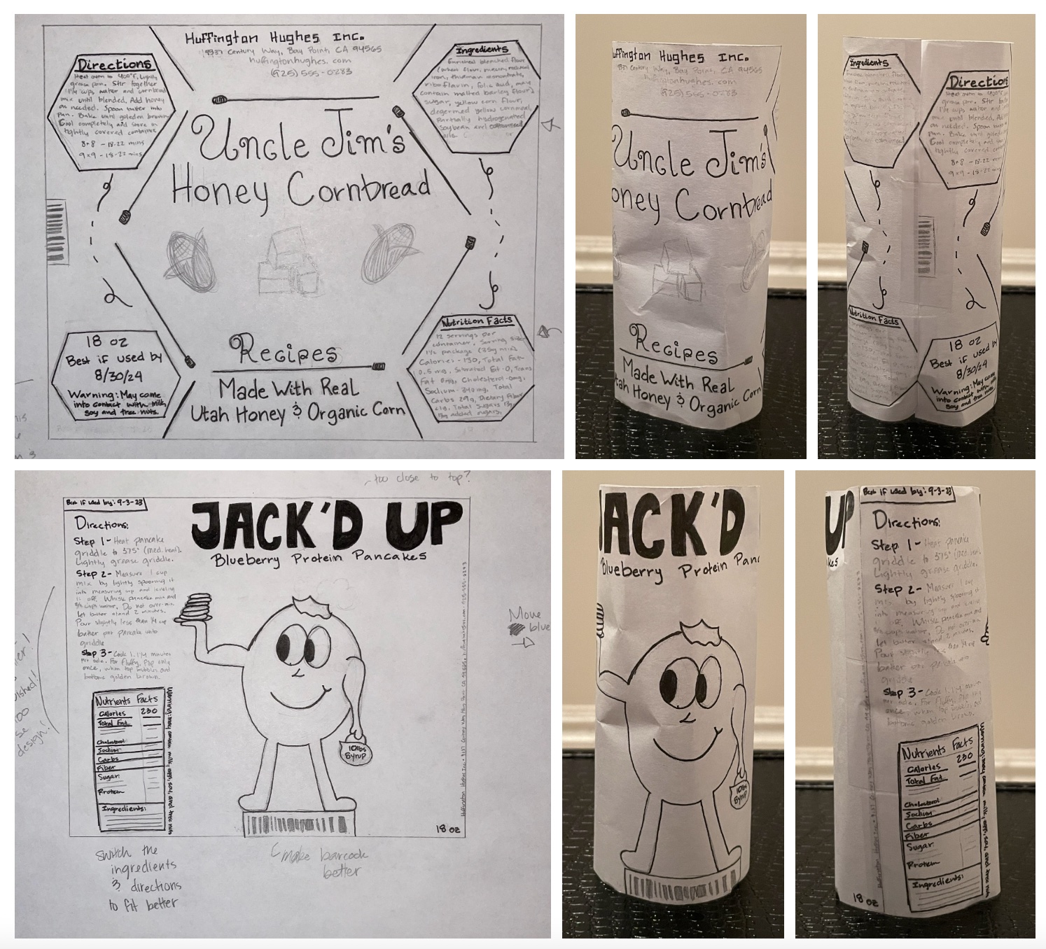
I liked how these two were completely different. The honey cornbread was really fun! It was interesting to make a pattern and to try and mess around with that. I also tried to
make the information fit into different shapes, making it more interesting. I thought of being able to make this into a series, which is why I have the honey wand (I think that's
what it's called) with the corn. I also tried to add some fun little bees. I didn't take a picture, but when I was in Williams and Sonoma, I saw some beautiful bee plates and dinnerware,
which is really what kind of inspired the idea in the first place. I then messed around with the blueberry protein pancaked. I liked the name 'Jacked Up', but the blueberry needed some work.
I thought a kettle ball full of syrup was clever, but it didn't end up working out, which is fine. I also realized that I had some serious layout issues. Honestly, I was really embarrassed
I hadn't figured that out earlier. I was determined to figure it out for the hand final.
After asking family members, friends, and classmates, I decided to go with the 'Jacked Up' idea. I loved them both and might go back to the other one in my spare time, but I liked the
'Jacked Up' idea better. It seemed to do better with people and they all got it right away. Plus, the title kind of catches the eye.

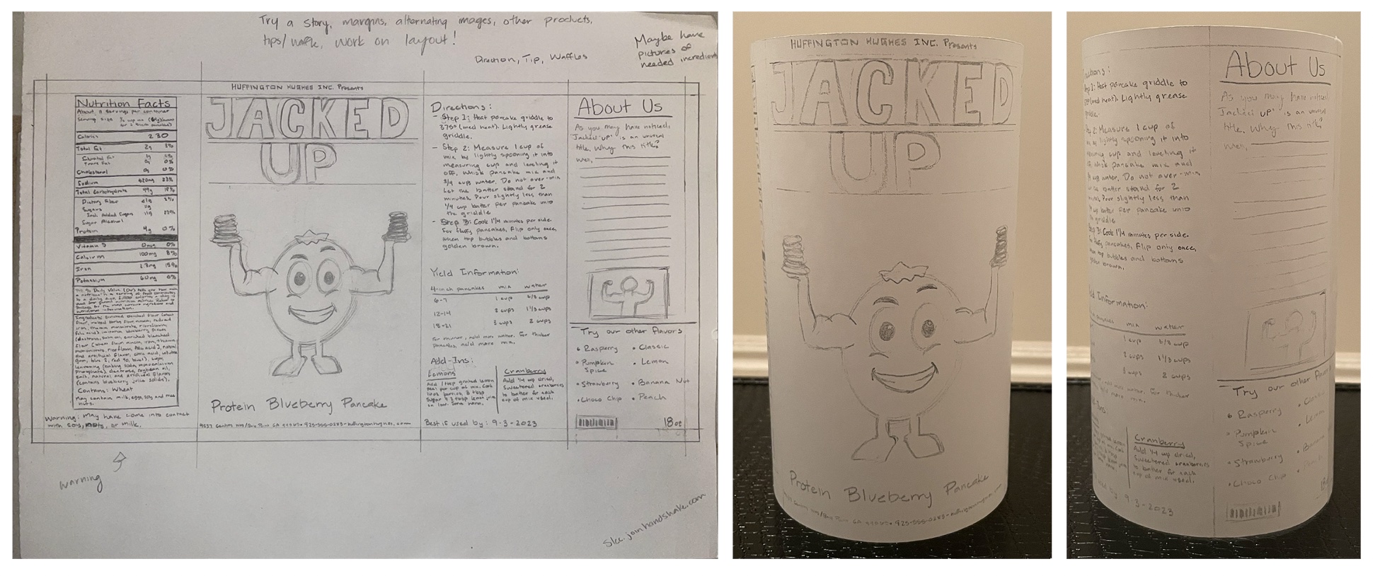
Hand Final and Dummy
I was determined, and I like to believe that I succeeded. I had made a much better layout! I know it's not perfect and there were still some things to iron out, but it was much better than before.
I also looked up different cartoon buff berries to make my blueberry look better and believably buff. I think he turned out much better than before. It's crazy what some good visual references and
inspiration can do! I was able to organize all the information I had and because of that, I was able to have so much space that I added an "About Us" section! I didn't even think that was possible
with the other "layouts" I had! Just crazy!

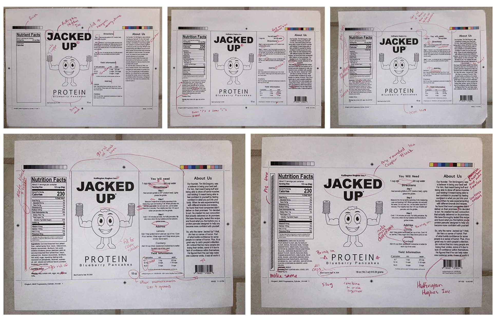
B&W Computer Progressions
There were a lot of corrections, which is good. I'd rather get to the nit-picky than to still have major issues still in play at this stage in the game. Luckily, a few of my classmates started a group
chat and we were able to correspond with one another, sending photos and giving positive feedback as well as constructive criticism. This was so crucial for the B&W Progressions! There's only so much we
can do in class sometimes, so it's helpful to get each other's opinions. There were still some corrections to be made when I went to class, but it was little things that could easily be changed instead
of other things that I fixed earlier on. It was awesome! I've never felt this good about going into a final!

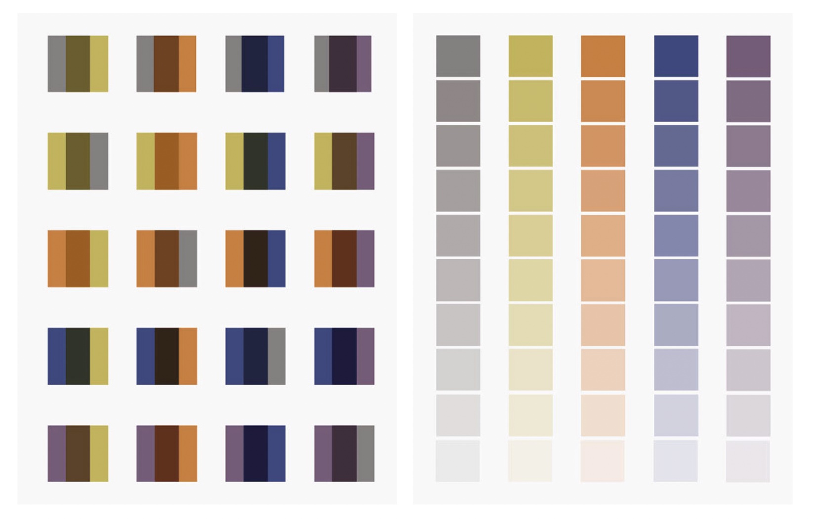
Color Studies
I tried to pick colors that would go with the colors of a blueberry (blue, purple, or something in between) as well as colors that might overprint well when I got to the color studies. I really liked
colors I ended up with. They all go really well together when paired up into twos. I was curious about the overprint, so I tried overprinting the squares to see what color I would get. It was very
interesting.

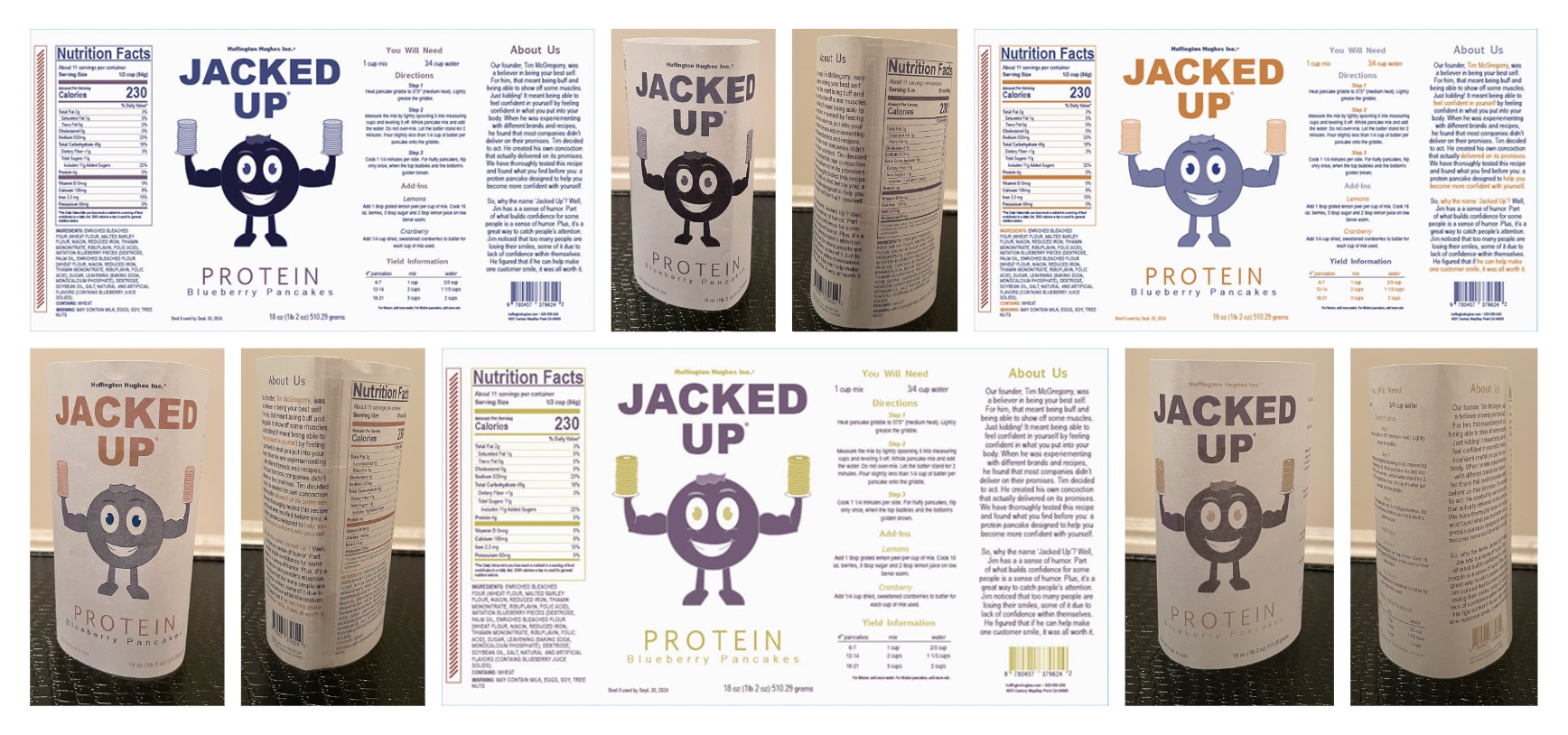
Color Combinations and Dummies
I tried overprinting, which is something I've been afraid to try before. It's not that I didn't know how, it was more of a fear of lack of time. Well, I had some time to try it. I was also determined
to try an overprint since I didn't all last semester. Why not, right? It didn't turn out the way I thought, but it wasn't bad. It was darker than I wanted to be for my little blueberry, but I like the
making the lighter color the accent on the little guy. I also liked being able to feel like I had three colors, when I truly only had two. Alas, I ended up going with a blue and orange. I feel like they
complimented each other as well as fit for the blueberry and pancakes. Plus, it makes the information on the side pop out too (after working with it a little bit). Overall, I think it turned out a little
better than I thought. Also, I apologize for the printing job on the dummies. My printer was being weird and didn't bring out the color as well. You can see what colors they're supposed to be, they just
came out really muddy. It never ceases to amaze me how much different it becomes from screen to print.

Final Product
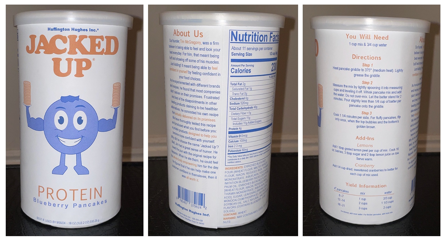
I really love how this turned out! It was a quite a different experience to mount it to a physical object that was round instead of a flat black board. I had to play a lot more with the layout when I was
cutting to make sure that things didn't overlap as I was mounting. I am also really proud of how well it turned out and I really like the color combinations I chose! I think they work really well together.
I am so glad that I got an 11x17 printer - it literally saved so much of my time and I could work things out better!
Overall, I'm grateful for this experience! Considering how nervous I was for this class the entire summer, I am really proud of what I was able to create for the first project! I am looking forward to be
challenged with the next project, as well as being humbled again, haha. Until then, I will enjoy this victory!
