Kassidy Klingler
My Work
Package Design
Adv. Type and Layout
Adv. Design
Poster
Overview
For this assignment, we were tasked with creating a poster based off of Banned Books Week.
We needed to find a banned book and create a type poster (all visuals, if there are any, are
created out of type) that explains why this book shouldn't be banned. This is kind of a test
to see how well we were paying attention to the previous assignments, since this has a little
bit of everything. I think all of my fellow classmates can agree with me when I say that this
one was a lot more challenging than I previously thought.

Research
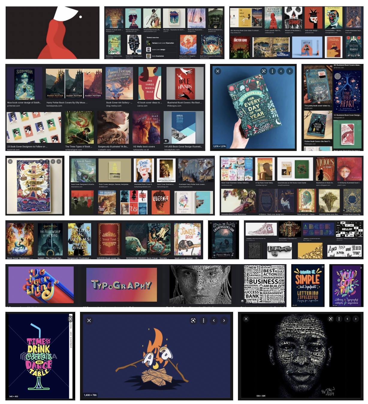
For my research, I first wanted to look at book covers to try and get inspired from the different
interpretations different artist have. I know they're all not images made from type, but I wanted
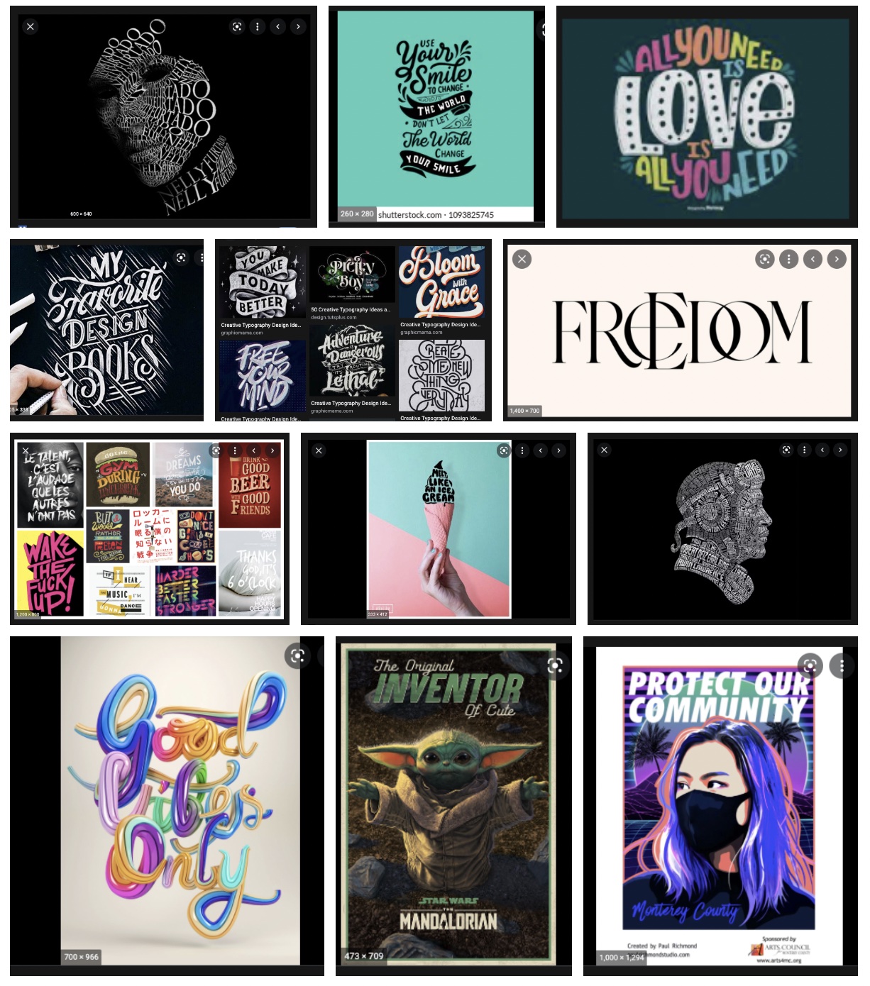
to be inspired by how other people viewed other books. Then, I looked up different typography examples.
I do have some research similar to my type figure, but most of this is different enough and is more inspiring
for this current assignment. There are some fun ones in there!I also looked at a website that had some fun typography
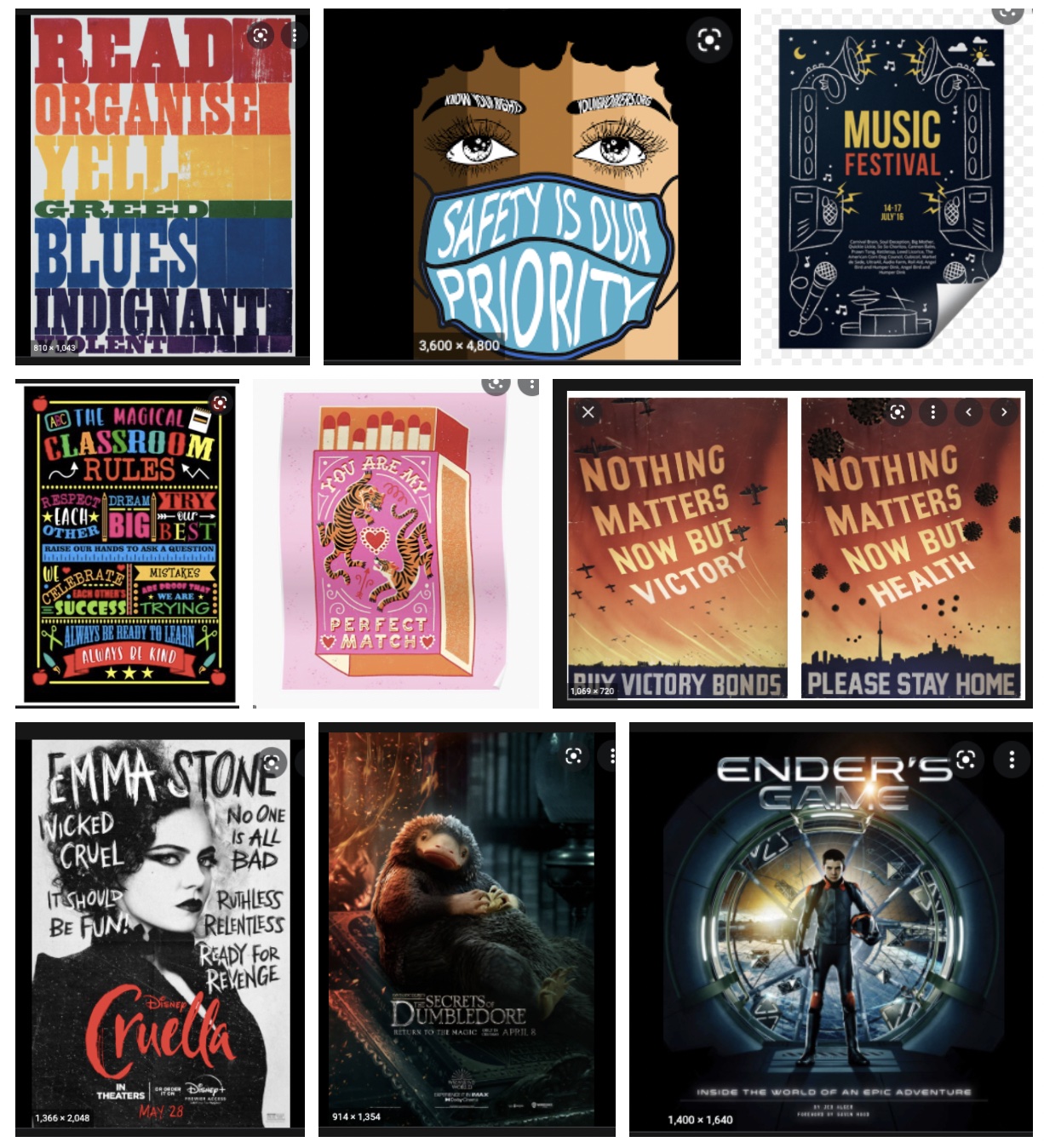
on it as well. Then, I looked at different posters. How did they get information across without many words? What headlines
did they use? How did they draw people in? I was inspired by the different ways people got information across and I also saw
some creative ways of using type. I also included the different book covers of the books I eventually chose to take to my thumbnails.
I thought that this may inspire me down the road.
As for the other links below, this is most of my research for banned books, what the books were about, and different quotes I could use
from the book and use it on my poster. It's not all of them because I forgot to save them as I was looking at them, but it is a majority
of them. I had a rough time figuring out which books I wanted to do, so I went to a lot of different sights, looking for any that made
me feel inspired.
https://www.pastemagazine.com/books/book-recs/frequently-banned-books-everyone-read-lists-censored/
https://www.ala.org/advocacy/bbooks/frequentlychallengedbooks/classics
https://www.ala.org/advocacy/bbooks/frequentlychallengedbooks/decade2019
https://www.barnesandnoble.com/blog/11-books-that-were-banned-for-completely-ridiculous-reasons/
https://www.buzzfeed.com/spenceralthouse/classic-childrens-books-that-have-been-banned-in-america
https://www.sparknotes.com/lit/giver/summary/
https://www.sparknotes.com/lit/endersgame/summary/
https://creativemarket.com/blog/typography-ideas-websites
https://www.npr.org/sections/thesalt/2017/05/11/527459106/tar-baby-a-folktale-about-food-rights-rooted-in-the-inequalities-of-slavery
https://tinybeans.com/kids-books-and-childrens-books-that-are-banned-books/


Brainstorming
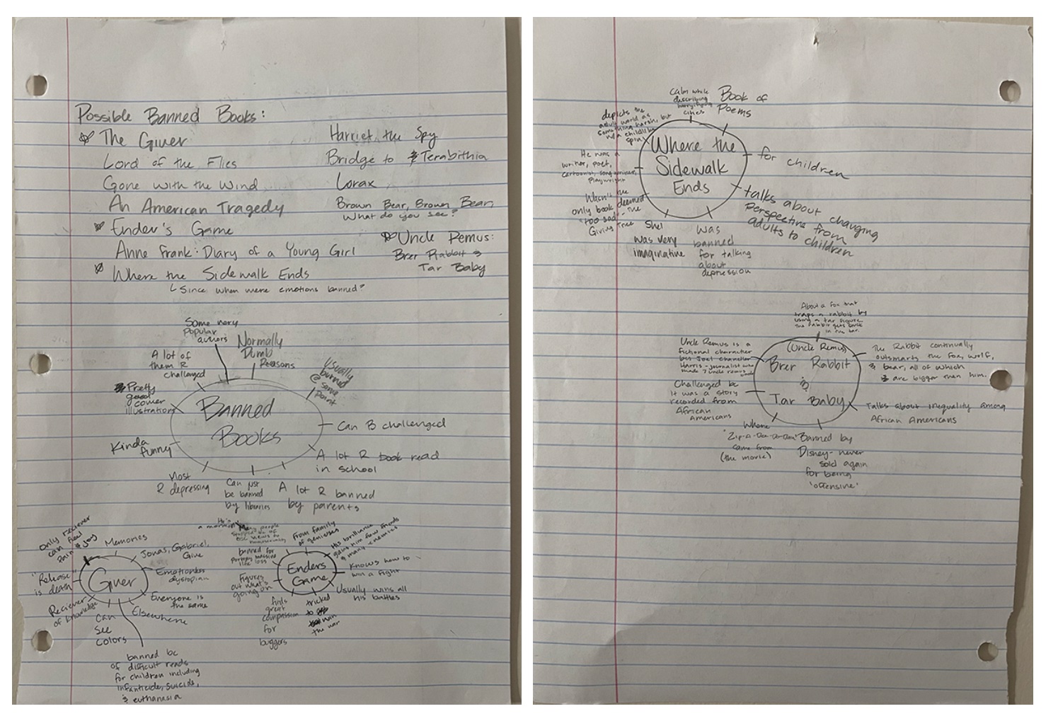
At this stage, I had a fair idea of the different books I wanted to do. The trouble was narrowing down the four to the three. On the top
of the paper, I wrote a couple of different banned books and narrowed it down to the top four. After that, I did some brainstorming with
the help of some brain-maps. I wanted to narrow down the ideas as well as narrow down the book topics down to three. With the help of the
class critiques, I was able to narrow down my idea to three books: Ender's Game, Uncle Remus's "De Tar-Baby", and Where the Sidewalk Ends.
Then, I did some brainstorming on those three so I could get an idea for the three thumbnails. I did different things about the author, why
it was banned, and the main parts of the story. Eventually, I got a few ideas.

Sketches and Doodles
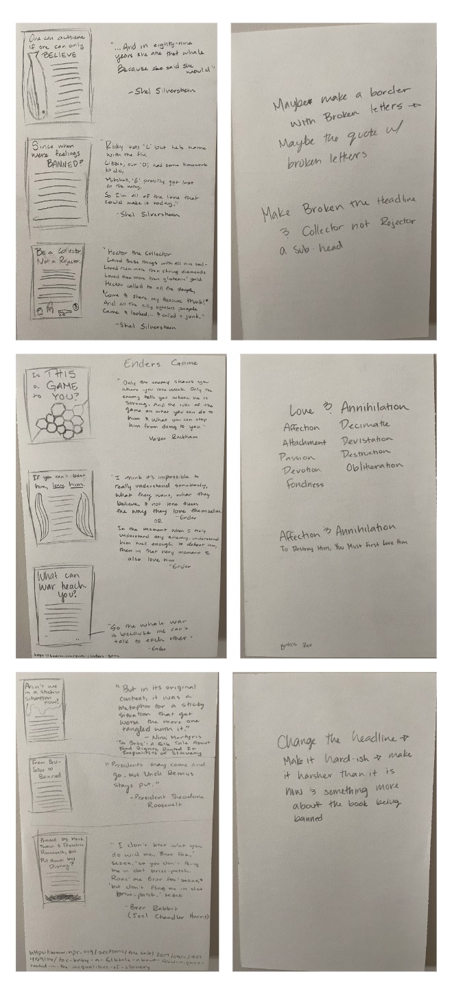
For my sketches and doodles, I tried to come up with three ideas for each story. I tried to create a couple ideas that had some symbolic
images while the other was to just have some fun with the type. I also started to mess around with different headlines that related to the
different research I did. They were a little rough, but I got ideas from the bad ideas, so I'd say it was worth it. I also tried to find a
quote that I could put somewhere on the poster, whether that was in the body text, image made of text, or a combination of both. I wanted
to try and make a strong argument on my poster. Quotes can be some of the best ways to do that, especially when trying to argue whether
banning the book was a good idea or not. Anyway, that's what I decided to do for my sketches and doodles. This really helped me for the
next stage.

Thumbnails
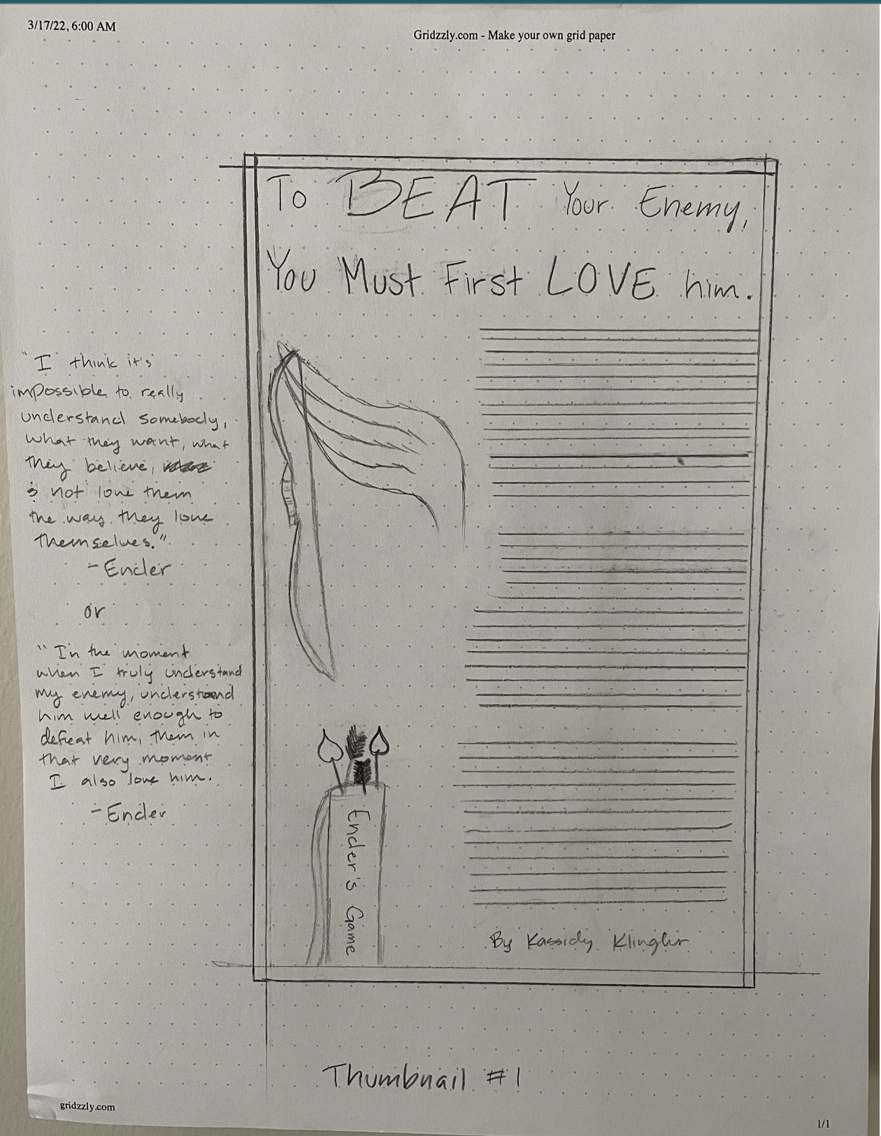
These ideas were a bit rough, but considering that the thumbnails are essentially rough drafts, it is to be expected (somewhat). The feedback
from the class was helpful. For the first thumbnail, I did 'Ender's Game'. The headline was okay, but the class and the professor were able to
brainstorm some really good synonyms to make the headline more intriguing. I chose to use different Eros themes (basically a Greek version of
the Cupid)because a lot of the book is based off of loving one's enemy. But, since the book doesn't talk about Eros, it seemed awkward. So,
I tried something different for the intermediate.
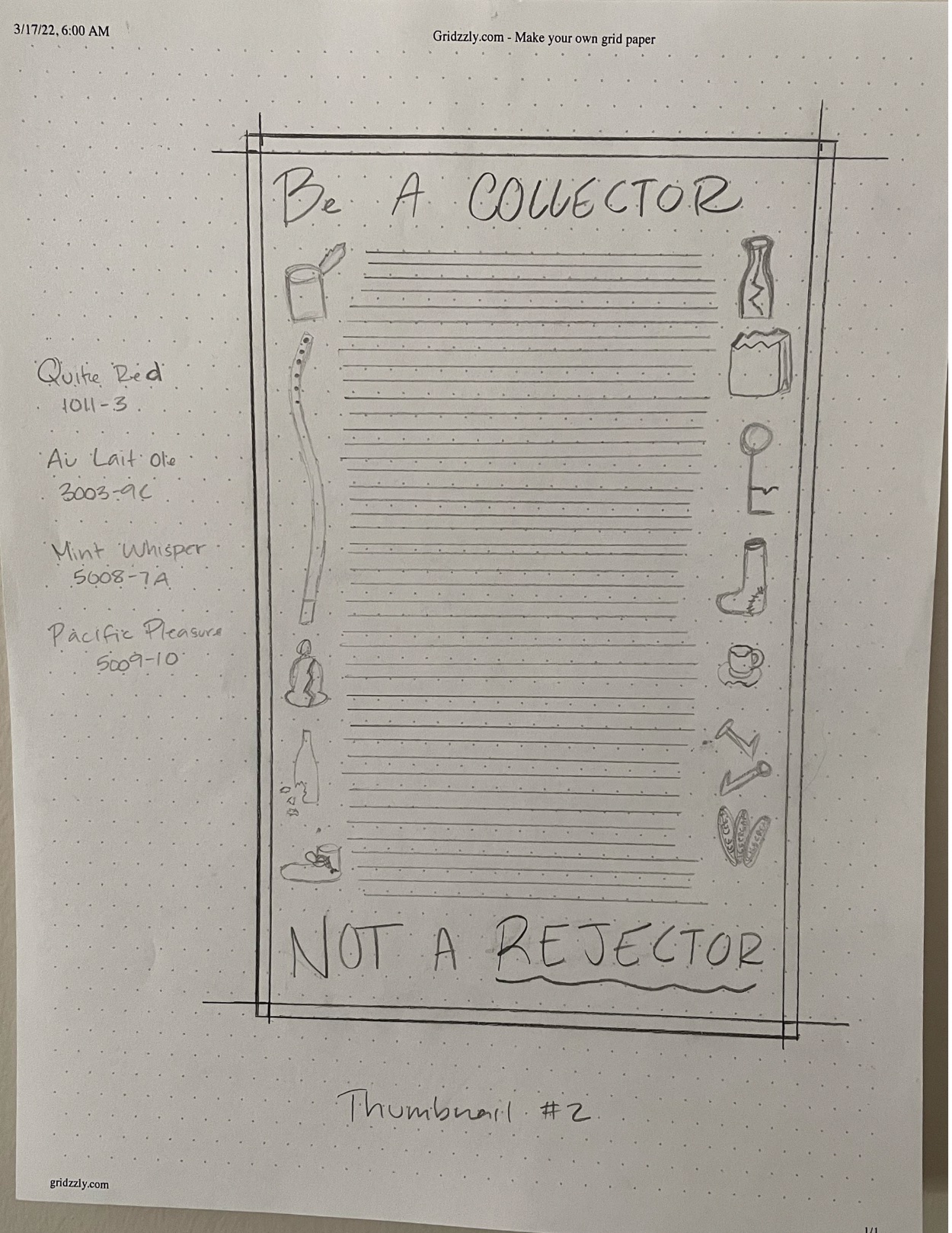
The next one I did was 'Where the Sidewalk Ends'. This one was interesting. Since it's a book of poetry, it was difficult to pinpoint any one theme.
So, I decided to stick with one of the more popular stories and go from there. The story I chose was Hector the Collector. Essentially, he collects
all the things other people think is junk, but loves theme as his very own little treasure. I had the suggestion that instead of broken things around
the sides, I would have broken letters as a border. I liked this idea, but didn't go with it.
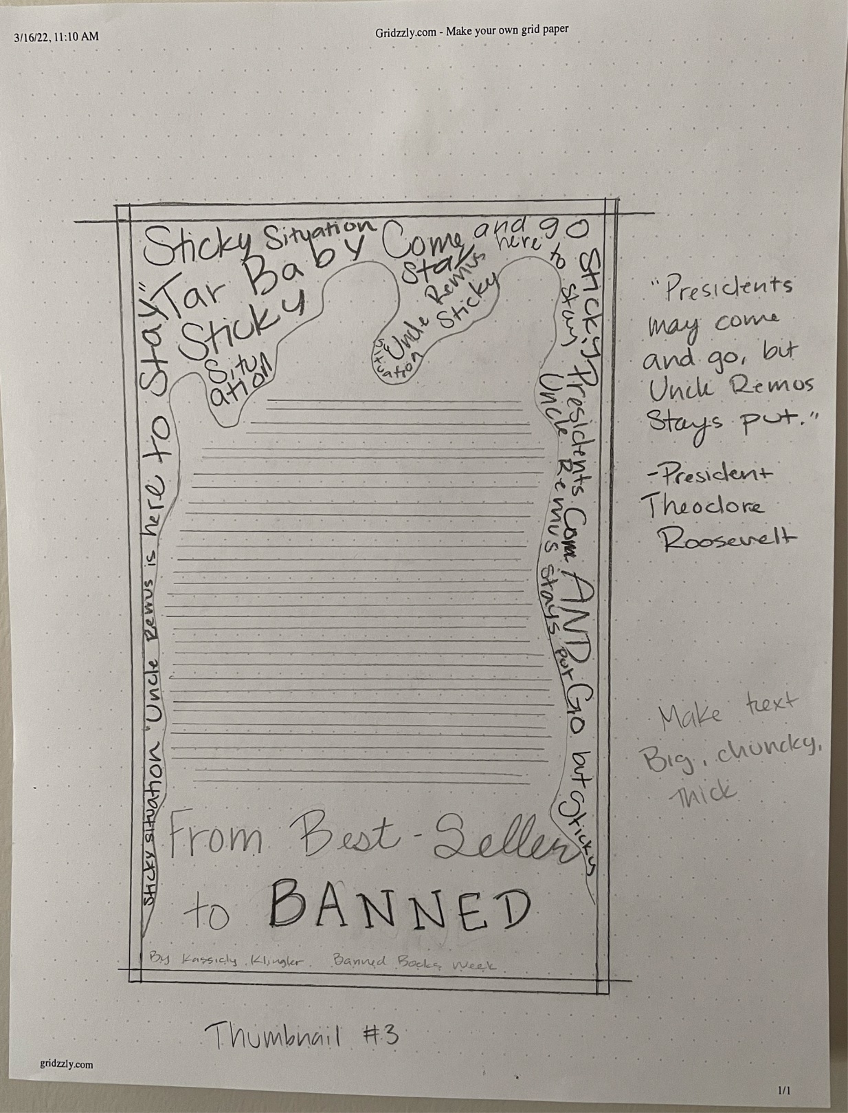
The final one I did was "The Uncle Remus" story "De Tar-Baby". This one is fairly controversial, so it was kind of hard to find a headline that matched.
I was given the advice to make it connect with the reasons for banning it. People also really like the idea of the tar, but with more of the words overlapping
to give more of a tar feel. This is one that a lot of people in my class liked, including myself, so I took it to the next level.


Intermediates
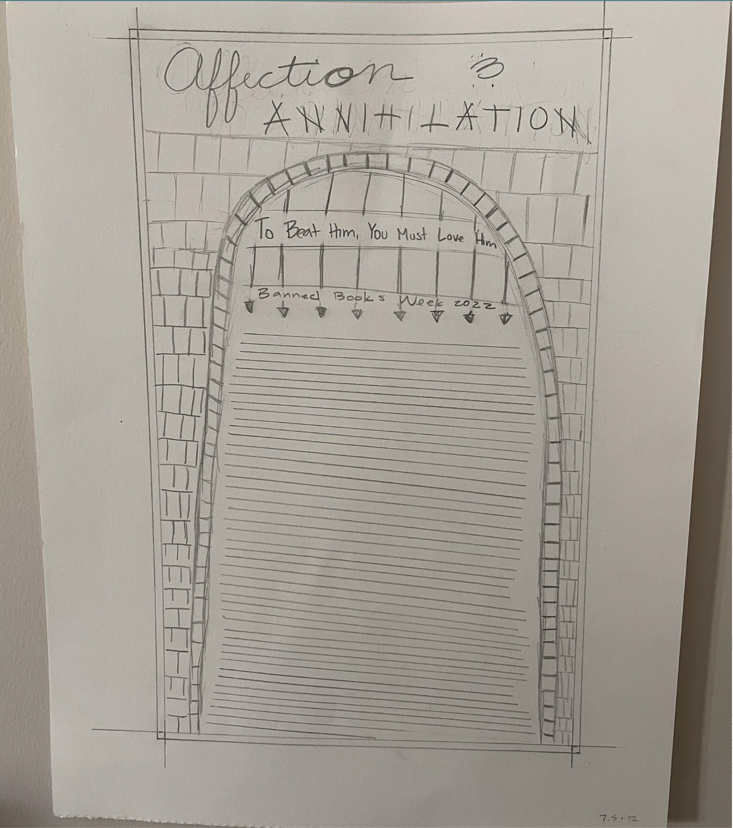
For Ender's Game, I made it into a castle. My dad has read the book, so I asked him what the biggest symbol in there was for him. He thought it was the castle,
since you see it multiple times throughout the book and becomes especially important towards the end. I also messed around with some different synonyms to get
some better and more interesting headlines. I also tried a bit of slanted body text since the castle isn't in good shape in the book, but I don't think it translated well.
I don't think the whole idea translated well, but I got some good suggestions, such as building a castle out of characters in the distance and have the body text to the side.
But, I didn't end up going with this idea.
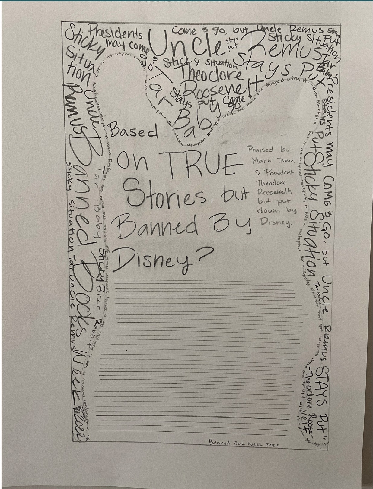
For the "Tar-Baby" story, I made some tar around the text, tried to make it as dark as I could with the pencils I had at the time. I also tried some more overlapping,
but I could see the need for some more overlapping and even bulkier text. I also unintentionally made the tar surrounding the text look like the silhouette of a bunny,
which correlates to the story. My professor pointed it out to me and suggested that I try making a silhouette of the bunny. I really liked this idea. Everyone else seemed to
like it too and liked this idea the best. So, I moved on with this idea.


Hand Final
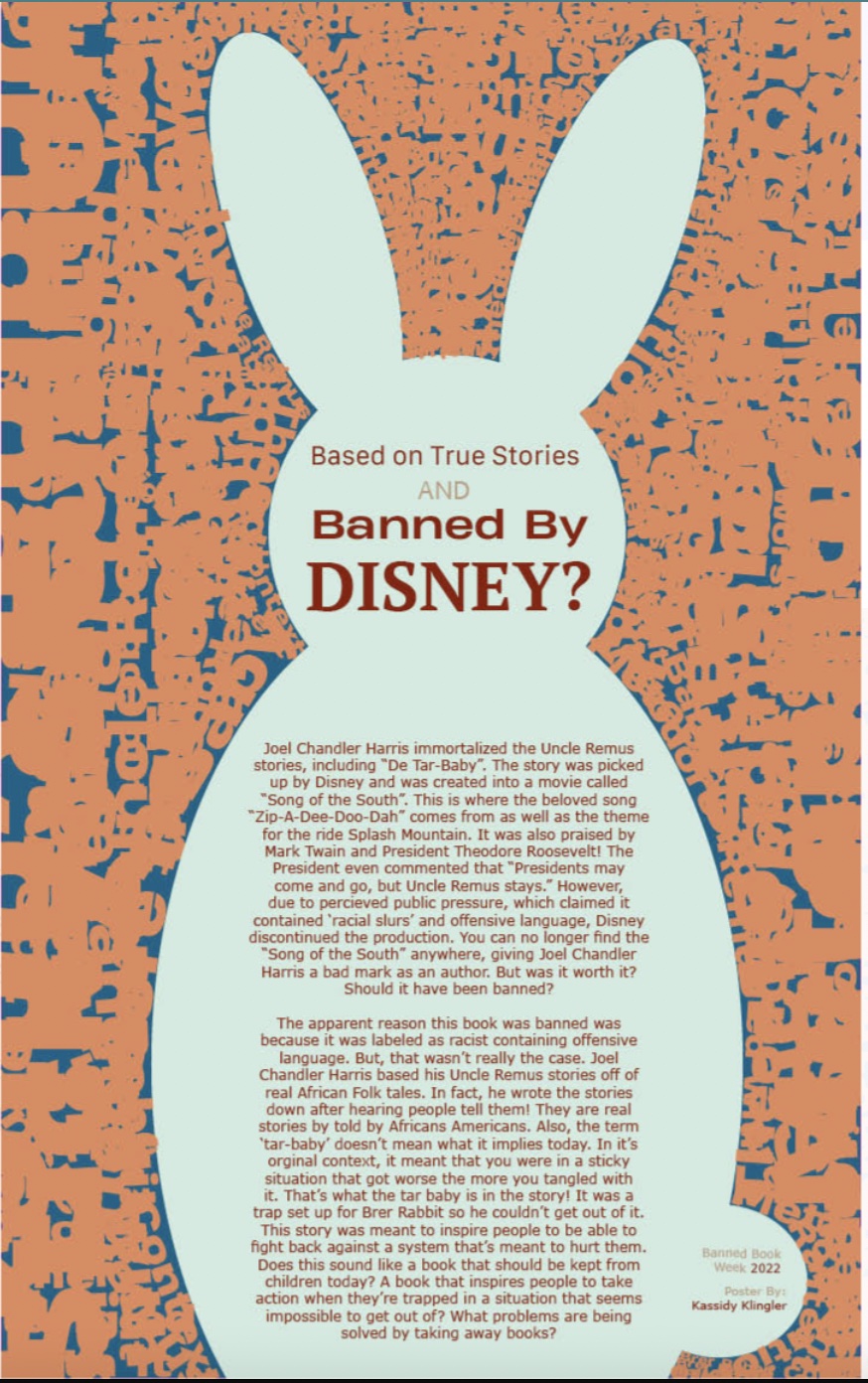
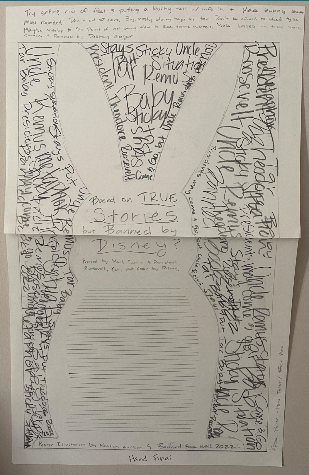
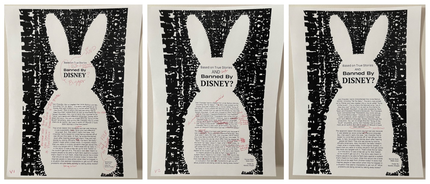
I made a silhouette of a bunny out of 'tar' using the dark, bulky, and overlapping letters. It looked pretty cool! My bunny shape was a little awkward, so I was suggested to
simplify it more. I was also suggested to add a bunny tail so I could add the byline information. I really liked these ideas and tried to incorporate them into my computer version.
I was also suggested to treat my title a little differently. My classmates like the idea of making it smaller to bigger so that the "Banned By Disney?" stood out more. I kind of wish
I had worked more on my paragraphs in these stages, but I was also really worried about how much time the overlapping text would take me.

B&W Computer Progressions
The overlapping text did take me forever to do. But, once it was done, it looked super cool! I really did look like the bunny was surrounded in tar with some of the words still legible.
The body text gave me some trouble. I had my dad read through it and he gave me some pointers on what to change so it sounded more professional. That's mainly what my progressions where fixing.
That and widows as well as some different variations of the headline. These were simple changes, but I think they made a world of difference!

Color Studies
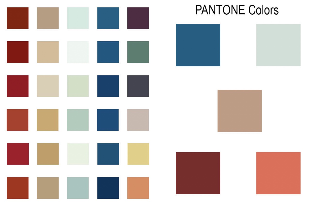
In class, we were asked to choose a color palette. Inside were four colors circled. These four colors are four of the five colors we needed to use on this assignment. For the fifth, we need to do
some research and see which ones work better. I looked at the rest of the palette and thought maybe those might work. But, I wasn't sure if that was 'cheating' or not, so I decided to do some research
of my own. I researched the different colors, got the hex codes, then tried to get the closest Pantone to that color. I tried different things to try and get the closest Pantone and to try and see which
one matched the sheet the best. Then, I started messing around with different colors for the last color. I tried some colors I'm more comfortable with such as blue, green, and purple as well as some
I'm not comfortable with such as the orange and yellow. Now it was time to try them out on the bunny!

Color Combinations
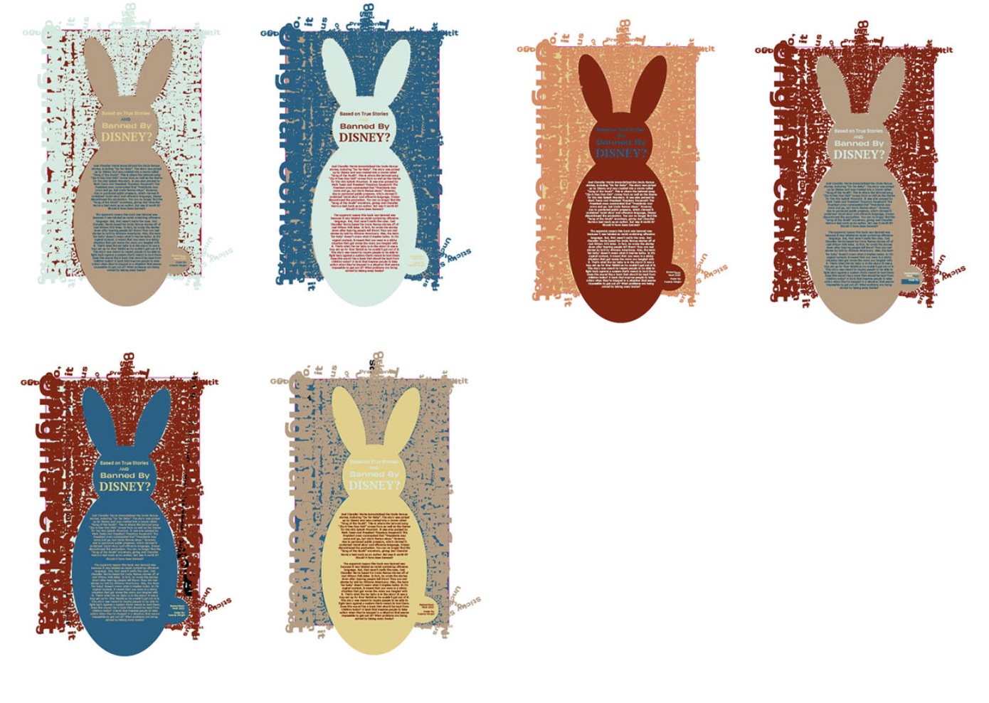
I did not realize how annoying changing the color on this would be. I had to change every text box by hand. I thought there was a was to change the color of all the text at the same time, but InDesign is
incapable of doing that. It took some time, but I was able to change the different text colors. Before coming to the final result, I had the text in the background as the yellow from above. It looked weird
and I didn't like it very much. I tried the, which wasn't much better. I thought the grey might allude to the fact that it's tar better than the yellow. I wish I would've tried the other colors too and maybe
messed around with some white, but at the time, I thought it looked nice.

Final Result
I am fairly happy with the result. After it was printed, I realized I wasn't too keen on the orange, but I really liked the overlapping text. I also realized that I should've left the bunny path alone and shouldn't
have given it the mint color. I should've given it the same color as the background so the type could make the figure of the bunny. However, I do like how it turned out. I think it's a fun and cool design that gets
my idea and concept across. I did learn a few things. Coming up with a headline that matches the concept and the body text can be very difficult, as well as trying to fit the body text all in the shape you want
it to be in. Another one I learned is another printing lesson: Only put the PDF on the USB. I won't put the InDesign file or a jpg, just the PDF file for them to read and for them to print.
