Kassidy Klingler
My Work
Package Design
Adv. Type and Layout
Adv. Design
Brochure
Overview
For this, we were asked to create a brochure for our company. This was a little tricky because we weren't allowed
to use words on the cover. We could only use an image to entice people to want to look in. The challenge here is to
create a design so enticing that people want to look just from the photo, then be pleasantly surprised as well as
interested when they look in. We were also required to have a coupon and some kind of a send-back. I forgot the word,
but we basically needed something where they fill out something and then mail it back to the company to get something,
such as signing up for a class or newsletter. This was a very interesting challenge indeed.

Research
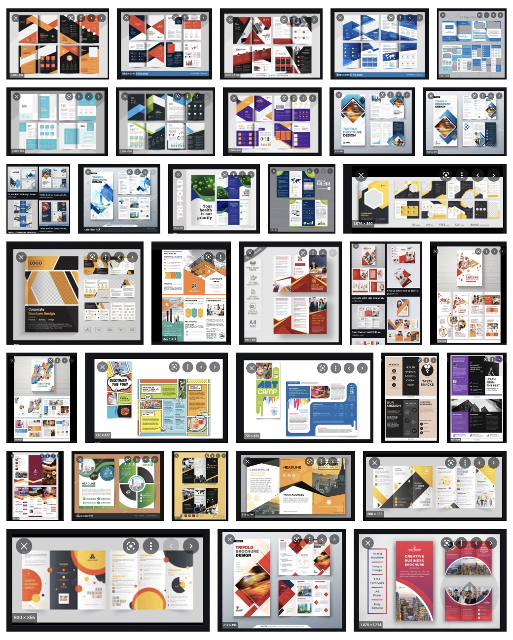
I'm not as familiar with brochures, so I wanted to get some ideas on how other people were able to tackle the brochure
and make people more interested in their product or company. I also wanted some inspiration on how to entice people.
Since we also had to have at least three different subheads, I wanted to see how other people decided to do their subheads
and make it connect. I was able to find some good inspiration through this and get some really interesting ideas.

Brainstorming
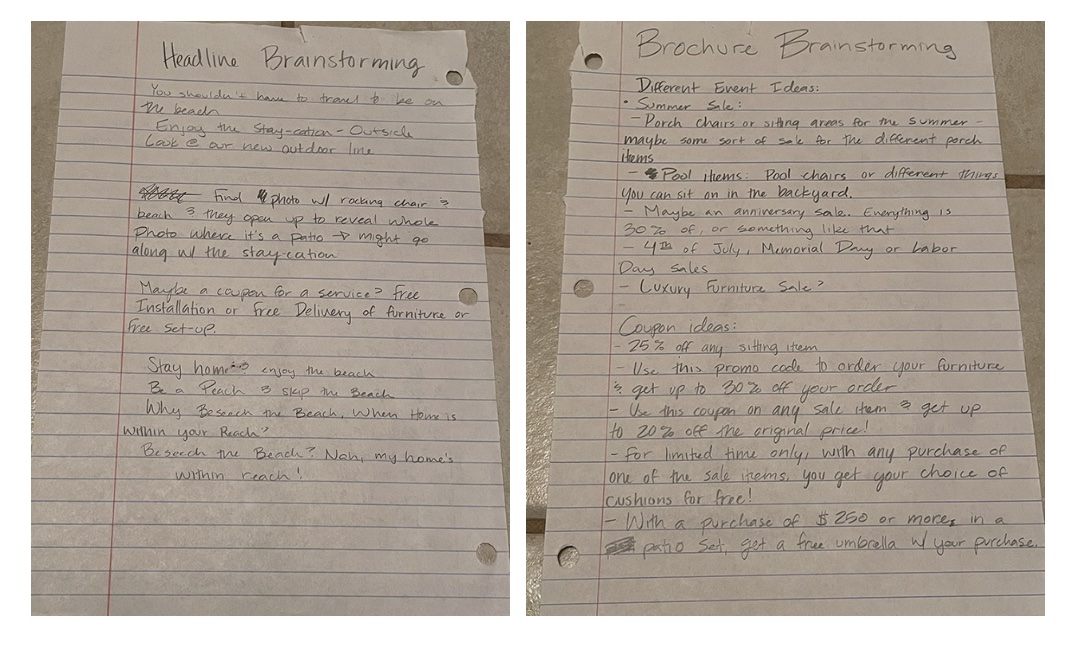
For this, I tried some different things. I was mainly trying to come up with the theme of the brochure. What did I want to say
about my company at this point? I was thinking and realized that I hadn't talked about summer furniture yet. So, I decided to
make my brochure advertise the selection of outdoor furniture we have. I also tried to advertise the headlines, trying to find
something fun and outdoorsy. It took me a while, but I think I finally set on something I liked.

Thumbnails
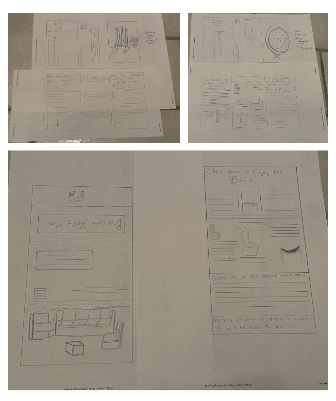
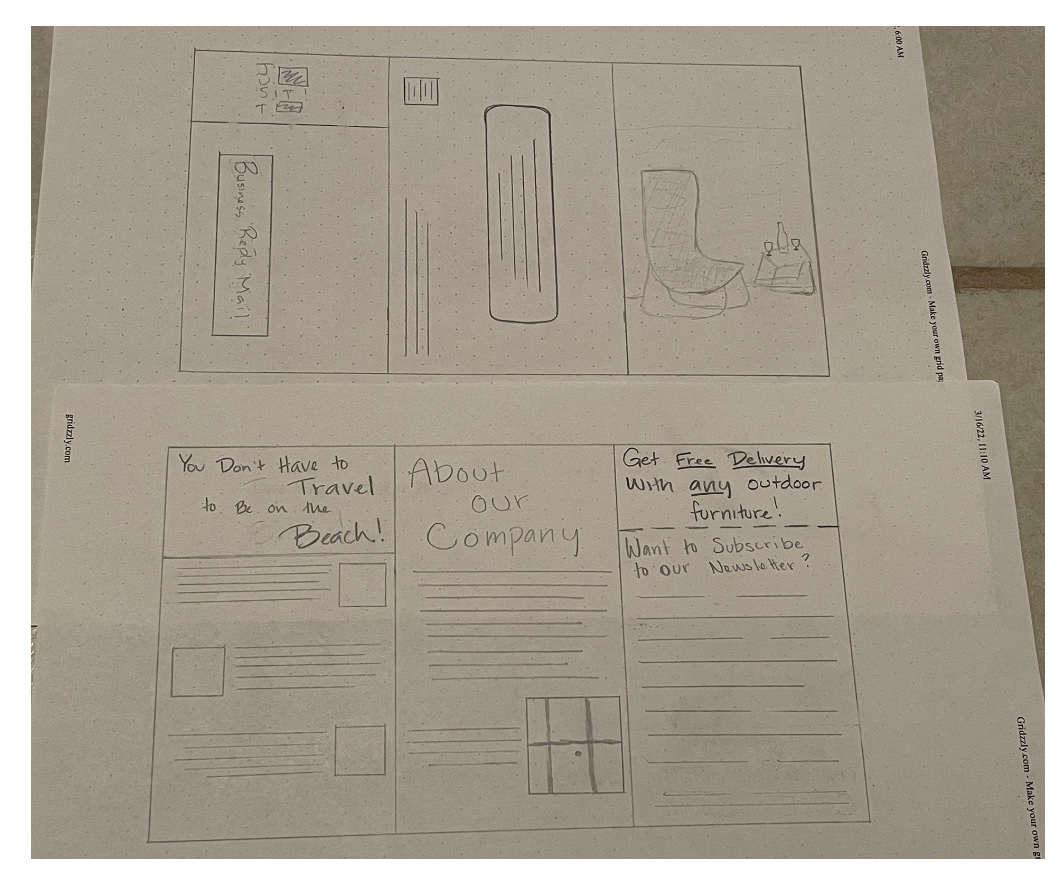
I wanted to try some different things, including a portrait orientation instead landscape orientation. I also played around with
different images on the front to try and bring in the audience. I also messed around with how to do the subheads. I tried some different
layouts or different fun things such as chairs acting as bullet points. I also tried to mess with how the map should look. Essentially,
I tried some different things on the thumbnails to see what I liked or what worked going forward.

Intermediates
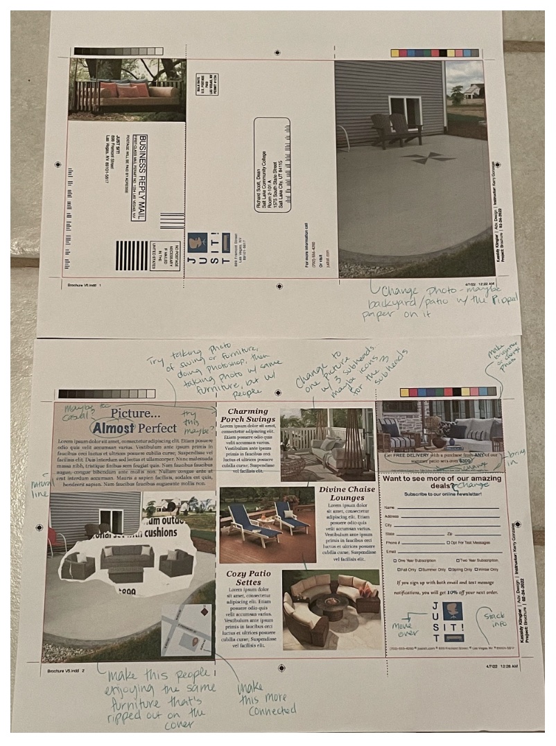
I had an interesting concept for this part. I had an idea to try and connect my brochure to the kit cover by creating something of a teaser.
I would have part of the image on the cover that would be very interesting. Then, on the inside cover, I would have something very scenic,
like people were enjoying the furniture and enjoying the view. I was planning on some interesting things with the map, like making it look
like a chair. Some fun ideas happening at this stage of the brochure.

Hand Final
Again, unfortunately, due to time, I wasn't able to complete the hand final. I decided it was more productive for me to go straight to the
computer and work out some things before it was due.
B&W Computer Progressions
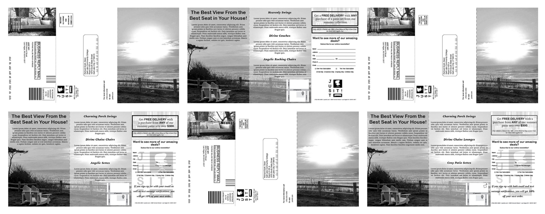
For these, I think I was mostly trying to get to the color, so I put the type, pictures, and map down. The progressions were more what I could
do better with the layout and margins, making sure everything worked. I also had other people edit the text I did write to see if it made sense.
Unfortunately, I have no idea what happened, but I misplaced my progressions. I definitely remember doing them, I just have no idea where they
ended up. I tried to keep everything in one place, but I guess I misplaced something. I apologize for the inconvenience. However, I can show the
different progressions I made on the computer. The majority of the changes I made were with the type and the placement of the different elements.

Color Progressions
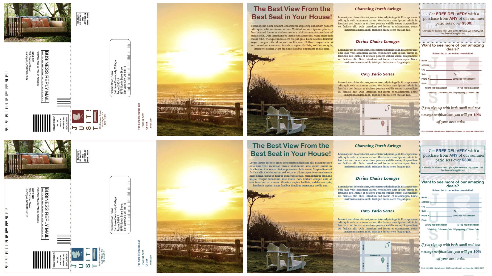
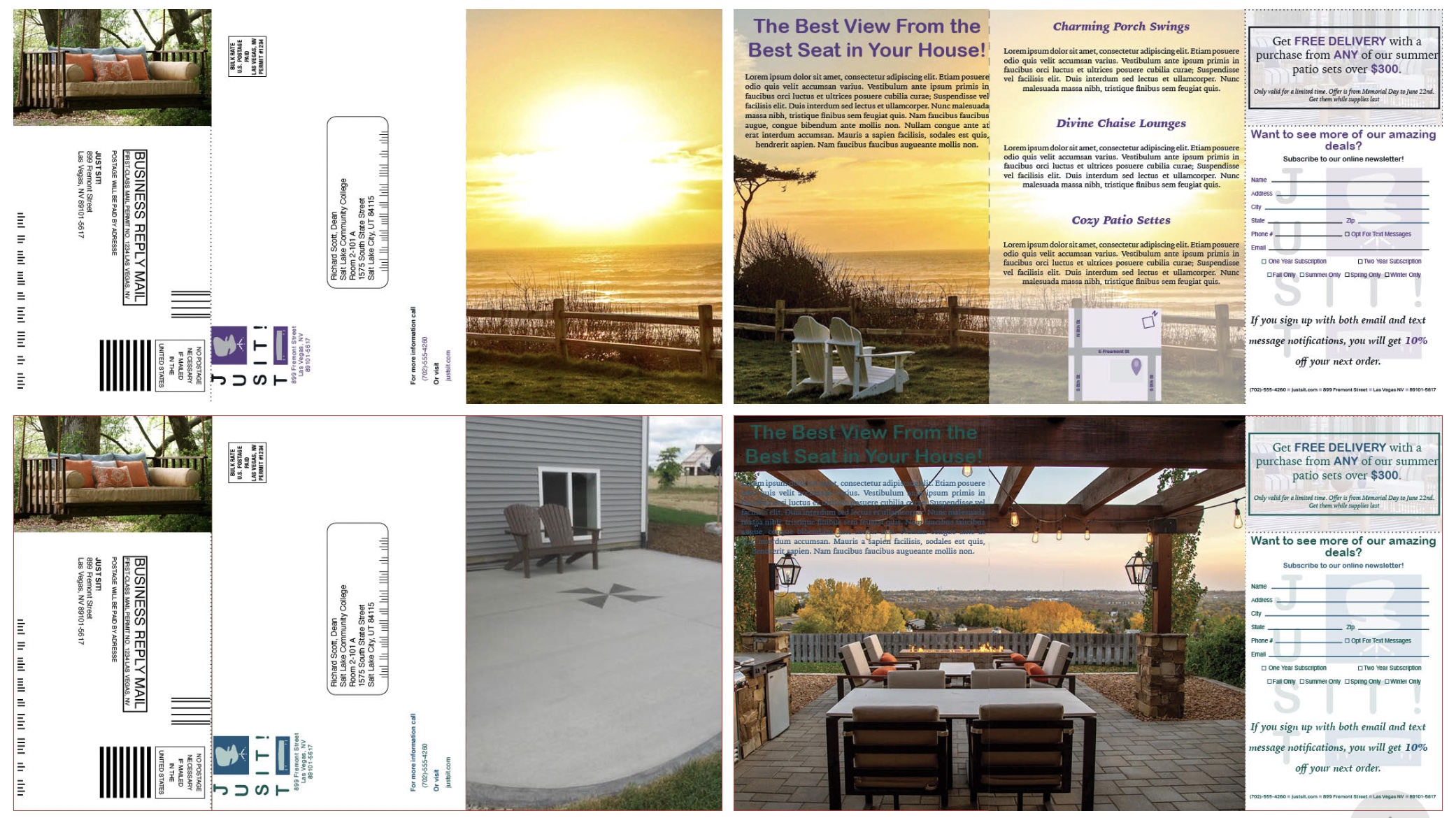
I messed around with the colors, trying to make sure that everything worked together. I didn't use as many colors as I probably should have, but
for some reason, I was under the impression that the pictures could be in CMYK, but the rest of the brochure was a two color. My bad. Anyway,
I struggled with the colors and know that it wasn't the best combination at this point.


Critique
As I expected, the colors weren't working. For the most part, my brochure wasn't working. The picture on the front wasn't enticing enough and confused
people more than making them want to look further. The three subheads also weren't working, so it would be better if I changed that. I was trying something
fun with the map trying to make it look like a chair. In the end, it wasn't making sense. There were a few other things, but you get the idea. I was struggling
with this one.

Final
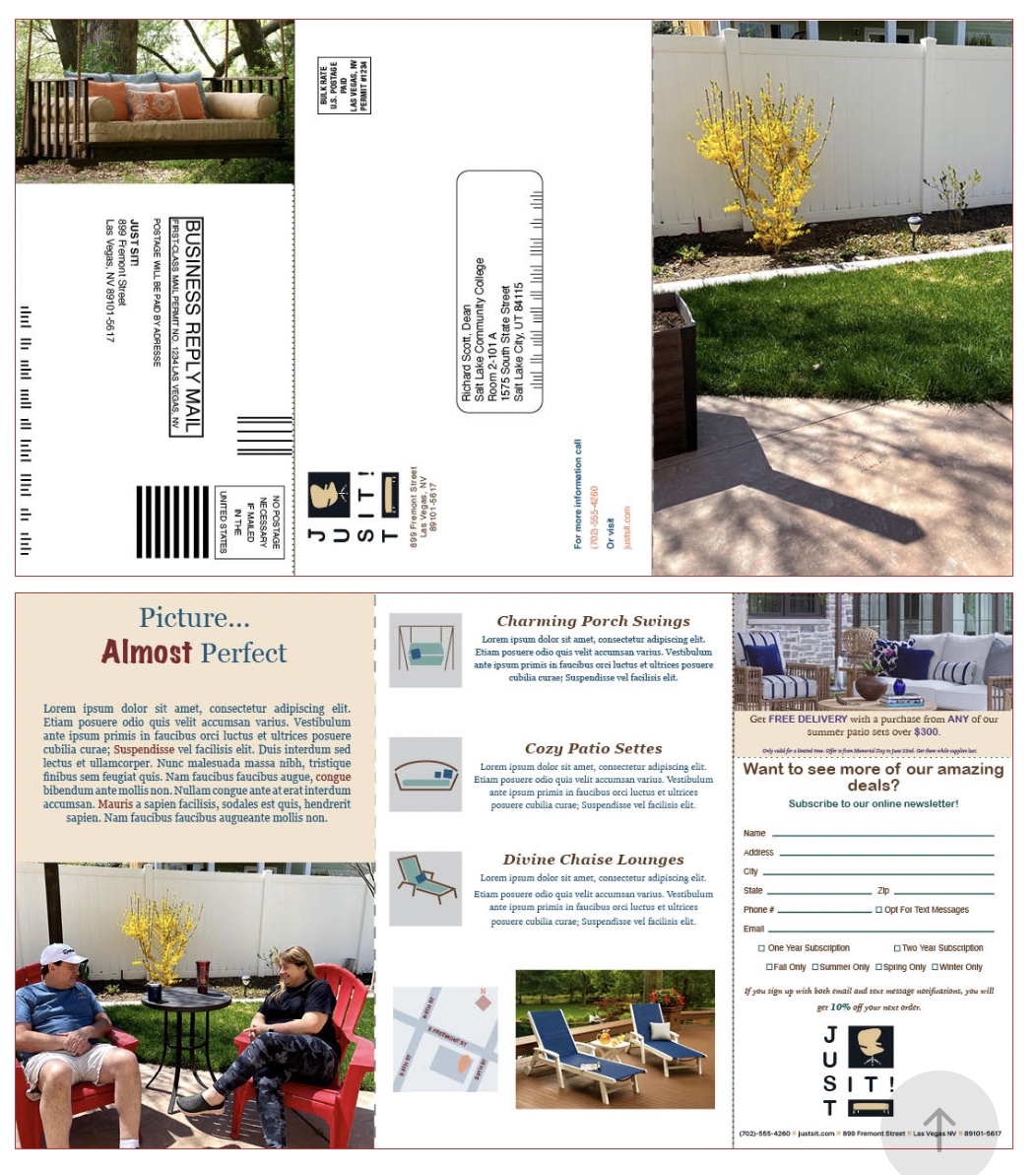
I think the final result ended up being a mash of good and bad parts. I ended up using more typefaces than I needed to. I think I used about 5 typefaces on this project,
which is way too much. I also used a few too many colors, which ended up making it too busy. Some things that are fun are the different symbols I used for the different
subheads as well as the different photos I used. Unfortunately, I wasn't able to get the ripped image I wanted to on the front, but I'm still pretty happy with the overall
result.
