Kassidy Klingler
My Work
Package Design
Adv. Type and Layout
Adv. Design
Kit Cover
Overview
For this assignment, we were asked to create a folder as a part of our branding project.
We couldn't use any words on the front cover and had to entice people using the cover.
We could have some type on the inside if so desired, but it's mainly a something a company
uses for people to carry important documents. So, in other words, this is meant to be a more of
a simple project. However, the tricky part is that we have to figure out a die line as well as
figure out a way to create a pocket on our folder. With this pocket, we also need slits so we can
put our business card inside.

Research
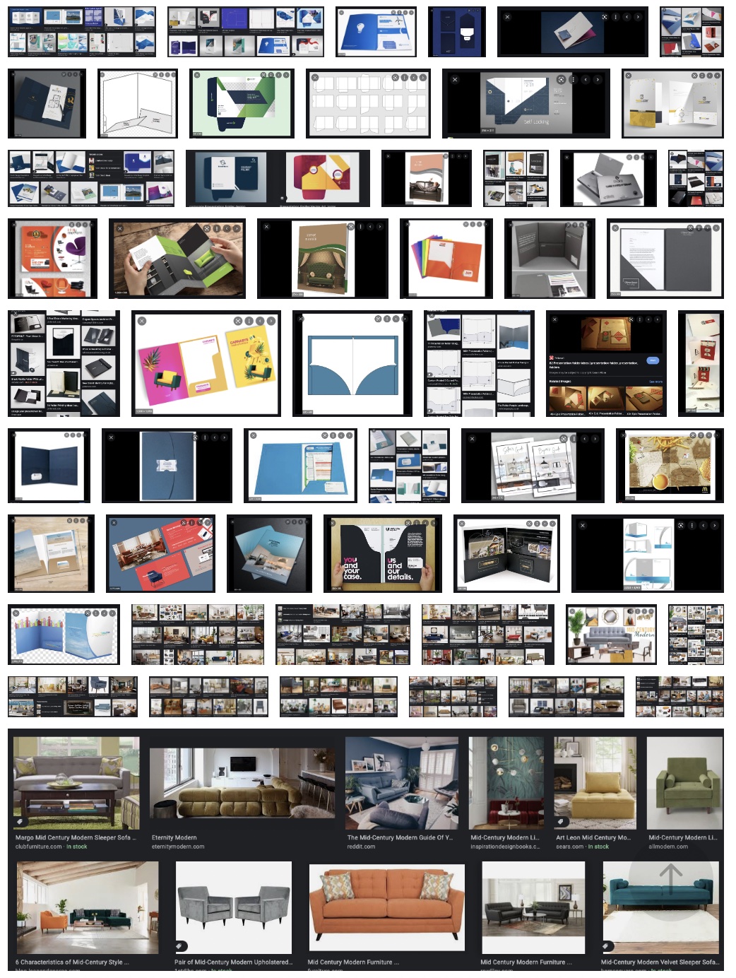
As usual, I started with the research. I wanted to be inspired by the different folders out there.
I also looked up some fun ways to do pockets. I thought it might be fun to do a different pocket on
it to make it stand out. Being able to look everything up certainly helped me receive much needed to
inspiration. It was also interesting to see how they made it match the rest of the stationary set. I
wanted to match the feel of everything else I had done so far, so I soaked up these ideas like a dry
sponge.

Brainstorming
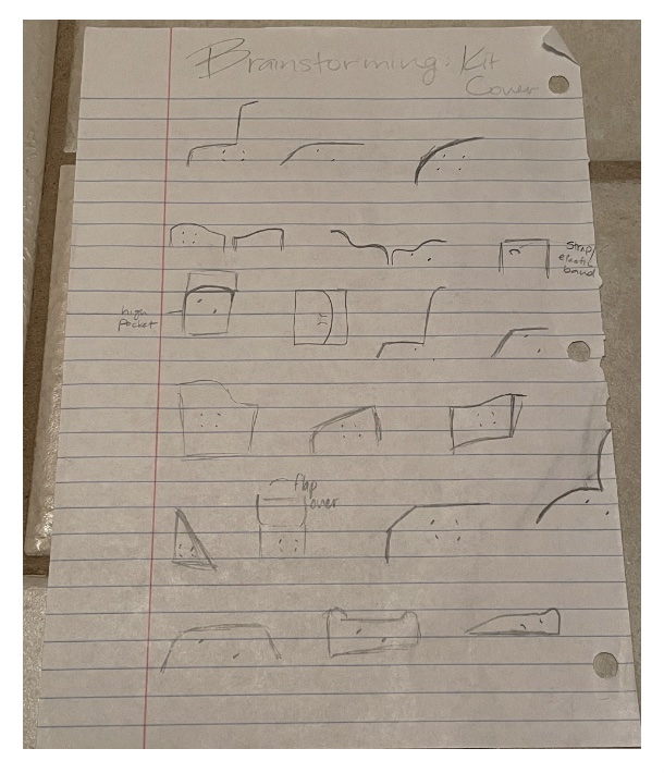
For the brainstorming, I decided to brainstorm some different ways to do pockets based off of the
research I had done. I figured this might help with the layout I wanted to choose when I got to that
point. Whatever layout we chose would determine if we would need extra panels or if we would need to
glue the pocket or not. I found some traditional pockets as well as some fun ones in my research, so
I decided to play around with those a little more. I'm glad that I did.

Sketches and Doodles
For these, I decided to play around with different layouts I could use before going to the thumbnails.
I played around with making some of the pockets into chairs, making some look like sofas, having on
pocket or two, fun ways to put in the business card, and so on and so forth. I didn't play much with
panels because I originally thought I was going to stick with the two. At this point, I think it was
more important to play around with the different ideas than to try and have a set plan of what I might
or might not do in the future, as I have learned from previous projects.
Thumbnails
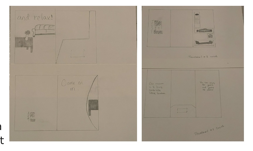
For the thumbnails, I mostly messed around with two panels and some fun pockets. I tried one where the
pocket would be kind of like a pillow to a couch background. The other two panel played around with the
idea of a chair on the front of the panel while the inside had pockets that kind of looked like chairs.
I did also mess around with a three panel. For this, I messed around with the idea of having a cut-out
that would tease the viewer, making them want to look inside to see the full picture. When they open to
the two panels, they'll see most of the picture, but they need to open all three to get the full picture.
The really difficult thing about this idea is that I would need to find the perfect image.

Intermediates
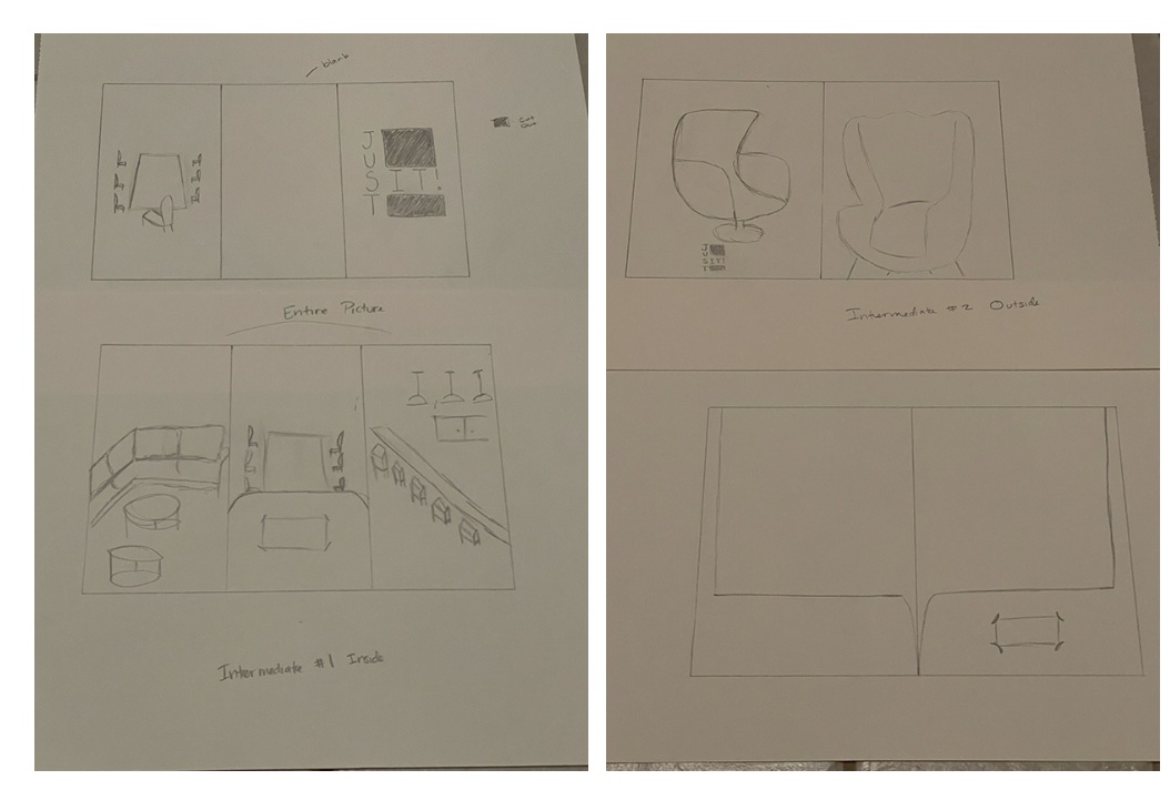
I explored the three panel idea more. I played around with the different layouts and the pictures I might
use for the real thing. I think I found a really nice picture. I also messed around more with where I wanted
to place the logo on the front page as well as the orientation of the business card. I think I also tried a
different pocket to see how it looked.

Hand Final
Again, due to time restraints, I don't think I was able to complete the hand final.
B&W Computer Progressions
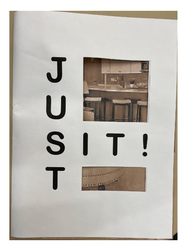
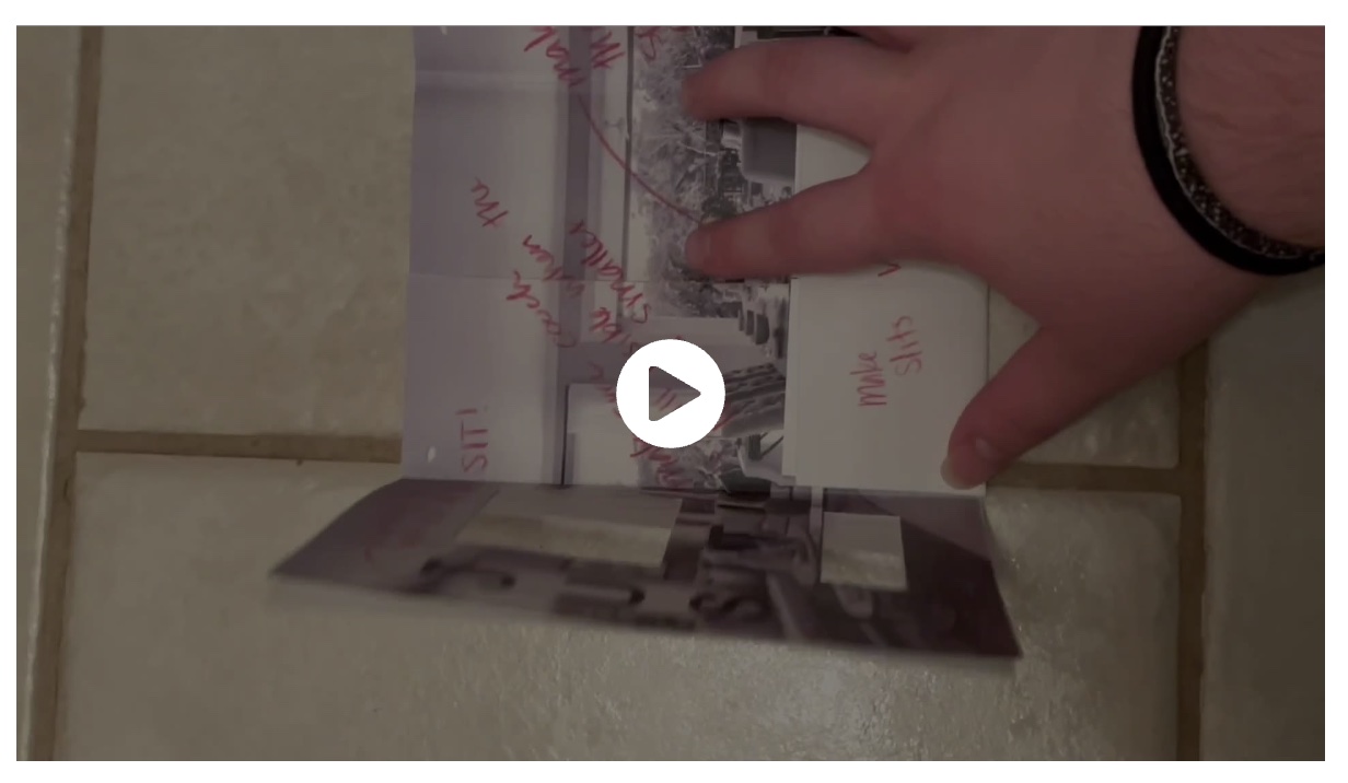
This looked really good in black and white. I made dummies to figure out if the cut-out showed enough of the
furniture in the picture to make the teaser. I also played around with the photo, trying to make it all look nice.
I also wanted to get the pocket right, so I messed around with how much I should cut on the inside to make it fold right.
Basically, I played around a lot trying to get it right.


Color Studies/Combinations
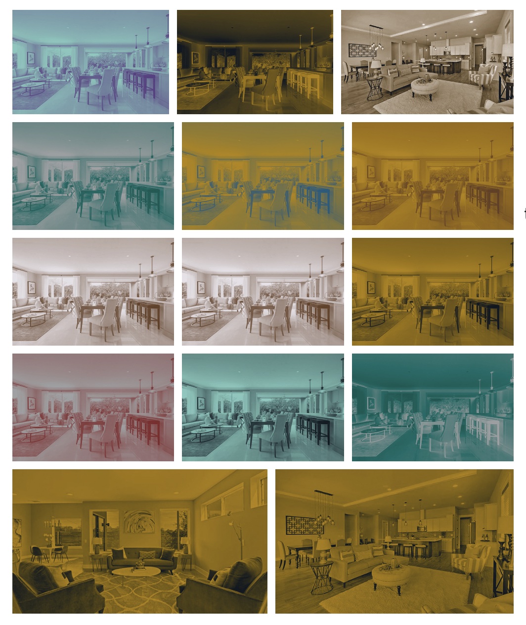
I did do some color studies on the kit cover, not realizing that the two colors from logo were the ones we needed to use.
I had some fun trying to play around with the different combinations and found brown to be a nice one. I also realized,
a little later, that I was doing a fake duotone and needed to learn to do a real duotone in Photoshop. After I finally
learned it, it looked much better.

Critique
Well... I had technical difficulties printing. Somehow, I got my math wrong somewhere and ended up having my folder too big.
I mean, really big. I was so embarrassed to come to class with the monstrosity, but was so relieved when we all had a great
laugh about it in class. We joked that we kind of liked it bigger. Being able to laugh about it helped me get through the
embarrassment. When we got to the critiquing part, I was told that my picture may need to change since it wasn't much of a teaser.
I wanted it to invite people in, but with the way it was set up, it was almost impossible to get it the way I wanted it.
I also accidentally had the wrong colors. I was only supposed to do the two colors we used from our logo, but I misheard
somewhere and thought we could use any two color we had in our palette. Oops, my bad.

Final
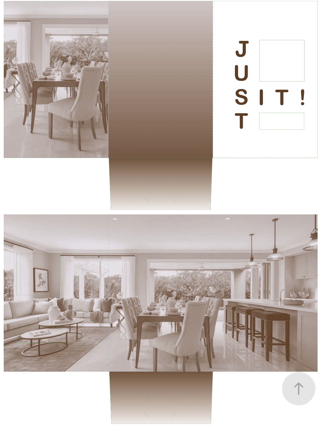
For the final, I did end up changing the picture. I'm going to change it again because it is too pixellated for what I want,
so I am planning on changing it in the future. I also made a correct duotone in Photoshop. It ended up being a nice looking
duotone that I'm pretty happy with. I also changed the dimensions, so what I have on file should be the right size this time.
I actually triple checked my math to make sure everything is how I wanted it before printing it. I also got rid of the gradient
because it was really distracting from my image. It was already an interesting and somewhat complicated layout, so I didn't want
to add a distraction with the gradient. Overall, I'm proud with how it turned out and I think it's a really fun idea.
