Kassidy Klingler
My Work
Package Design
Adv. Type and Layout
Adv. Design
Logo Design
Overview
In this project, we try our best to create a logo based off of what we've learned so far in our other classes.
We've been given four completely different companies to try and brainstorm for and eventually narrow it down to
one final logo that we will use later in our branding project. Essentially, this project is crucial for further
projects down the road.

Research
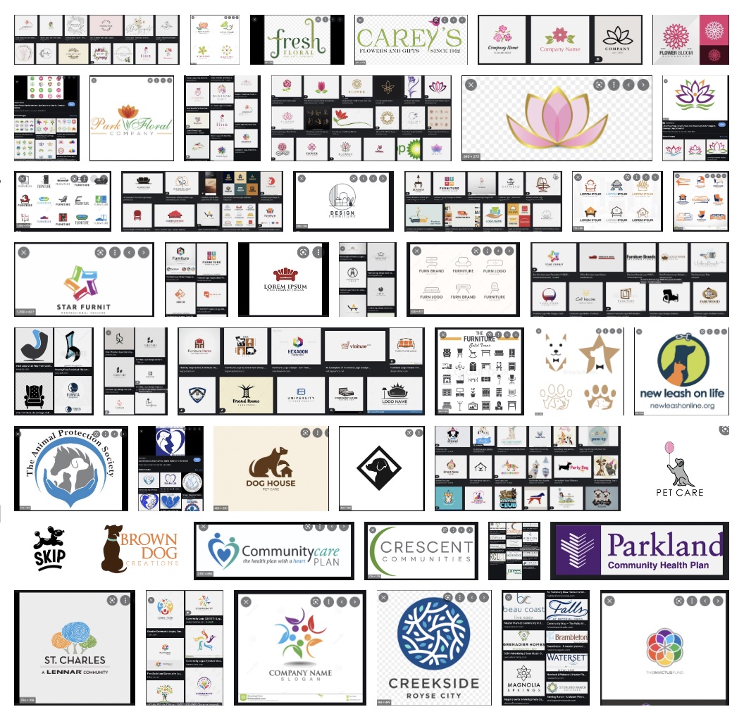
I was able to do a lot of research for this one. Since we're creating logos for four different companies to start out with,
I wanted to do some research on similar companies to see how they captured their company through their logos. I researched floral
companies (for the Bella Flora company), furniture logos (for the Just Sit! company), different logos with dogs in them
(for the Party Dogs A-Go-Go company), and different planned communities logos (for the Quail Hollow company). I tried to only
allow myself 30-ish minutes for each company so I didn't go down the endless rabbit hole.
I honestly had no idea what to do until I looked at these and was pretty much inspired! I was so happy since I was worried I
might get stuck on this project.
This research also really help me because there were a couple times I had to go to the drawing board and I wasn't sure where to start.
Luckily, the research I did earlier was very resourceful.

Brainstorming
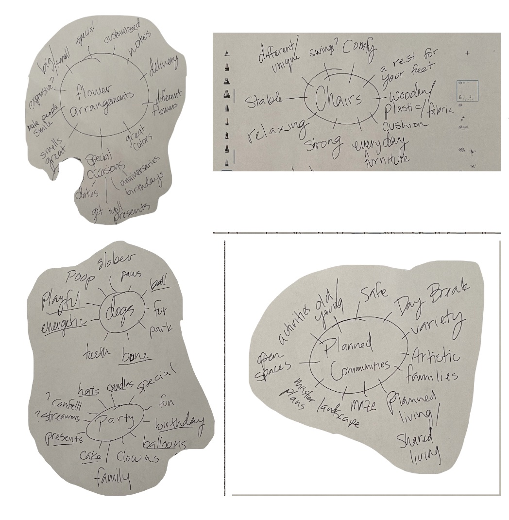
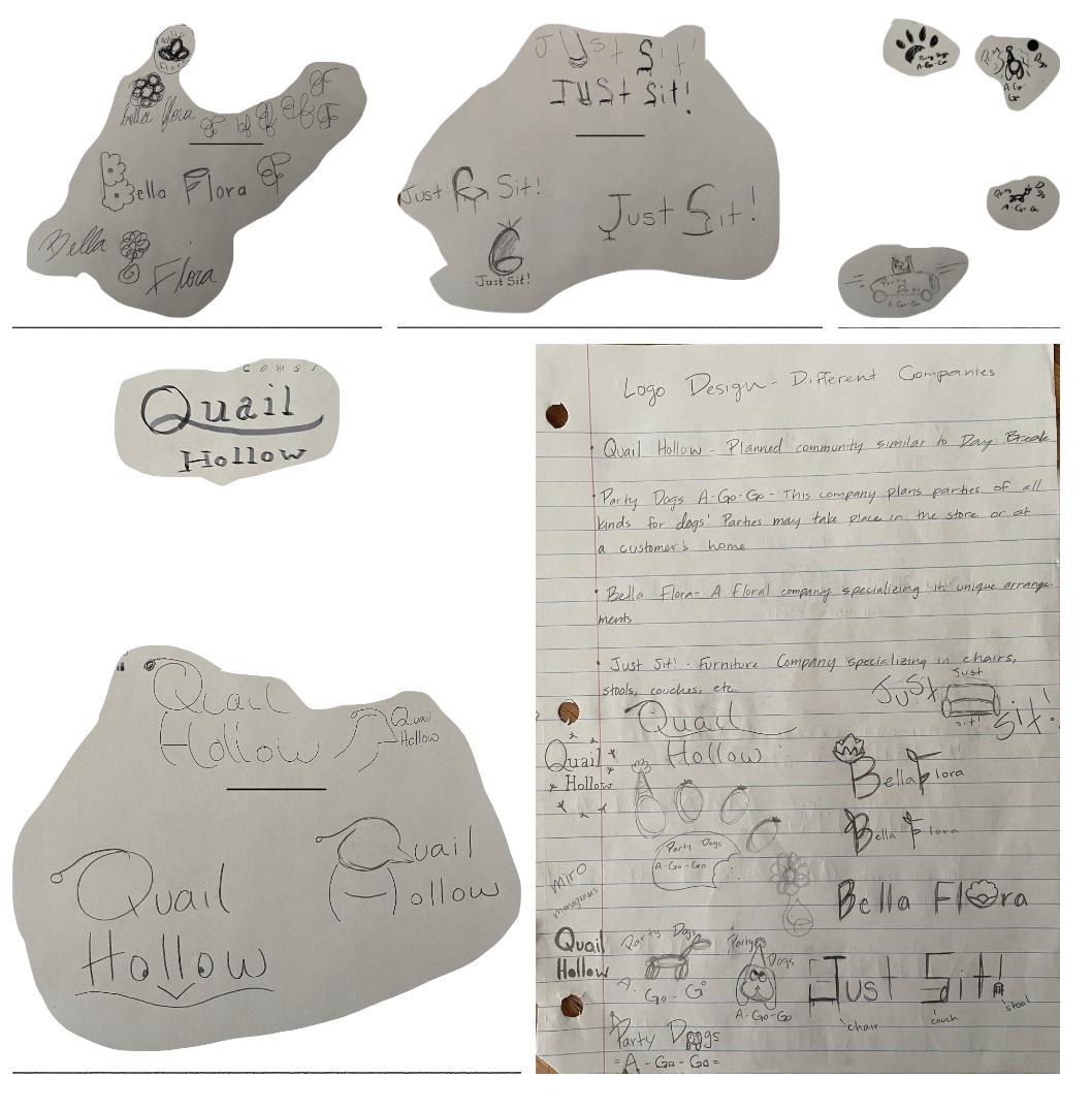
For brainstorming, I decided to do a brain map. I haven't done one before, so I don't think I made it like everyone else, but I thought
the important part was that my ideas and connections were out there and on paper. Well, kinda. I was trying to do these brain maps while
helping my sister with her math tests. The nearest thing to me was my iPad, so I did this brain map on a sketching app. Next time, I will
definitely do it on paper. Also, I started to sketch while I was brainstorming, which is why the maps are all is such weird shapes.
My apologies about that.
Anyway, this was helpful. I didn't think it was when I first made it, but the further along I got, the more helpful it became. It was most
useful when trying to sketch different ideas. Also, from the research, I got certain things or feelings for some of the logos I was trying to
design, so I tried to incorporate that.

Sketches and Doodles
I tried to have a lot of fun with these different logos and tried to make them different from one another, so they weren't all the same idea.
I also tried every idea that popped in my head at the time. I wanted at least 4 or 5 of each so I could have more options when I took 2 to do
the thumbnails from. I tried to take the class's suggestions from when I presented my sketches in class and I think the thumbnails turned out great!
I honestly had a lot of fun trying to think of all these different ideas!
Again, my apologies for the weird shapes, but I learned my lesson: sketch and doodle on different papers.

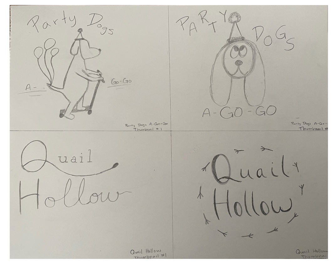
Thumbnails
I tried to take my sketches and doodles to the next level. I regret not tracing them in pen, but I learned and did it from now on on the intermediates
and final. It's so much easier to see when it's traced in black.
I took the idea of the dog in the car and instead put him on the scooter (mostly because the car looked like the "Go Dogs, Go" books). I also tried
to take a cartoony dog and make it into a cute logo. However, both of the Party Dogs A-Go-Go logos were not my favorite.
I also wasn't loving the Quail Hollow ideas. I think they were good ideas to begin with, but I don't really want to go further with either of them.
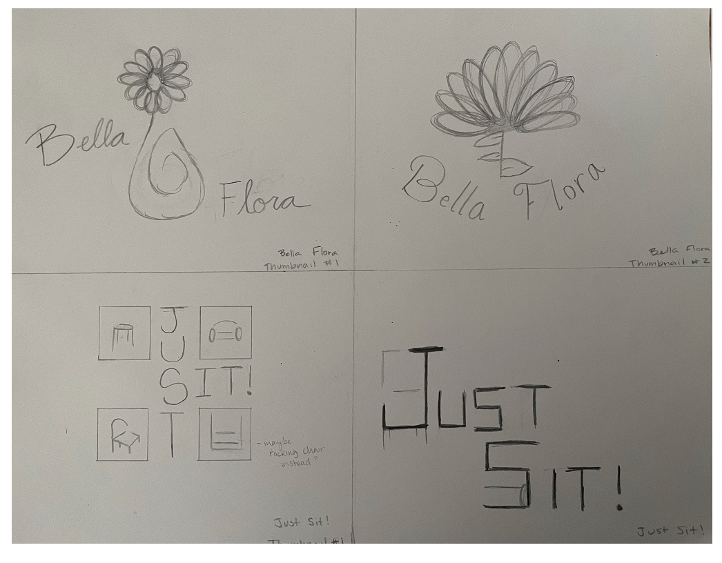
The Bella Flora logos are very interesting. The one on the right didn't have the leaves originally, but I thought it might be fun to make the leaves
look like a "B" and "F", but I don't think that idea translated very well. I did really like the one on the left. In fact, I took that one to my intermediates.
The Just Sit! was fun. I was trying to mess with the letters and tried to make furniture out of the letters or played with different simplified versions of furniture.
I really liked the one of the left and took that one to the intermediates.


Intermediates
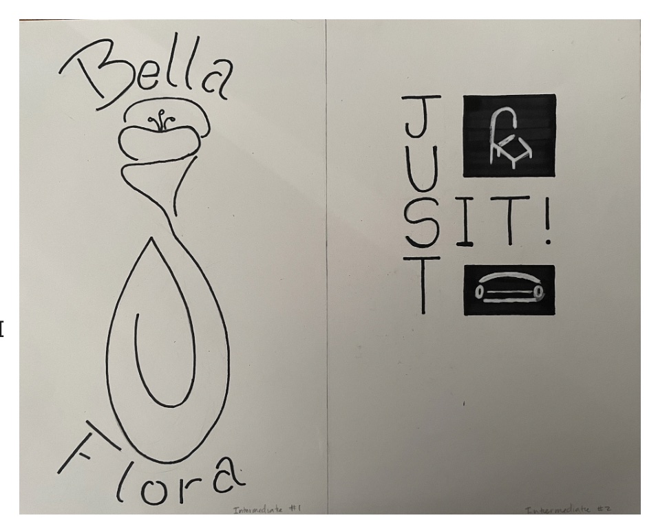
I tried to have more fun with these logos and also tried to incorporate the class's suggestions into my work. I changed the flower completely to match more
with the simple vase. Took me a couple tries sketching, but I eventually got it looking the way I wanted. I also had more fun with the typeface and tried to
make it match the style of the drawing.
The Just Sit! logo is where I took the most class suggestions from. I simplified it to only two boxes. I wanted them both to be squares, but if I wanted it all to line up,
I had to make one a square and the other a rectangle. I think it looks nice, honestly. I also like that the furniture was reverse and I think it really pops.

Hand Final
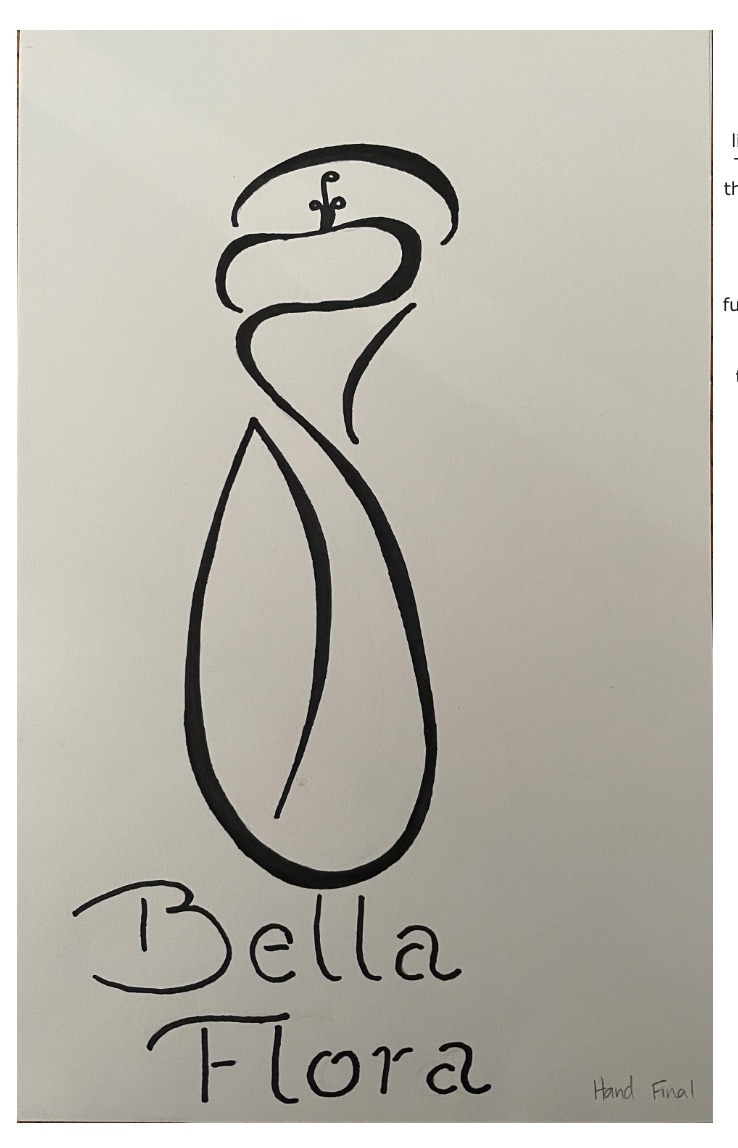
I decided to go with the Bella Flora logo to go to the Hand Final. I really liked the idea of the line art and had trouble thinking what else I could do.
Then, I had the idea to add thick and thins. It looked so much better with the thick and thins. I also had more fun with the type trying to make it a lot like the image above.
I actually really like how it came out.
However, when I took this to class, I was outvoted. A lot of the people, including my professor, felt it was better that I take the Just Sit! logo further because
it's working better and will be easier for me down the line. I wasn't mad; I just tried to think of it like a client saying they liked one design more than the other.
I was a little disappointed because I thought this one was good, but I'm trusting their judgement that it'll be easier for me down the line.

B&W Computer Progressions
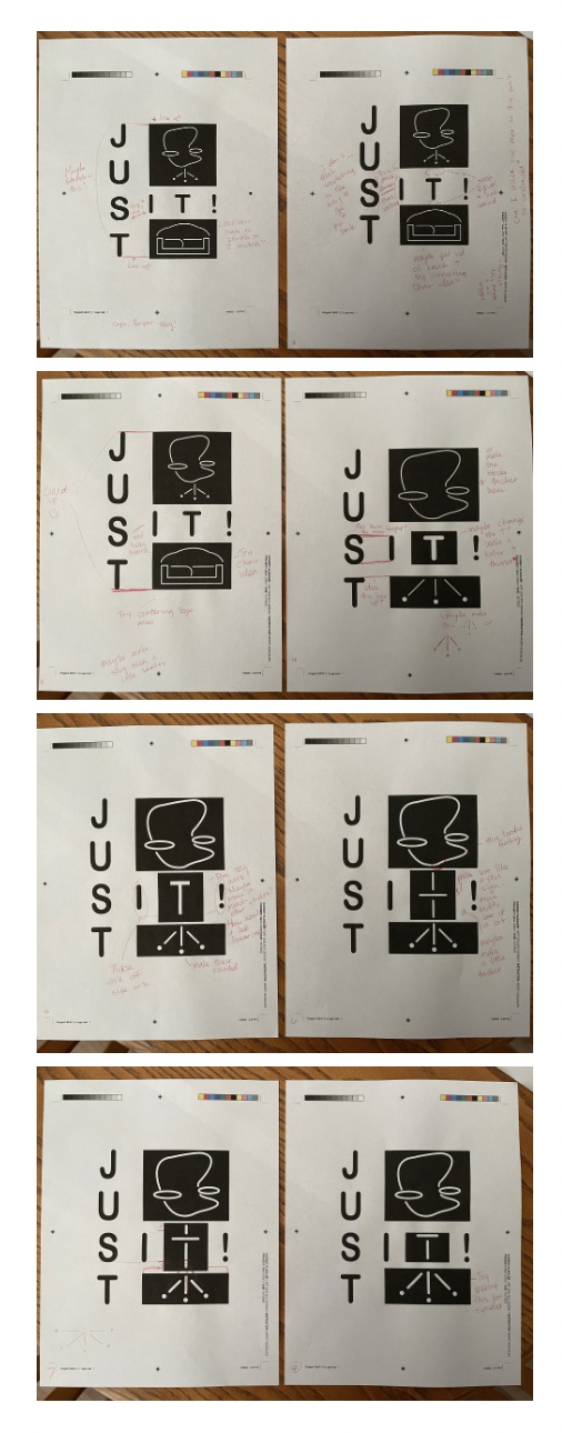
I made the chair and couch and little different so it would there would more of a difference and to so that they were more distinct (you didn't doubt it was a chair and a couch).
I tried to make it work, but the words were always offset and no matter how much I messed with the letters, it just made it worse or barely made a difference at all.
So, I tried a different idea all together.
I tried to make the "T" a part of the chair. I tried to mess with it and make it work. I think the final two progressions are my favorite. I like the lowercase "T",
but I asked some family members and they had a hard time thinking that this was a "T". So, I changed it to make a "T" that was in the same style, but still easily to identify.
I think it turned out pretty well!

Final Clean Version
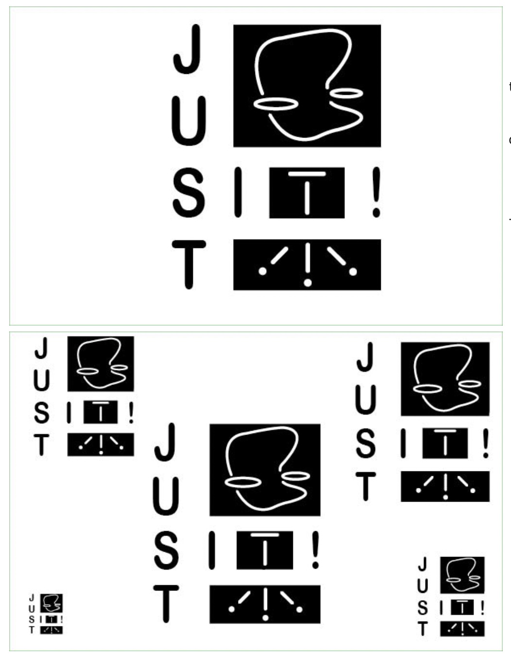
This is the final result! I think I'm pretty happy with the result. I think I tried to be creative with the words as well as the playing with the image. I did have a lot of
fun with this project and learned a lot about myself as well as the design process. I've never had to change my idea after deciding a hand final, so that was a good life lesson;
sometimes, the one I like isn't necessarily the best one for the job/design. Sometimes, I make it harder on myself. Overall, I'm glad I was able to do this project!
I love getting in some logo practice in!
This is the logo I turned in for the assignment. I did, however, make some changes as you will see down below.

Different Logo Variations
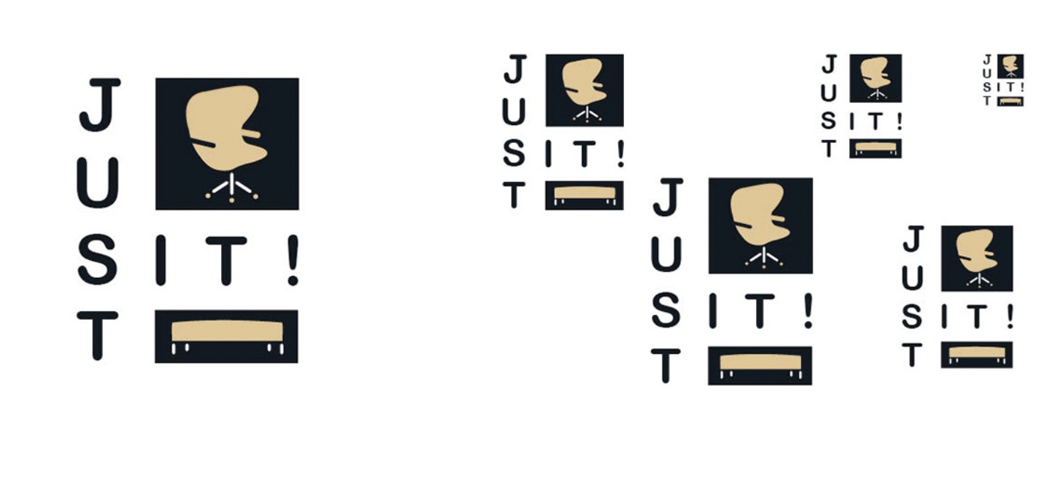
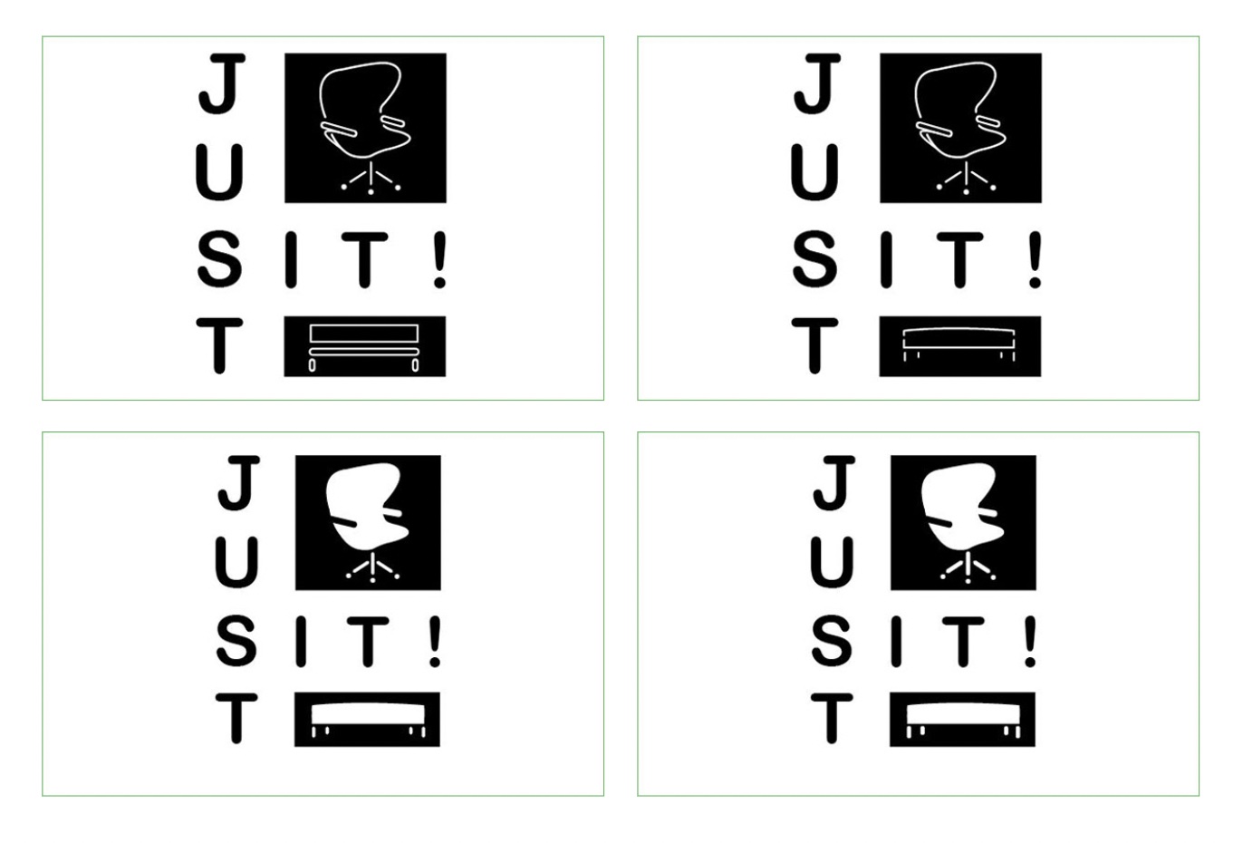
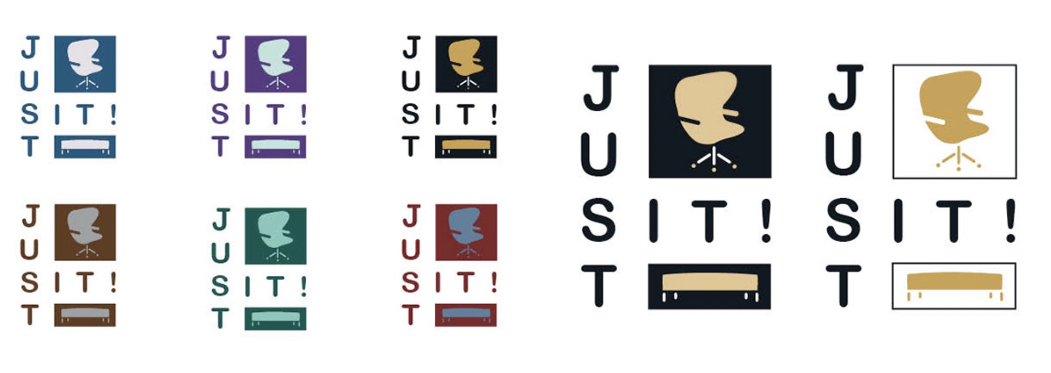
When I presented my 'final clean version', my fellow classmates told me that one of my earlier logo designs was working better than the current one. I went back a
little and made some changes to try and make it better. I kept changing and tweaking until I think I figured out the final product.
As my classmates mentioned, the 'T' wasn't working as the 'T' or as part of the chair. So, I went back to the chair/couch idea, except, instead of the couch,
I did an ottoman or bench, whichever you see. I also started messing with filling the shapes as well as making some of the strokes thicker. I also tried to make sure that the words
lined up better with each other, which is what I was struggling with before. I think I was able to figure everything out that I was having trouble with before. I also think that
it looks much better now.

Color Studies
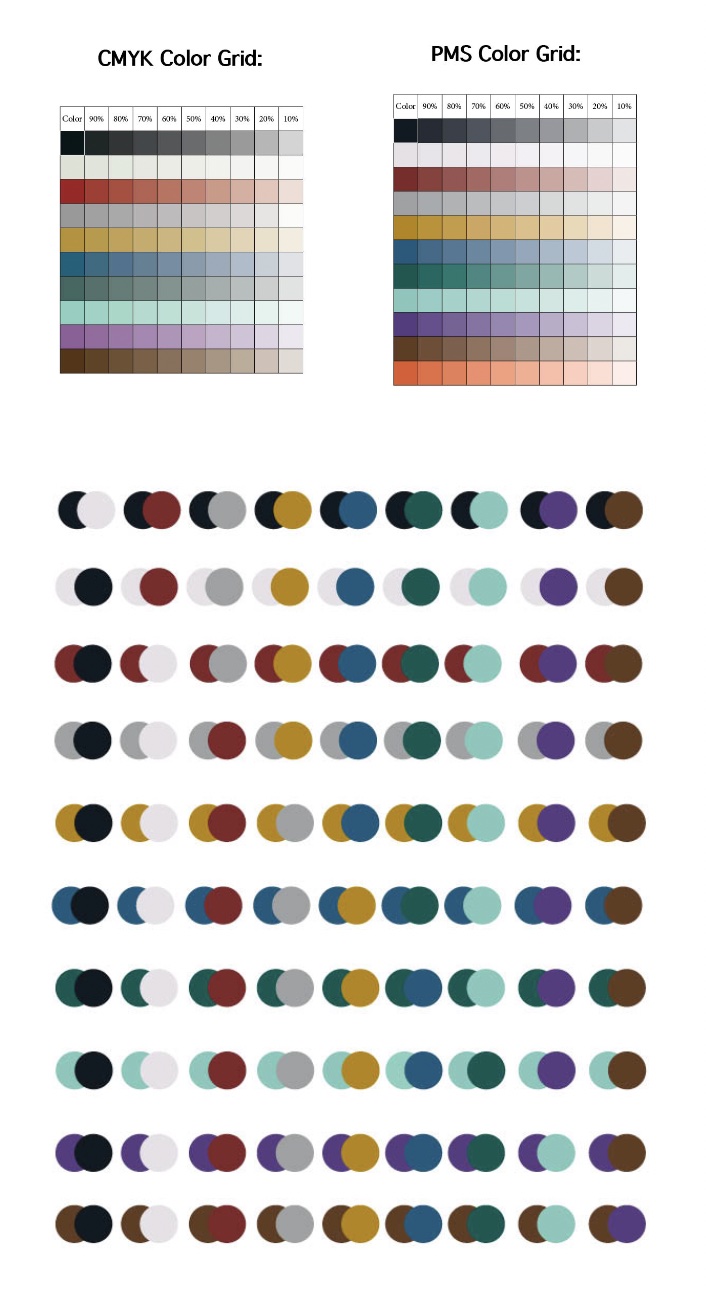
I know that we're only working in PMS colors, but I figured I could find the colors I want and convert them from CMYK colors to PMS when I found the colors I wanted. I used a website
to see the different colors with one another: https://coolors.co/. This helped me find some really nice colors that I think work really well together. I then went to a different
website to see the closest PMS color to the CMYK you put in as well as some other helpful information. Then, I made sure to make matches with each of the colors to see how well
they will work together. The orange was added later and I didn't have time to them into the circles.

Color Combinations
After figuring out the colors, I to apply the best ones to the logo. I found some that I thought might look nice and applied them to the new and improved logo. I did have some that
worked and others that didn't. I also played around with some tints and tried using the white or the paper so it looks like a three color instead of a two color. I ended up choosing
the yellow/goldish color and the black color.

Final 2C Logo
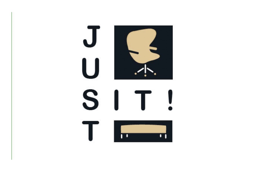
It took a little bit to get here, but I think I was able to be happy with my finished logo. It turned out better than I thought it would or, I admit, could. There was a while where
I was frustrated because it felt like it wasn't going anywhere. But, I finally figured out that I need to stop caring so much and let people help me to make my logo better.
I was being stubborn, I guess. And, I can say that it turned out better than I thought and I'm very pleased with the result.
