Kassidy Klingler
My Work
Package Design
Adv. Type and Layout
Adv. Design
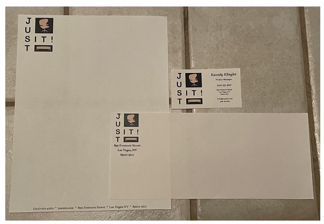
Business Letter/Letter Head/Business Card
Overview
For this project, we were challenged to creatively have our logo match some different things that are
common for a company, including business card, letterhead and a business letter. Business cards are the
most challenging, but the letterhead can get away from us if we're not careful. Another challenge is to
make sure all of these match and look like, as well as feel like, they are all from the same company.

Research
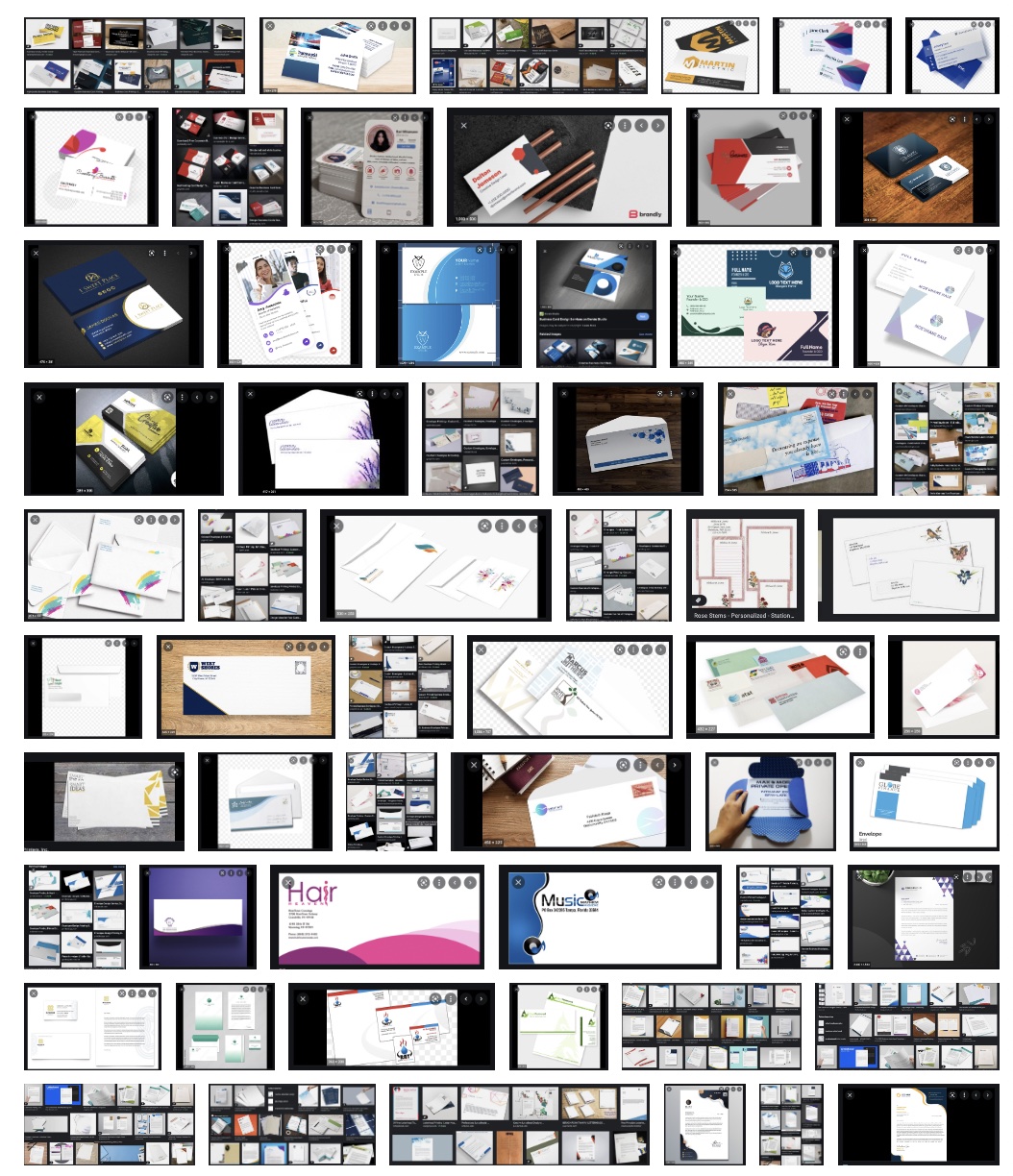
For this project, I tried to start the research with the business card. My professor mentioned that if we
figure out the business card, the letterhead and envelope should be much easier to figure out. We weren't
doing the back of the business card for this assignment, but it was nice to be inspired by how they were
able to keep a theme or a constant element as they designed the front and the back. It seems that the
business card typically has easier elements, such as geometric shapes or creative ways of separating the
different information. It was also interesting to see how they connected the envelope and how people designed
the letterhead to make it work with the business letter.
Overall, my research was very useful and completely inspired me to try some things out on my business card.
It also got the gears turning for what I could s do for the letterhead and envelope to help them connect.


Brainstorming
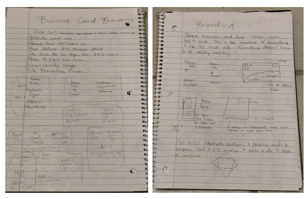
For the brainstorming, I mainly focused on the business card. Once I had that figured out, the rest should
fit right into place. I played around with different layouts for the business card, seeing which words I liked
where or what grouping of words worked best with one another. I also wrote down the different information I
needed to see how long everything was so I could try and work with it. I came up with some fun results. I wish
I had incorporated the logo with my different configurations, but I still got a fairly good idea of what I might
to do when starting thumbnails.

Sketches and Doodles
I'll be honest: there are many sketches and doodles for this project because I was trying to figure out how to do
some fun things with this project. Some were out of frustration and others out of feeling inspired to try to do
different things with this project. But, much like any project, keeping it simple is usually the way to go.
It took me a while to come to terms that simple is okay. I mostly felt small because it felt like everyone else
had a fun design. Later on, I went to the Portfolio review hosted by the AIGA. Seeing how simple some business
cards were made me feel better about my own simple business card. My logo was a bit complicated, so the simple
option may be the best option for what I'm doing. I tried to sketch all three together so they would all look uniform.
I also did this so I could try and think ahead, seeing what would work on what and what wouldn't work early on.

Thumbnails
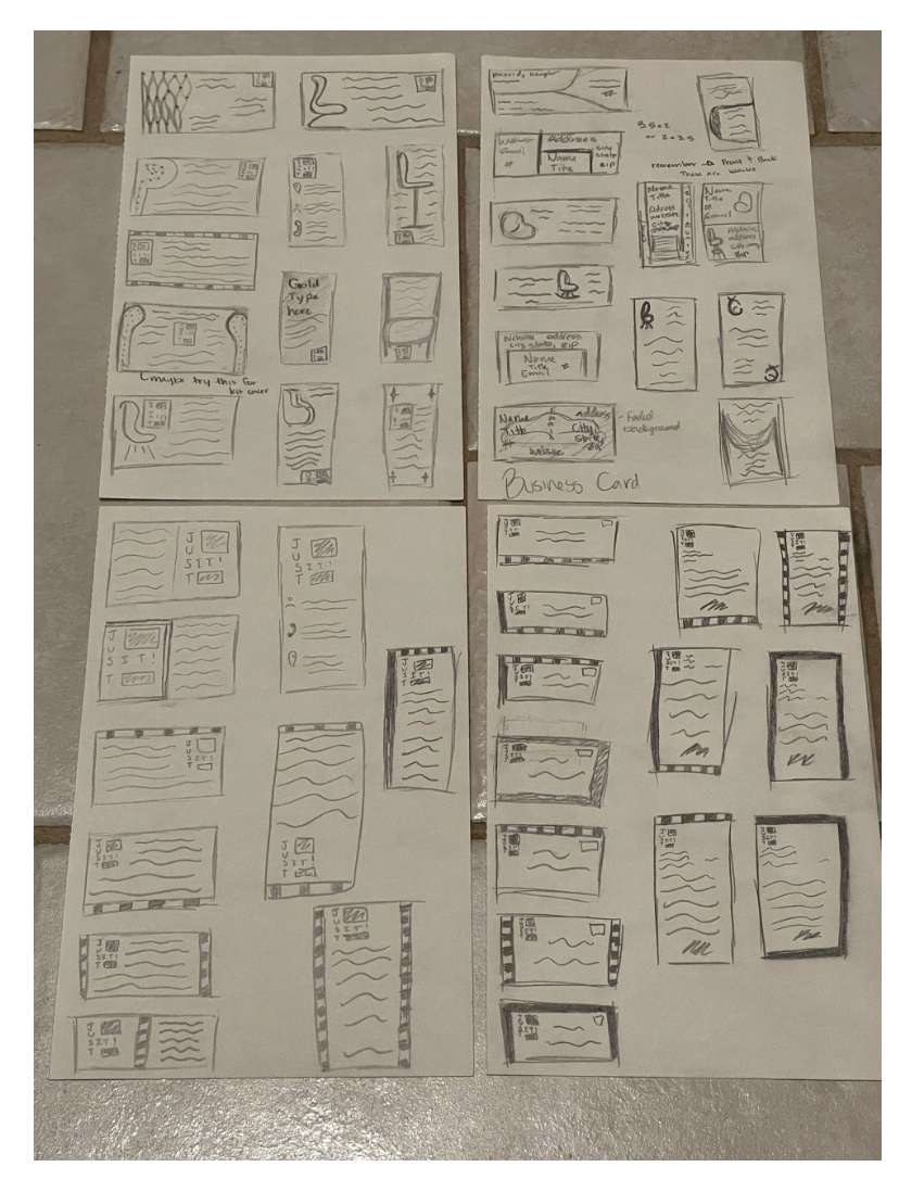
For the thumbnails, I tried different things, trying to be fun with it, but they ultimately ended up not working.
They made the page too busy or were a little too extra for the assignment. I then went back to the drawing board and
tried some different things to see if those would work better. I was trying to do all three of them at the same time
so they would have the same feel, but I knew that nailing the business card would be the key. It was just a matter of
getting there.

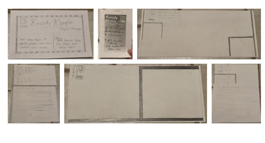
Intermediates
Nope. They didn't work better (XD). They were still too busy for the kind of look I was going for when I created my logo.
I wasn't sure what to do, honestly. I felt like I had given some creative ideas on that one, but they were still too busy
and distracted from the company and logo. So, I tried the drawing board again. The business card still wasn't right, so I was
still trying to nail the card to get the other two styles. I was starting to get really frustrated at this point.

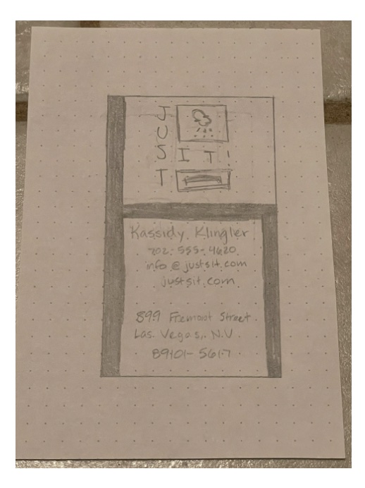
Final Hand
This final hand was very frustrating. I guess I was just a little stubborn, refusing the fact that I could go simple and it
would look good! I felt a little inferior because other people had so many other creative ideas and none of mine were working
well for what I needed. I finally just decided that it's okay for it to be simple; everything doesn't have to be this over-complicated
run-around. My logo took a lot of work and was a little more busy, so business card, letterhead, and envelope may need to be more simple.

B&W Computer Progressions
For these, I was starting to mess around with the layout, trying to figure out where everything should go. I think I only did the
progressions on the business card, simply because the other ones don't really need it as much. As I've said through this whole thing;
if you figure out the business card, you figure out everything else. So, doing the business card in the black and white made the most sense.
For some reason, I think I lost these too. I'm not sure where they went. I know I printed them out and that we critiqued them, but I have
no idea where they went, so I apologize for the huge inconvenience.

Color Studies
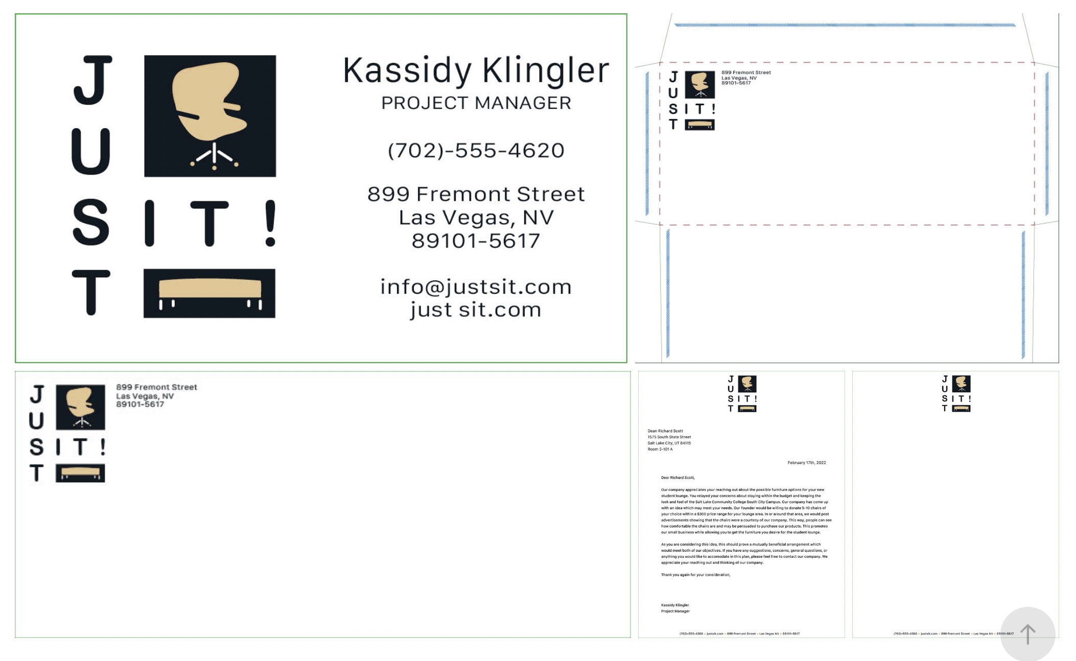
These were really easy since we were using the same two colors from the logo. The hard part was figuring out which parts should go where.
What I mean by that is figuring out if I should use the black pantone, the gold-ish color, or just leave it process black. I ended up doing
different things for the different pieces, but they were cohesive enough that you could tell they were from the same company. I also added a
yellow tint in the background, a last attempt to make it more interesting.
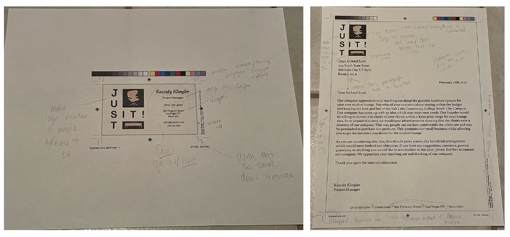
Critique
I learned a lot of different things with the critique. I needed to change the information on the bottom of the business letter to make it work
better as well as add a 'golden' box to separate the different information. This was a good suggestion since a majority of my logo is a square shape.
I also had the suggestion to change some of the layout on the envelope because it was a little wonky and didn't look right. I wanted to mess around more
with that if I had time. There wasn't much of a surprise when I was told to watch my margins and to bring my text size down. I don't know what it is about
margins and text, but I haven't gotten the concept down yet. Oh, well. I'll keep trying and try and learn the lesson. Also, as I suspected, the yellow tint
wasn't working. It made the paper look old, which was a huge 'no' for me and the company.

Final
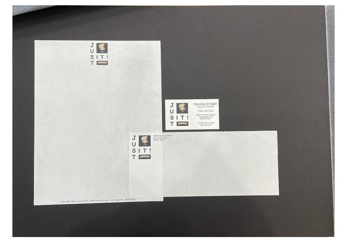
Overall, I am very proud with the end result and with what I was able to accomplish. I think I really learned a lot from this step in the project, mostly
because of all the missteps I took and with the different frustrations I had while trying to do this project. It was very tough for me in the beginning, but I
think by the end, I was starting to do better with constructive criticism and realizing that I can't compare myself to other designers. I have to do my thing and
trust what I know. I also have to try different things, especially things that may be simpler than what I imagined, but end up working much better for the benefit
of the project. And, a little for me.
