Kassidy Klingler
My Work
Package Design
Adv. Type and Layout
Adv. Design
Zine
Overview
For this assignment, we were challenged to make a Zine, which was explained to us as being a self-made magazine.
Our topic: our COVID-19 experience. Since this is an advanced class, this is meant to put everything we know to
the test. This project is meant to include more type than illustration, but it should also be fun and reflect our
personality as well as our own individual stories during this crazy scenario. We definitely use everything from what
we've learned so far in class, but, again, this is a test to see if we are capable of being able to see this and apply
it to our project. We also had all semester to complete this project, so we had a lot of time for inspirations and renditions
on this project. Well, it seems like we have a lot of time anyway.

Research
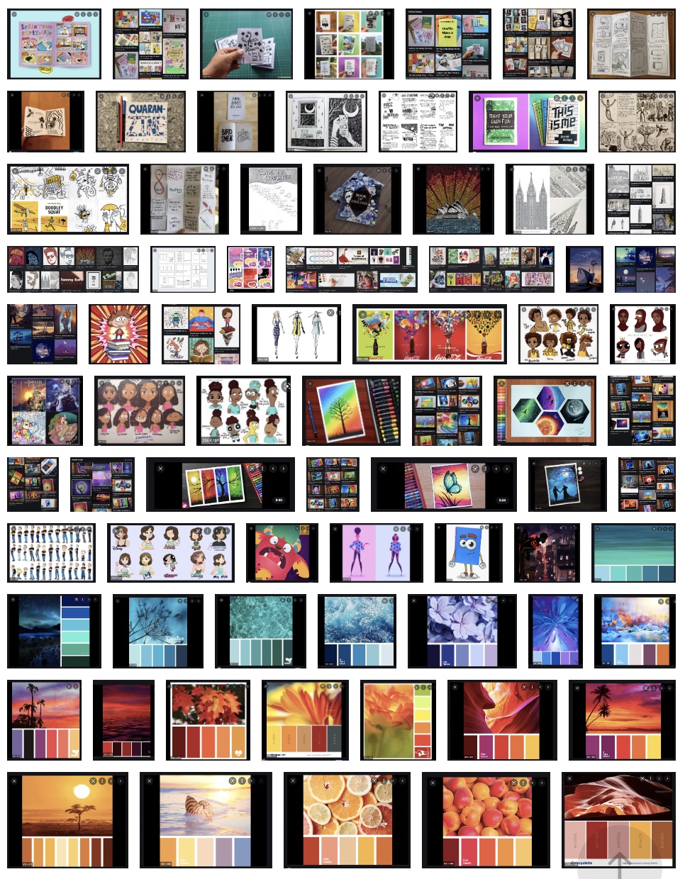
I wasn't exactly sure what a zine might look like or might need to include, so I sought inspiration from Google. I tried to
look at different art styles, typographical treatments, contour types, color studies, and so much more. I wanted to be prepared
for the ride I was in for. I knew there would be speed bumps, so I wanted to be prepared if I could. When looking at the different
zines in my research, I was also looking for inspiration on titles since I was struggling to try and come up with any. I was able to
get some ideas from this and started to try and brainstorm some more ideas.

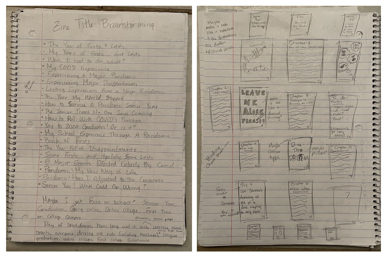
Brainstorming
For the brainstorming, I started brainstorming topics I might use. I played around with many different things, including a timeline or
interviewing family members. But, being able to tell my story was a little hard to pass up. But which topic? There was a lot that happened
during the pandemic. Do I talk about the different things I tried to do to keep myself busy, my feelings, or my school story? I felt that my
school story was the most compelling. I'm a 2020 high school graduate and it was a hard time for me to accept my ideal graduation wasn't going
to happen for me. So, I decided to focus on the school aspect of my COVID-19 story. Besides my senior graduation being a little different from
the traditional, I also decided to start college during the pandemic. So, I decided on this aspect of my story for a theme.

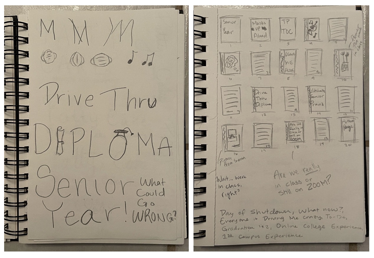
Sketches and Doodles
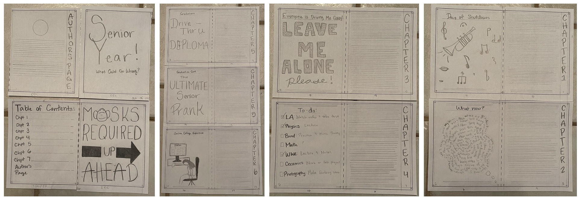
Here, I tried several different things. After choosing a topic, I tried to create a layout so I could try and figure out how many pages I might have.
I knew this could change, but it's nice to have a good idea. I also started messing around with different ideas for the different chapters and what
I might put as illustrations. With trying out different illustrations, I also started messing around with different typeface styles I might want to
use with the Zine. I tried to have some fun with it.

Outlines
The outline was pretty simple after choosing a theme. I wrote down everything I could think of pertaining to what I wanted to talk about. I tried to keep
it short, but I am not very good at summarizing. To me, if I wrote as many ideas as possible, it would be easier for me to build my storyline. So, I figured
a little longer outline might be worth it in the end. Later on, when it came time to write my storyline, I ended up being write. I was able to get the storyline
done faster because I had been a bit more thorough in my preliminary work, which I am extremely grateful for.

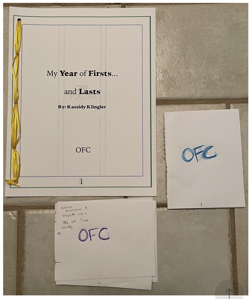
Initial Dummy
I know this is a bit of an after thought because it won't rest the match of my layout, mostly because it is an after thought. I forgot to include it when I was doing
the website, but I figured it was better to have it on here and look a little weird than to have it on the bottom where it would definitely stick out like a sore thumb.
I think from the beginning I either wanted sewn bound (I'm sorry, the name escaped me) or saddle stitch. Those are the ones I've been playing with the most. That and
perfect bound.

Thumbnail
For this part, I tried to play around with some of the typefaces I was trying during the sketches and doodles. I also had a few other ideas, such as my picture in a circle
on the author's page and the different thoughts being individual thoughts. I also tried some different treatments of the headers, titles, and page numbers. I tried to include
some honorable mentions such as different crafts or different things I did during the pandemic. I ultimately decided against this idea because I thought it was a bit much and
distracted from the main theme. I also decided to change some things, such as the In-class/online experience. I wasn't a huge fan of the typeface I was playing around with,
so I decided to go with something else. There were also plenty of other changes, such as where to put the contour type.

Intermediate
I tried a couple different things here. I kept playing around with the different headlines, seeing what else I could do that might look nice. For this, I did some siders as well
as some normal centered headlines to see which ones I liked better. I then decided to make the thought bubble my contour type. I figured this made the most sense. It also gives
off the feeling of being overwhelmed with a lot of thoughts. I changed a little of the typography to make it more fun and interesting. For the to-do list, I made it more of a
checklist than just a list of items I needed to do. There were more changes being made, but you get the idea.

Final Hand
When being reviewed by the class, they had a few suggestions for me. They felt I should change the chapters by removing them and just keeping the fun headlines. I moved the headlines
to the side of the page where my illustrations were and kept the text and the page numbers on the other page. This looked much better and was a good suggestion. I also changed the
thought bubble so it was more of swirling thoughts rather than a whole bunch of different thoughts all clumped together. I also decided to put a picture on that page so I could keep
a pattern of which pages had photos and which ones had illustrations. Around this time, I also had an idea to make a chord running around the whole piece, but I wasn't sure how to go
about it, so I put the idea on hold for a minute. I also changed the "First College Experience" to be something to do with type and illustrations rather than a picture. The author's
page bothered me, so I changed the circle to be a square instead. Also, sorry the video is sideways. I couldn't figure out how to make it right side up.

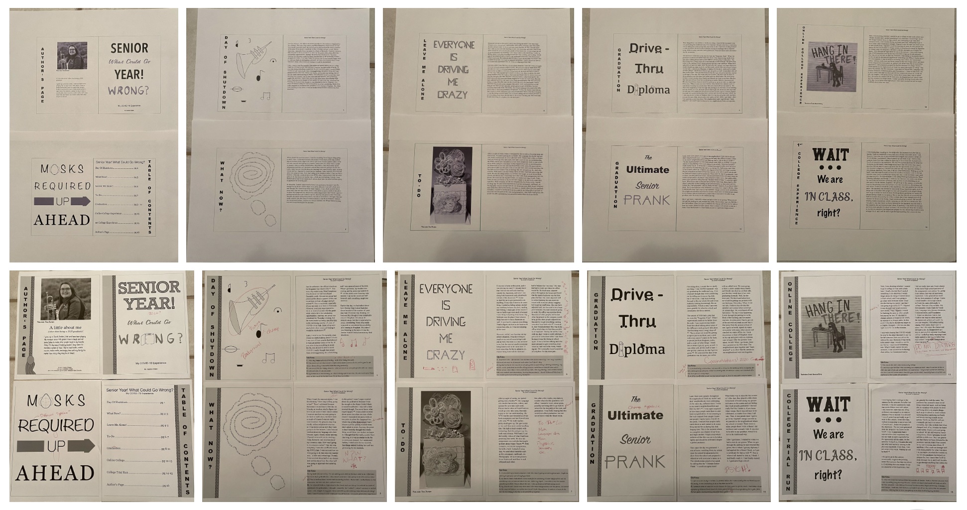
B&W Progressions
These I struggled with a little bit. I didn't do as many as I would've wanted, but I figured it was better than doing nothing. I was able to get some good feedback from this, so that's
what's more important. Honestly, I was a little behind when it came to the progressions review, so I was just putting the basic things on there from the hand final and changing some different
things. I wasn't proud of it, but we all have to do what we can just to finish the project. I took what the class suggested like a sponge because I was embarrassed to show what my zine was at
that point. I felt behind, mostly because everyone else had so many more creative ideas and theirs were more developed than mine was at that point. But, I did make another progression after that
class and made the necessary changes to be better prepared for the next class.
It kind of looks like two completely different things. I changed a lot of the things in there, making it better and more interesting to look at. As I mentioned above, I put in a lot of the suggestions
from the class as well as a few creative ideas of my own. After making the different changes, I then decided to print it out and have my mom go through it, asking if she would be my editor. She did and
found some mistakes that I corrected. I also had different ideas as I started changing to two column. There was so much empty space. What could I do with it? So, I drew some quick doodles of what I
could do and added those in. I think it really helps bring it all in and makes it so much more interesting to read. I liked the band I added on as well as the chord I received for graduation. All these
different changes help to tie it all in much better.

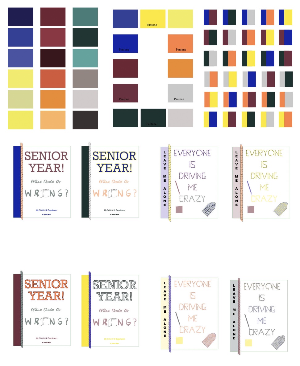
Color Studies
I struggled a bit with the color studies. I wasn't sure about colors and it seems the more I try to play with them, the more frustrated I become. It's definitely become this love/hate relationship I've been
battling. Anyway, I tried to brainstorm some different colors I could use. I thought I might use the colors from my school, but those were blue, white, grey, and black. I put grey and blue in my studies,
but I didn't want to make this a 2 color project. Then, I thought that I could add yellow since I talk about going to SLCC in my zine and yellow is one of the main colors. But what else? I decided on a green,
magenta, and an orange. I really think the orange and magenta work really well for this project and ended up looking really nice together. Orange and yellow aren't may favorite to work with, but I really
liked working with them for this project. I did only do the color studies for two different things, but that was all I had time for at the time. Sorry about that. I wanted to do more, but time got away from me.

Colorful Versions
As I mentioned above, the maroon and orange were really working together for me and I was excited to find a color combination I really liked. I also liked the green I added for the "What Could Go Wrong?" on my
cover as well as some of the body text or illustrations throughout the entire Zine. I also tried to make the different treatments of type I did in different colors to stand out a bit more. I added blue and yellow,
but sparingly since they were so bright. I did put strokes around the different letters because I thought it would help make it a bit easier to see. I ended up getting rid of a lot of them since they weren't needed,
but I left some on because I thought it toned down some of the brighter colors, like the yellow. I also finally added the pictures I wanted to add, such as the trumpet and a real picture of my chord. I also had a
suggestion to add myself unto the different illustrations with some fun expressions, just to add some more fun and personality. I did make many other small changes, but I think it looks super fun!

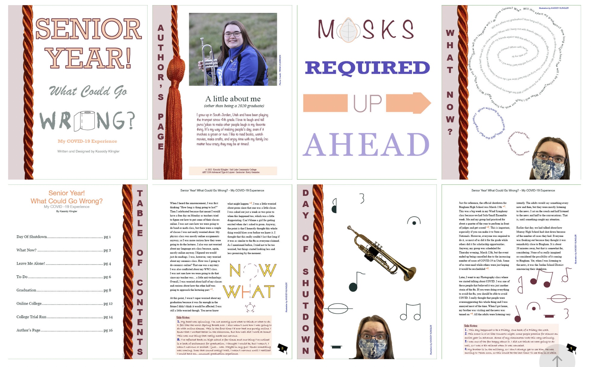
Final Version
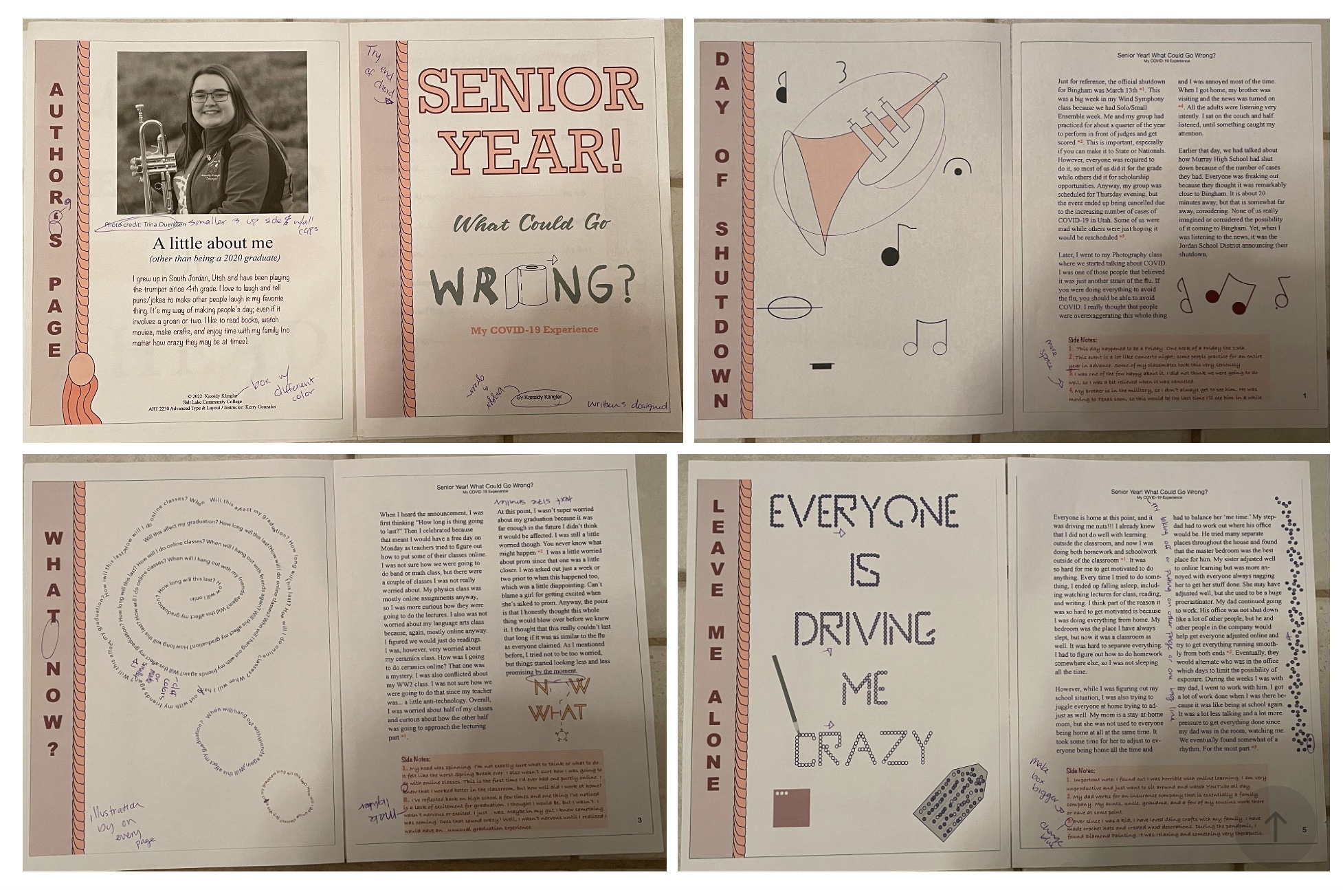
I added the necessary changes and went to go print it! There are a few mistakes, like a thought bubble being cut off of the siders being a little too close to the edge and not in the center like I wanted. I also didn't
move one of the chords far enough over, so there is some weird white spots. And, I forgot to change my trim line to be black so it wasn't such a bright green, but it's all good. I'm overall happy with how everything
turned out! I wasn't sure I would be able to do this project when the class first started, so I'm was overjoyed to find that I could! I not only did it, but made something I'm proud of. I know it's not as fun as some of
the other ones in the class or have as many talented illustrations, but I am proud of what I was able to create with the talent level I'm currently on. I went from not thinking I could do it, to being able to complete
something I'm proud of!
Also, I apologize for the jumble on the bottom. I tried to save it in order as spreads, but my Indesign didn't like that. I did try to save them together, but my computer was being weird. Sorry for the inconvenience
and I will try to fix it soon.
