Kassidy Klingler
My Work
Package Design
Adv. Type and Layout
Adv. Design
Type Figure
Overview
For this assignment, we were asked to trace a figure out of type. This is the first test to see if we truly
remember what was taught back in the Typography and Layout class. We need to use, with much careful thought
and appreciation, type in its endless amount of uses while creating a figure out of copy.

Research
This is where I got my inspiration from. Honestly, I was intimidated about this assignment from the start. I wasn't
really sure where to start and wasn't sure what I wanted to draw yet. I was thinking maybe a figure or an animal after
looking at some of the examples in the classroom, but I didn't want to get ahead of myself before I did any research.
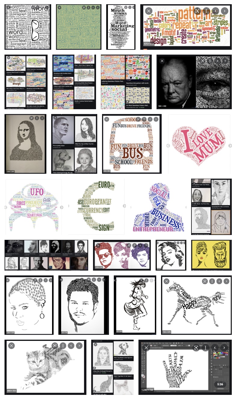
When I actually went on the computer for research, I had trouble when I started out. The first few examples shown were
the initial results. I mainly took a screenshot of it because I liked the different ways they oriented type and how they
messed around with sizes and arrangements.
Then, I tried to go back and see if i couldn't find more of what we'd be doing class. I found some interesting things that
really inspired me! I know a lot of them break the rules for this assignment, but I thought it was amazing the sort of detail
some people were able to get just from using words. This also really helped me to kick into gear and get excited to start
working on this project!

Brainstorming
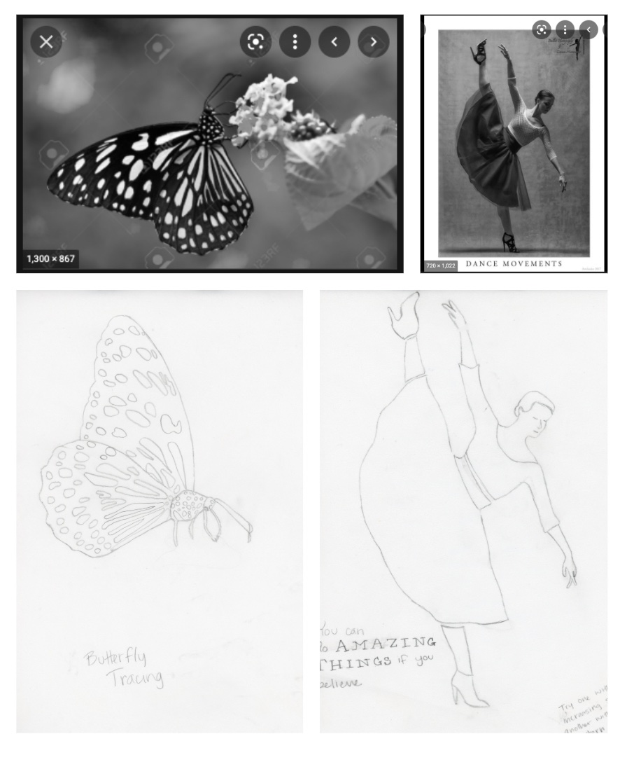
In this stage, I tried to brainstorm different images I might want to use as well as the different phrases. First, I tried to
find the photos. Once I found the photos, it would make more sense to try and choose a phrase to go along with it. The first
image I tried to find was a dancing figure or a person with a really fun pose (no foreshortening; more for our sake than anything else).
It took me about 45 minutes to find one that I liked. Plus, I was able to find it on a free domain, so I don't have to worry about stealing
another's photo. Then, I wanted to try an animal or insect. I wasn't sure what to do. I was having troubles with every animal I looked up and
couldn't decide on anything. For a break, I did a quick jigsaw puzzle on my iPad on butterflies! All of a sudden, I had inspiration! I found a
butterfly I liked and made it my reference photo!
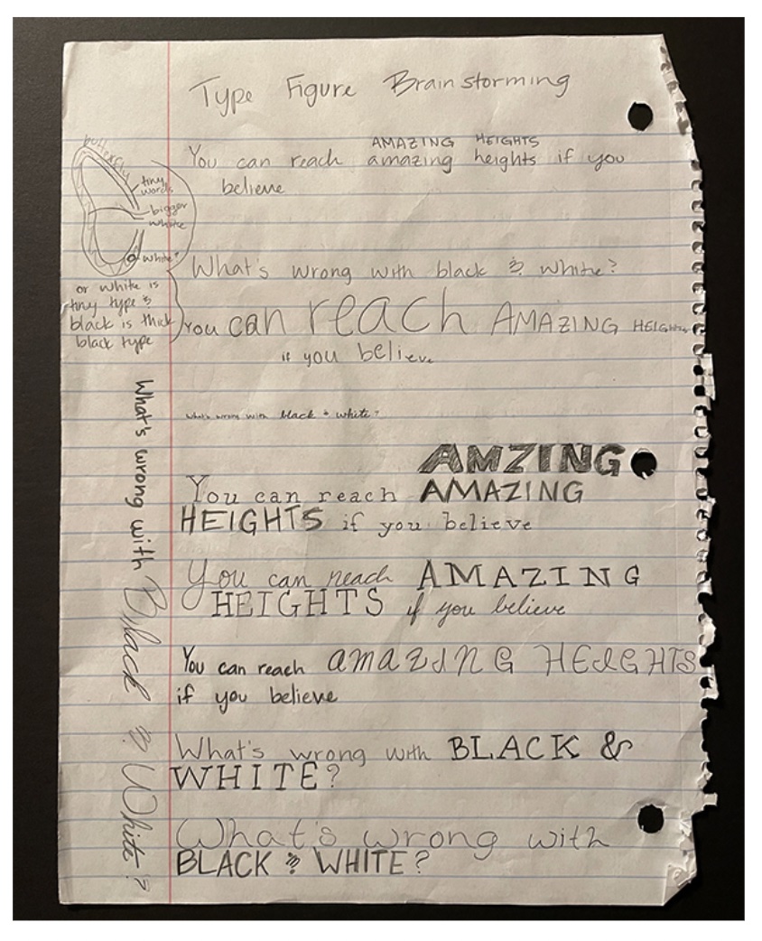
I then went to the drawing board on different phrases I could do. Originally, I wanted "You can reach AMAZING HEIGHTS if you believe", but ultimately
changed it to "You can do AMAZING THINGS if you believe." I felt that it might work out better for me when type blocking the figure later. With the butterfly,
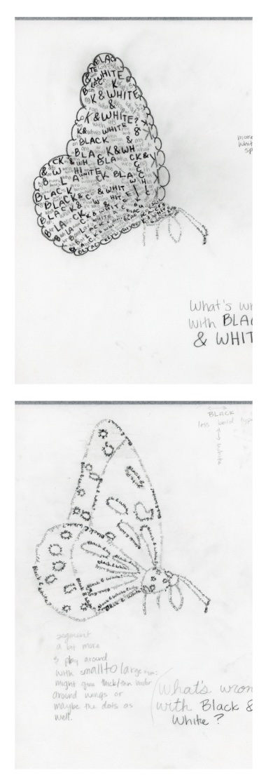
I tried to think of something fun and creative. I eventually came up with the phrase "What's wrong with BLACK & WHITE?" I thought that the question mark might
be fun to mess around with.

Tracing/Blocked Outline
For this assignment, we did a blocked tracing. This is help us separate the different parts of the reference. This way, we don't overcomplicate this project too much.
The goal was to simplify the figure and try to make as easy for our future selves as much as possible. Our professor told us to try and think of this like a stencil figure.
That really helped as I tried to block or 'stencil' my figure.

Blocked Type Figure: Butterfly
This was a lot of fun, but a lot of work. The first one I did of the butterfly looks really cool, but doesn't have a lot of whitespace. It took me a while to do on paper and
I imagine a lot on the computer as well. I basically covered everything that could be covered. I tried to use the bold type for the black areas on the butterfly and the thinner
type to outline the white spots. I think it ended up being too much.
The second one is definitely more of an outline. I think you can see the butterfly better, especially with the white spots. I also tried to simplify the butterfly's white spots
more so the text wouldn't be so small if I took it to the computer. Anyway, it looks nice, but it's also a lot of white space and not a lot of variety.

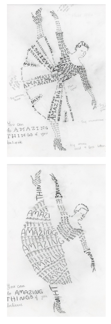
Blocked Type Figure: Dancer
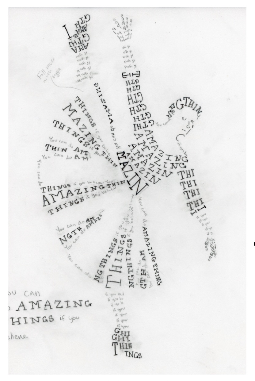
The first figure I did is probably my favorite of all the blocked type figures. I like how I did the skirt and how I did the skin. I also like how I did the shoes. I think they
really look like the reference image. I just really like the way it looks. I know it's not perfect and can be fixed in many ways, including having too many words too close together
and on the computer, they may overlap.
I also like the second figure and I really tried to make it much different than the first. I tried to treat everything differently. I also tried using different 'typefaces'. It was
fun with the cursive, but I don't think it has the same effect as the first one. I also really like how the skirt looks as well as the hair. The hands and arms kind of look like the
model is wearing gloves, which could've been an interesting take if I went forward with it.

Intermediates
For this, I took a lot of the class input to try out some different things. I tries some different treatments on the shoes and on the shirt. I tried to mess more with big and small
characters. I also tried to make it more wavy and look like the dress has waves/ruffles in it. I also tried to change the hand that's pointing down to try out some different things,
like the different character sizes. I also tried a different treatment of the neck by using "C's" instead of words.
One thing I noticed was that I had too much text still and needed more whitespace, especially to try and segment the different parts better. However, I do like how this one turned out.

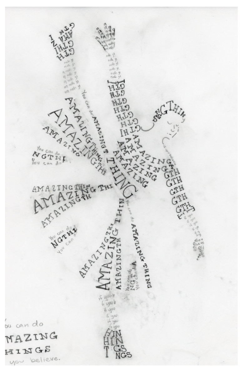
Hand Final
I still tried to play with the skirt. I tried to make the thinner typeface as the end of the path and the bolder part towards the beginning. This way it would look more like a fold in
the skirt. I also still tried to do different treatments of the shoes, face, hands, and neck. Basically, I tried to play around more with my figure.
One thing I wish I would've done is play around more with the type instead of sticking with the serif and sans-serif type combination. But, luckily for me, I think it ended up working
really well for my figure overall. I still wish I played around with it so I could be more confident that this would have been the most effective combo for this project.

Initial Computer Area Studies
The first one was is of the upside down shoe. I wanted to see what different ways I could create that shoe. I felt it might be one of the trickiest things when I got to the computer, so
I tried that. I had two shoes that I likes that looked like shoes, yet were different from each other. I used those two on the figure and they look nice! I think they work and are different
enough from each other that they don't look mirrored. Plus, with the shoe that's on the ground, the type is actually backwards, so that's kind of fun!
For the next study area, I used the hand that is facing down. I thought that one would be a trickier hand to do (especially since I was thinking of replacing the other hand with an image),
so I tried different variations. They all kind of ended up like Walk-Man signals without the head. There wasn't really one that I liked other than maybe the hand with the "b's" as fingers.
Even then, as I learned later, the characters were almost too small. I had to make them a little bigger later on, but for now, they worked as my hand.

B&W Progressions
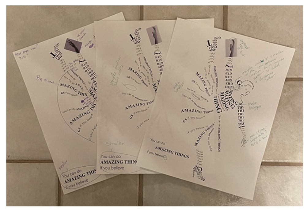
For these progressions, I mainly focused on, surprise surprise, the skirt, head/hair, neck, and the hands. This took me a minute to mess with. I tried to make the skirt more like the ones
I did in the Intermediate and the Hand Final; type goes big-small to give it more of a ruffle or fold or wave in the skirt.
For the hair, I decided to make it an outline because I couldn't make the type work the way I wanted it to. Plus, I added a bun because I thought that was fun. There was a bun on the reference
image, but it was kind of hidden with the angle of her head.
I ended up deleting a couple of lines so I could segment the areas of the image more. I think it turned out better. Or for some areas, such as the sash, I tried adding some smaller text in between
the torso and the sash so it would look more like a sash.
With the hand, I basically simplified the fingers. That way they weren't so tiny and weren't on the order for how small I could make type on this project. With the other hand, I took a different photo
from the site Pexels because it was a better image quality than the other one was. It was much clearer and less pixelated. It was also a true black and white and not a four color black, which I was much
happier with.

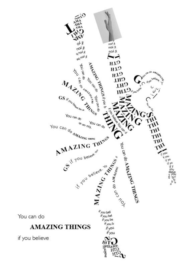
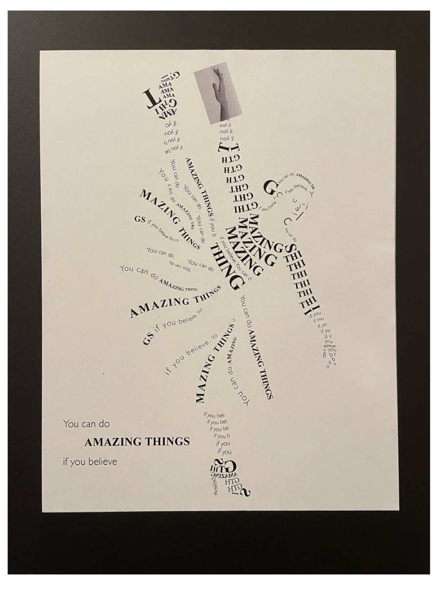
Final Clean Version
As I said above, this project turned out much better than I thought it would. It was a project I thought would be miserable to do and I was pleasantly surprised. I had a lot more fun that I thought I would too.
I was also dreading the computer work and I think I imagined it being worse than it was. Yes, I had a very hiccups along the way, but I was figuring everything out. I think I said this earlier, but the different
variations I did above with the hand and the shoes really helped me get used to the type on path tool. It actually really helped me with the rest of the project as I learned some tricks to trying to get something
just the way I wanted it.
I did learn a lot from this project, like the different things I can do with type and how much messing/playing around with a tool can help you in the end. I also learned to try and give myself as much time as possible
for the digital work so I don't have to get it all done in a rush. I probably should have learned this earlier or maybe I have, but I need to work better on applying this lesson more into my life. I also learned that
as a designer, I can change things. I don't have to follow the picture or stay within the lines, respectively. I can add things that would make my design better and I don't have to be confined by neat little lines.
Overall, I really liked this project more that I thought I would and I'm glad. I really liked the way this turned out. I'm also glad to have learned something new about myself and to try something that seemed absolutely
daunting when I first started out.
