Kassidy Klingler
My Work
Package Design
Adv. Type and Layout
Adv. Design
Magazine Ad
Overview
For this project, we were tasked with creating a newspaper ad. This one had to be in black and white, which I was pretty happy with.
We did have an advantage, which is that we knew which ads we were next to on the magazine layout. This was difficult in the way that
we had the least amount of time to do this one. However, I had the most fun with this project.

Research
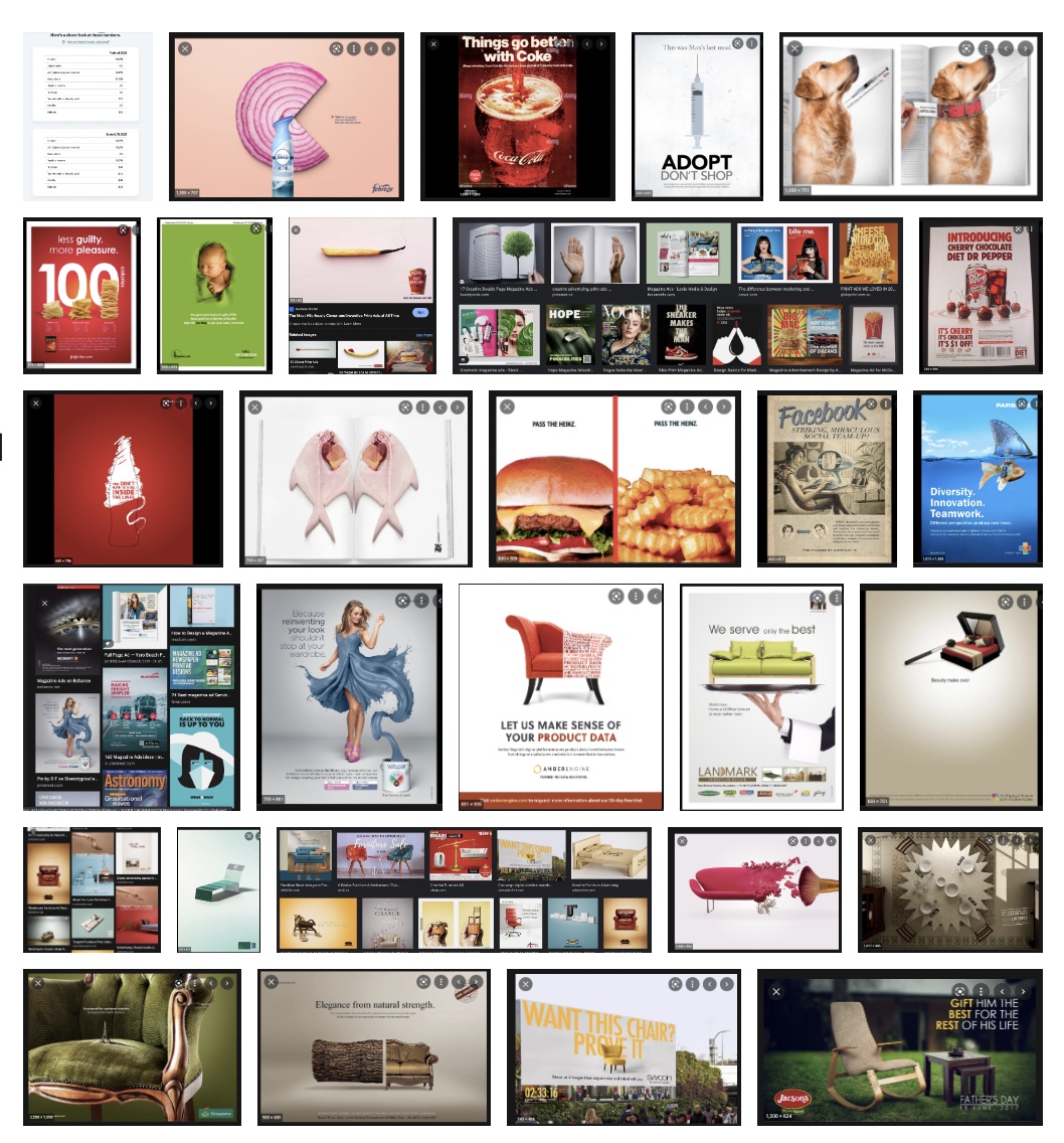
I tried to look up different furniture ads as well as some furniture ads. I wanted to see what other people did to try and make furniture
fun and something they could successfully sell. I really was inspired by what I saw. There are a lot of creative people out there that know
how to make some fun things. I was also inspired with the different things people were able to do with furniture, especially since furniture
is so hard to work with.

Brainstorming
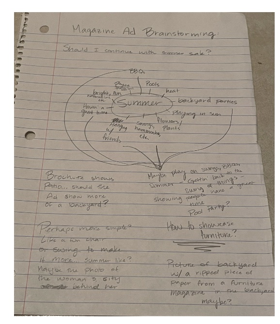
I was brainstorming the some fun headlines for this project. I wasn't sure what to do, especially to try and make it connect with my brochure.
I was also trying to make sure that the ad was something that enticed people to the website. I wasn't sure what to advertise, but I was thinking
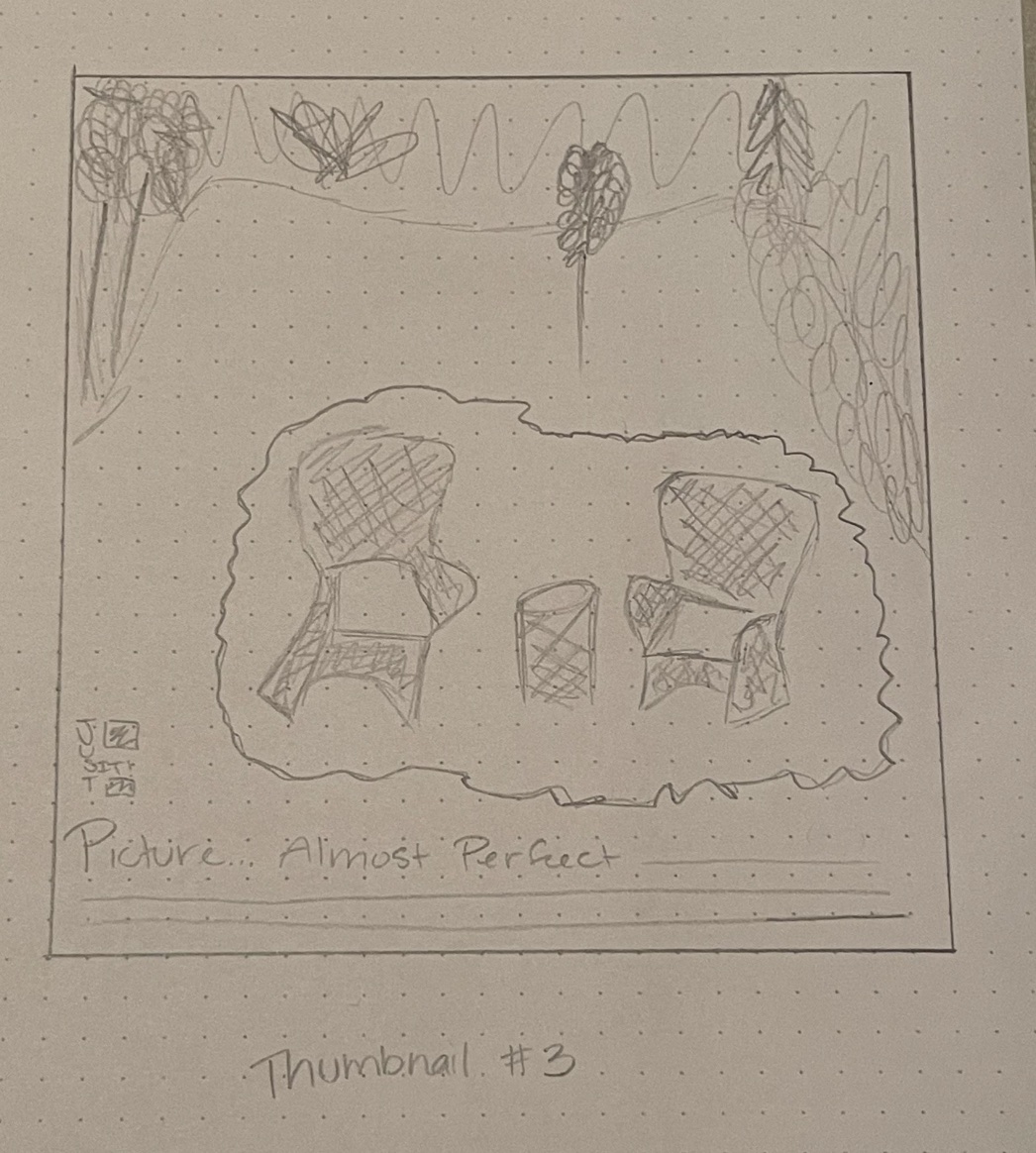
of doing something with outside furniture again. Maybe showcasing the backyard furniture this time.

Sketches and Doodles
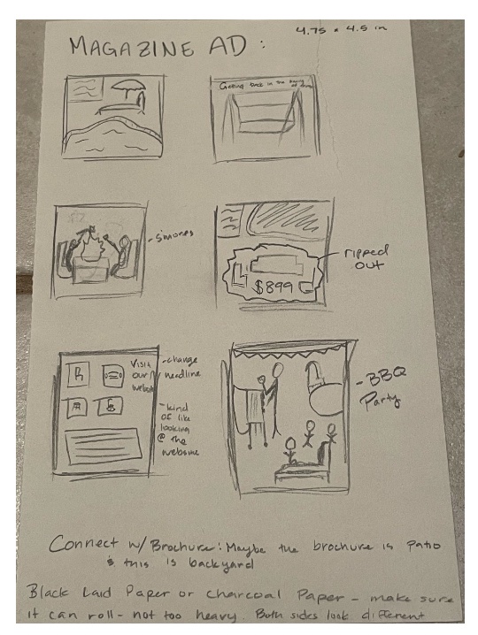
I was having some fun sketching these out. I was doing some interesting sketches, trying to get a good idea of what might look good. Some of them aren't
very good idea, but it's fun to get some of the bad ones out of the way so you get to some good ones.

Thumbnails
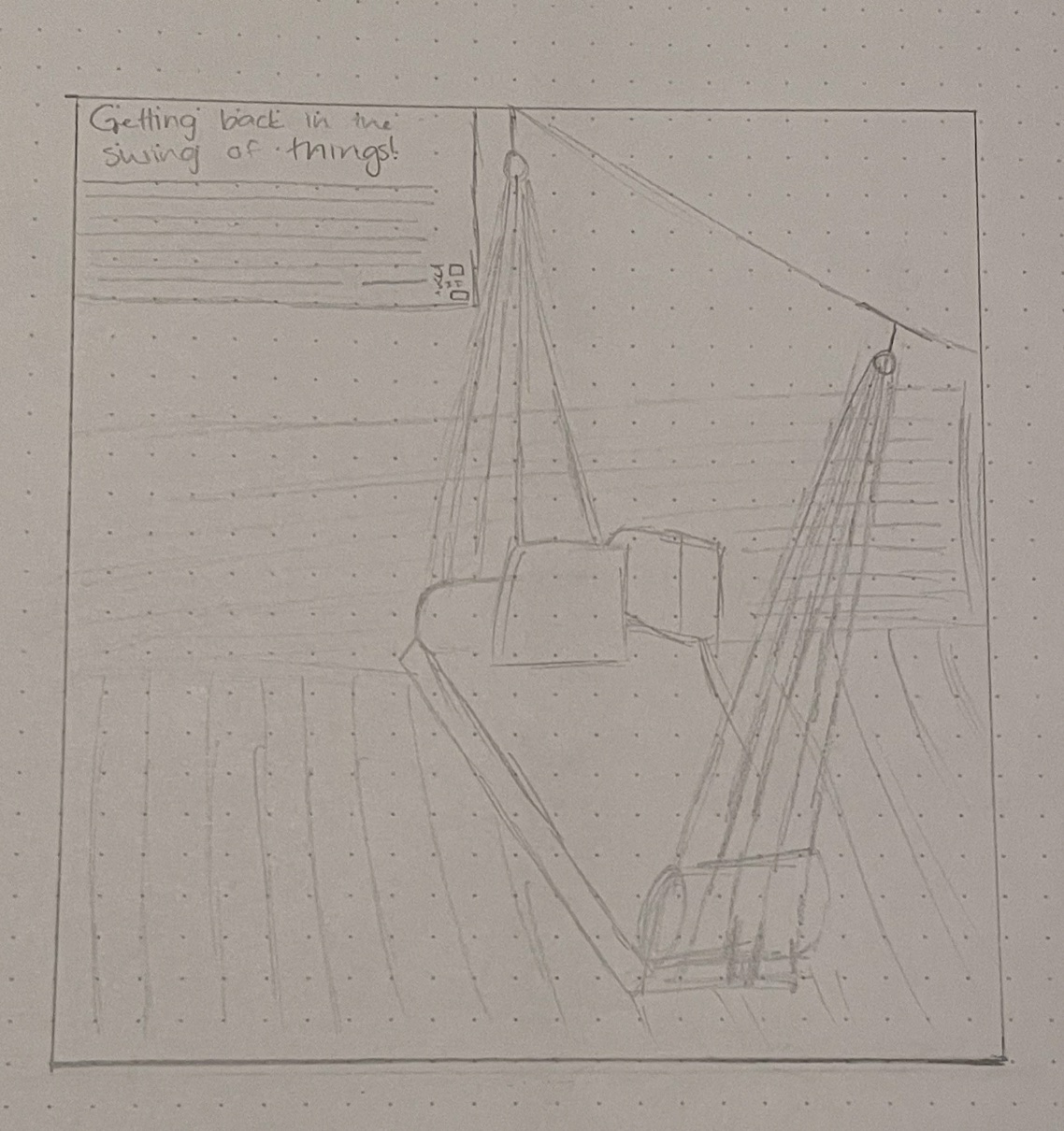
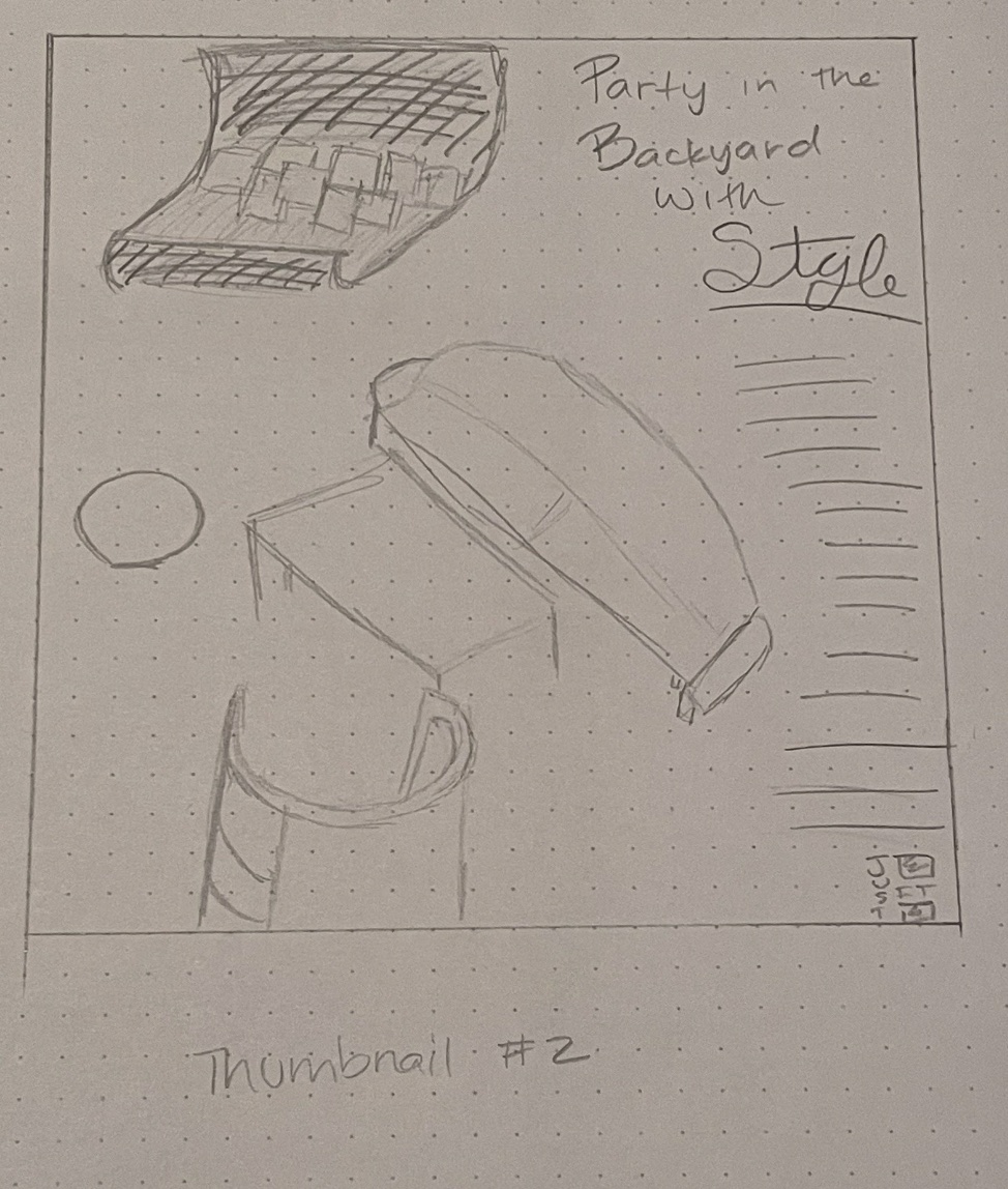
I was doing a couple of the thumbnails trying some different ideas. I went the scenic route for a little bit, trying to look for a nice photo online that
would be fun. I found one of an outdoor swing that I really liked. But, when I was doing this, I had a really good idea; what's the biggest problem with
buying furniture? You're not sure if it will match what you have. So, what if you were to rip it out of the catalog to try and envision it in your yard better?
I knew the rip texture might be hard to do, but I really liked this idea and decided to go for with it.


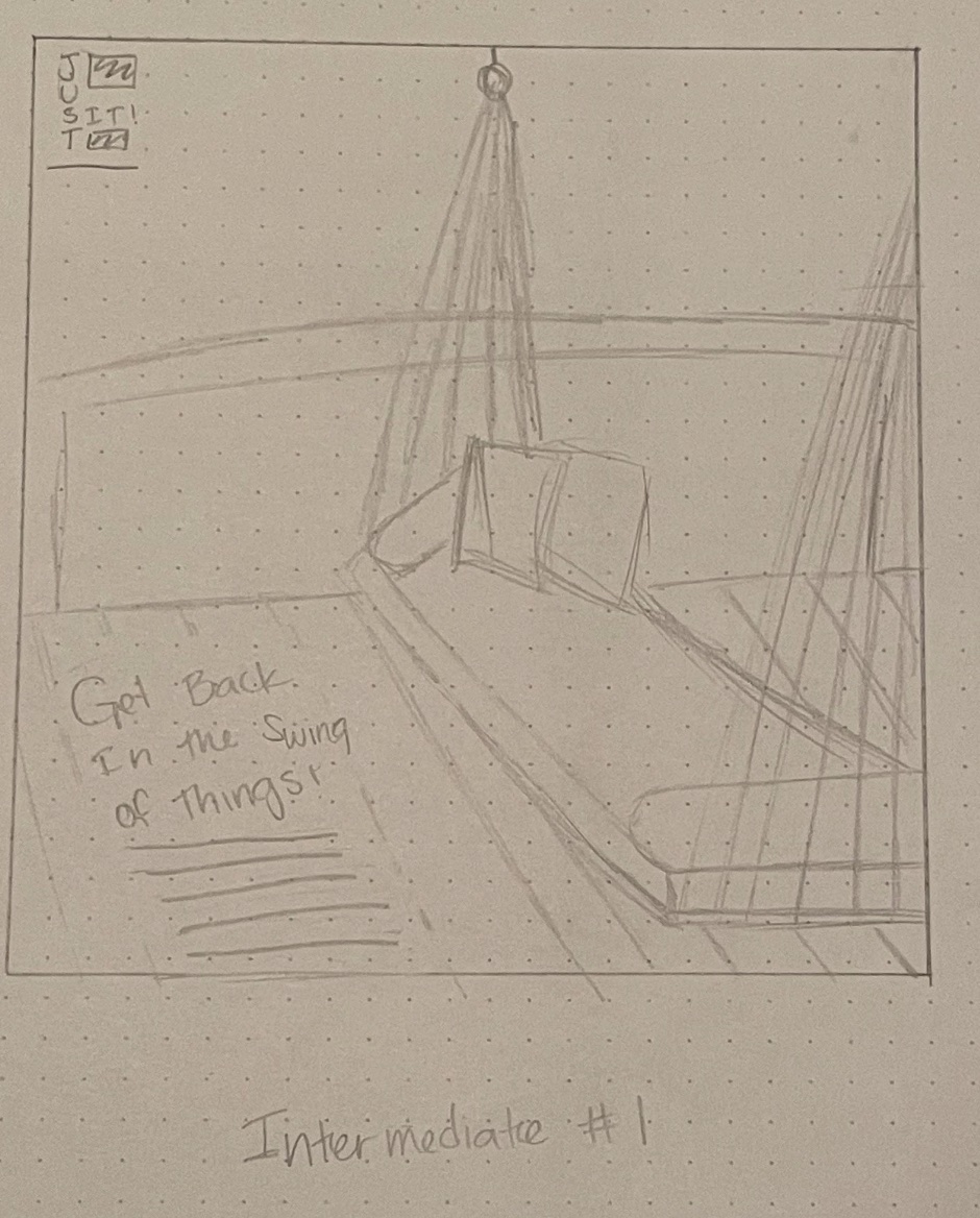
Intermediates
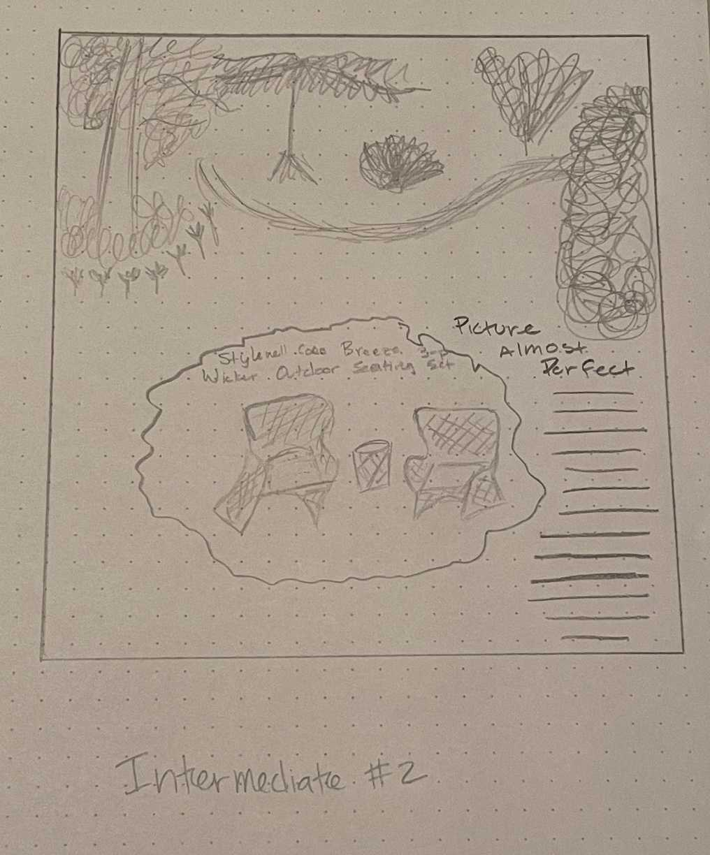
I still played around with the image of the swing and trying different headlines. I also tried different backgrounds for the ripped idea, seeing which one might
look better for my intents and purposes. Again, I played around with different headlines to see which ones I liked best. Headlines can be a little difficult at
times, but I also think it's fun to try. I tried to play around with where the text and logo went, seeing which one I liked better.


Hand Final
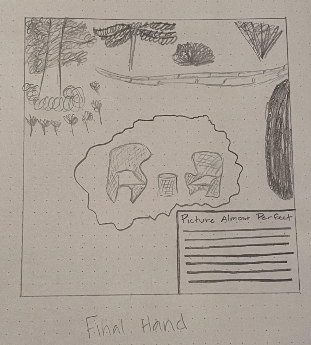
This hand final is probably the easiest one I've done of all the projects. I had the idea and the basic concept down, just still messing around with the image,
headline, and the location of the type. I kind of wish I tried some different things so it doesn't look so similar to what I did for my intermediate.

B&W Computer Progressions
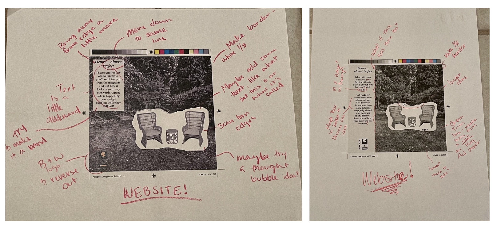
The progressions were fun to do. The main things I was changing was where the logo, type, and ripped image went. I tried to create a high contrast background
for the background. I then made fixes, such as what the text should say and making edits. It took a minute to get everything where I wanted it for the critique,
but I was happy with it. At least, for the most part.

Critique
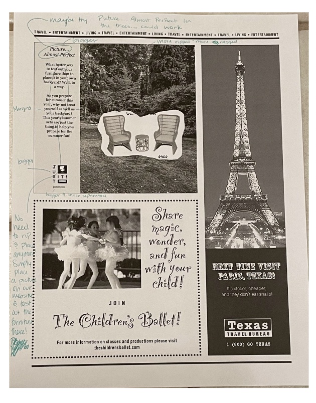
As many of the projects, some good things and some things to fix. The background doesn't look much like a backyard and more like a public garden one might walk through.
The type was also a little off and needed to be fixed. The ripped texture also didn't look much like a rip, so I needed to work more on that. I also had an idea to make
the body text explaining a new service allowing people to look a rendering of their backyard with possible furniture options the company offered. Overall, it's a fun
concept that a lot of people like. I just need to work on nailing the different details.

Final
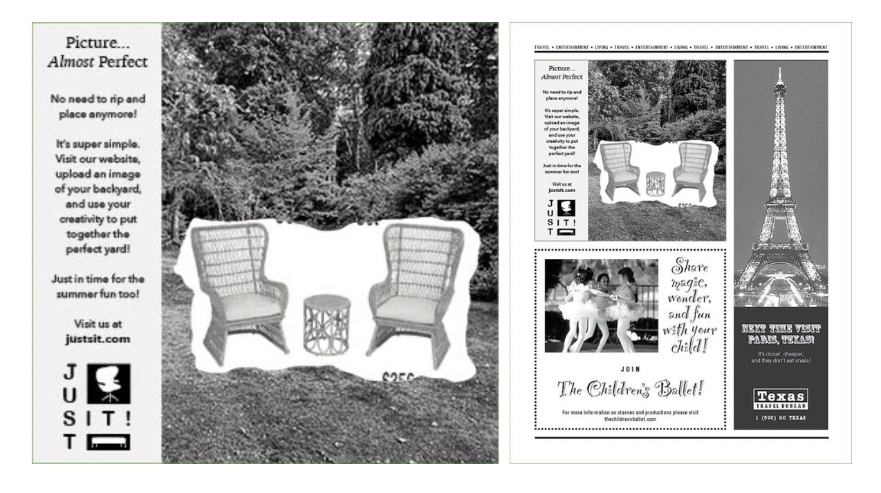
I tried to fix the rip, but I just ran out of time. Definitely something I want to mess with in the future, but not something I had time for at the moment. I changed the
text and I'm very happy with how it all turned out. I did get a suggestion to change the background so it looks more like a backyard and had more sky, so I'll be looking
for a different image. I'll see if it works out better than what I currently have. This was my favorite part of the project and I had the most fun making this! I'm super
happy that my idea has been working so far.
