Kassidy Klingler
My Work
Package Design
Adv. Type and Layout
Adv. Design
Banner
Overview
For this assignment, it was the ultimate test to see what
we have learned from all projects that have come before this one.
With the end of the class approaching, we have to use the skills we
learned and the creaivity we possess to create a poster and a banner.
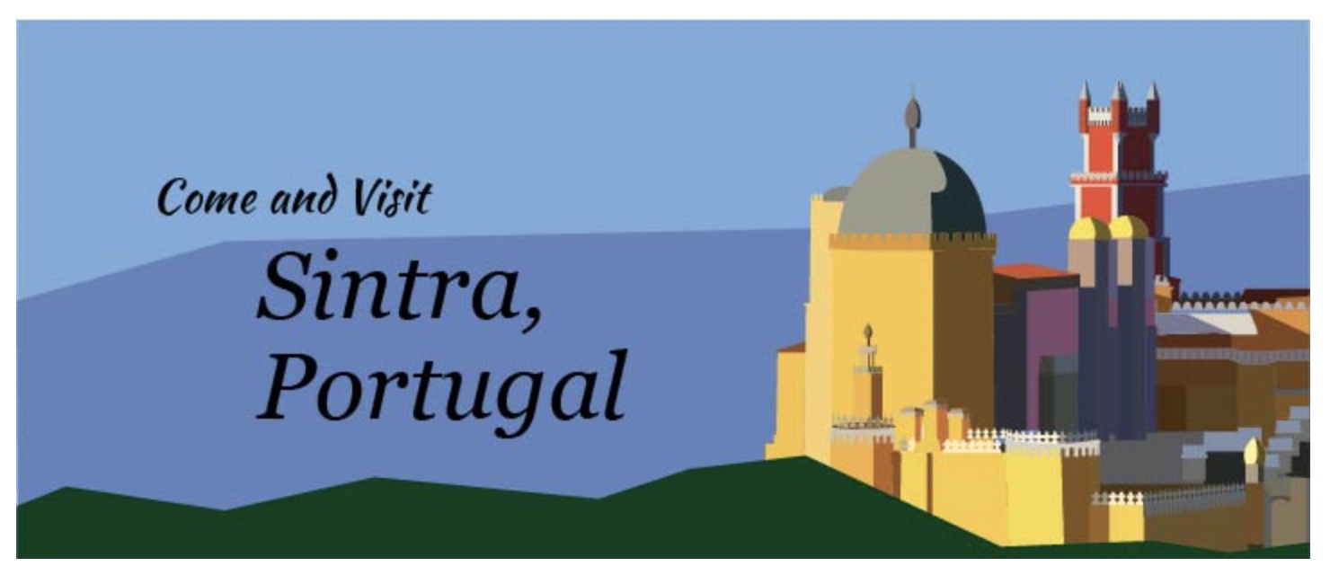
These are two very different ways to display the same design. We could make
the poster anything we wanted, from advertising a place to making a movie poster.
This was a unique challenge that tested all of us.


Reflection
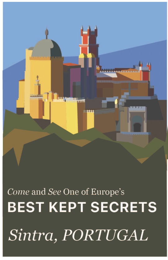
When starting this project, I knew I wanted to do a tourism poster. I'm not very good with movie posters,
so I figured I would try my hand at tourism. I wasn't sure where to do it, though. I did TONS of research.
I tried to decide on a style, as well as decide on a location. I took so many screenshots, I filled half of
the school desktop! When I got home, I asked my dad which location I should do my project on. We discussed
some different options until we decided on Portugal. My dad served his mission in Portugal, so I thought it
might be a fun place to do. He told me some really cool locations, including a place called Sintra. Apparently,
it's the perfect tourist location with tons of shops, great food, wonderful beaches, and ancient buildings,
including a castle. I found a super colorful castle and my dad said he had visited that castle. It's actually
a really cool location. So, I decided on a photo of a castle located in Sintra, Portugal!
I think I enjoyed building the castle. It was a lot of fun trying to figure out all the pieces. Although,
if I had more time, I would've done a better job of it. I feel like it's really geometric and simple and
it's very simple for being a final project that's supposed to reflect what I've learned in this class.
I definitely could've messed around more with the tools of Illustrator. But, this castle was filled with
so many different nooks and crannies, it was hard enough to do what I needed to do to get it in on time.
I guess another thing I would've done was managed my time more effectively. One challenging part was the
time constraint. I feel like I could've been much tighter if I had only given myself more time. I also found
the castle difficult to build and very intimidating to do as I was going through the whole process. I also
found the typography to be a challenge. I wish I could've found something better, as well as done something
more for the background. With this project, I think the main takeaway is time management and how much one
more hour, heck, one more minute, could mean for a design and how tight it can be. Right now, I kind of
feel embarrassed for the mess I'm showing, but I'm also proud of what I was able to finish in the time I had.
