Kassidy Klingler
My Work
Package Design
Adv. Type and Layout
Adv. Design
Book Cover
Overview
For this assignment, we were asked to create a children's book illustration from a story in the Public Domain.
We needed to show different ideas, do research, and use the techniques we've learned so far to create a fun cover
for the book we have chosen. We needed to use a lot of the elements we had already learned in class thus far, as
well as use our creativity to create something new for our classic and timeless stories.

Research
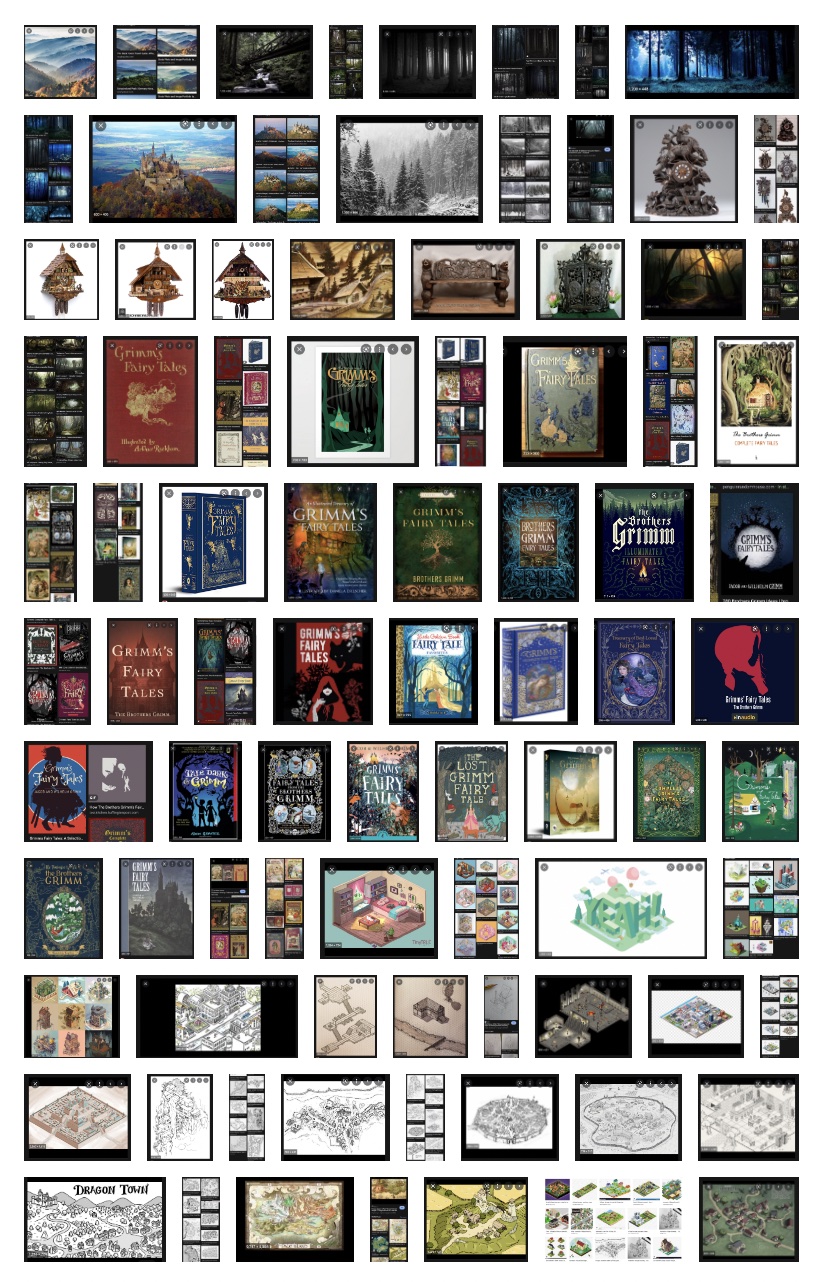
I wasn't sure what to do for the assignment, so I tried to research different Grimms' Fairytale book covers,
looking for inspiration. I found a lot with an overall image of a spooky forest or things like it. Another thing
I saw a lot was different individual stories being highlighted, such as Little Red Riding Hood, Cinderella, and so on.
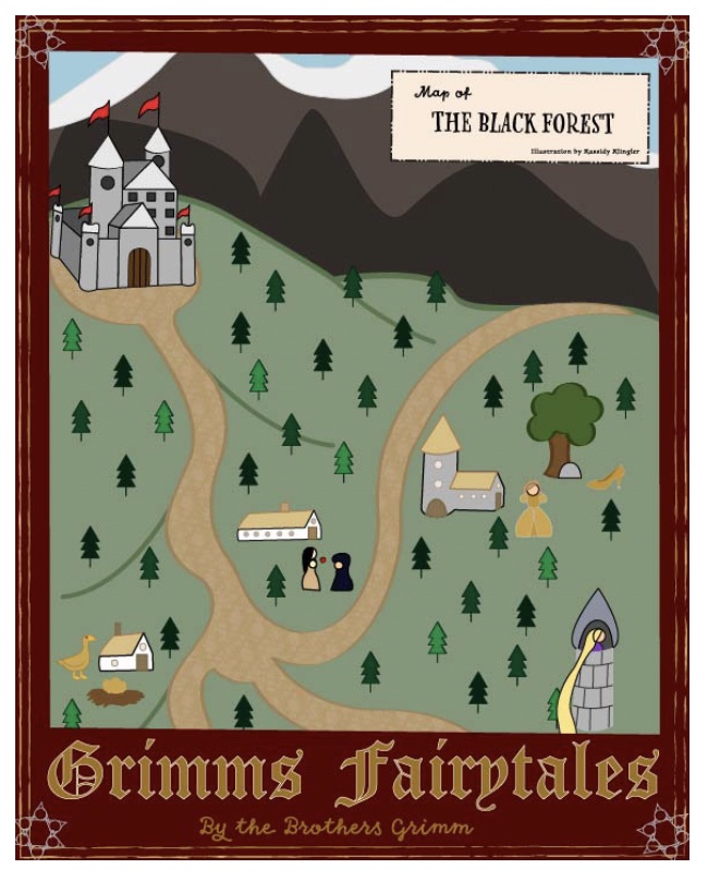
Then, on a stroke of inspiration, I thought of making a map with multiple characters on the front. I also wanted some
sort of a nice border, especially something you would see in that era. I thought this might be unique since I didn't see many,
if any, covers that involved multiple characters, not just one.

Roughs/Thumbnails
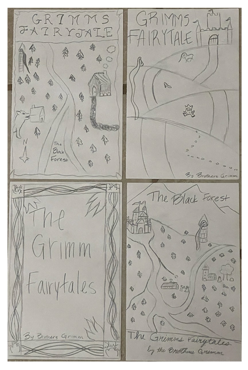
I had a couple of different ideas for the roughs. I had one where it was a road leading straight down with characters along
the side of it. I had another where it was just a fancy border and some main focus on type. Then, there was the idea I had above.
I did redo this idea with an isometric perspective in mind. I got this suggestion to try and make it more like the style of the
era as well as make a fun, simplified map to play around with. I had a lot of fun drawing these out and coming up with different ideas.

Reflection
This assignment was hard to start. I wasn't sure what story to do and what I could do when I decided. I was talking to my dad and trying to
brainstorm different ideas when we remembered a book, we bought a while back. My ancestors used to live in the Black Forest, so we really liked
reading about the Grimms Fairytales. We have a big book that includes all the stories from the Grimm Brothers. I know that this is in the public
domain, but the main question was whether it was allowed. After, I got the okay, I started doing research. I did research on different Grimms Fairytales
book covers. I was curious to see what other people did and what I could do differently. Unfortunately, with something so popular and so old, there are a
lot of different ideas that go on. But I did notice one thing when looking: most of them had one main story on the cover that was typically one of the more
popular and well-known stories. I wanted to do something that would have multiple characters.
I messed around with several different ideas, but the one I liked the most was one that included a map of the 'Black Forest' and featured
several different characters from multiple popular stories. I drew out two different versions of this idea (also combining some things
I liked from my other ideas) and started the computer work. I started tracing the different buildings in an isometric perspective
(a suggestion that really helped me and I did some research on different examples) with the pen tool. For me, the hardest part of this
assignment was probably the colors and figuring out how to make my design look less basic. I struggled with making the colors fit. I used a
lot of different colors, including for the strokes. It took a lot of figuring out. I tried to do most of the drawing stuff first before I
moved on the colors because I was becoming distracted. After I had everything colored, I picked out the different typefaces as well as made
sure my little characters were easier to see, I started to think I was done and could do the final touches. I got some advice from the professor,
who suggested that it was a little flat and to try and add some different depths to it. I changed the mountains, tried to give the illusion that
the terrain are hills, and changed the colors of the trees to change it up a bit. It helped a ton! I also added a border around the red border to
give it a bit more of an older vibe. I wish I had done something a little fancier, but I didn't want to just copy the border brushes and try to come
up with my own. I don't think I did too bad, especially since this is the first time I'm messing around with art from that era.
Overall, I really liked my illustrated book cover. I like the cartoon look and it looks fun! Especially if this is going to be read by children.
I think I got better with the colors, but there's always room for improvement. Are there a few things I would change? Of course! I would probably
make it a little darker all around. I know this is for children, but that doesn't mean some of these stories aren't terrifying. I also may add a river.
I'm still not sure, mostly because I'm not sure if it would be too much and make the whole design look too busy. I would probably change the mountains a
little bit, so they look more like mountains, but I think they look kind of fun! I also probably would've changed the trees. In some maps, you see a general
area of trees with holes or patches that have been cleared out for houses and such. I think that would give more of the feeling I'm going for. However, I am
happy with my design. As I said above, I think it looks fun and inviting to children. I'm overall proud of what I have been able to create.
